Click link below to see full image.
This is my mood board of folk genre tour posters. Conventionally it’s clear to see the main colour scheme for the posters are muted browns, yellows and reds. The fonts used on the poster are very old fashioned and are usually the serif fonts and are bold with all the letters being in capital. The images are mainly not in colour and are either in black or white or the artist is in white and they have one other colour to add their features. The masthead of the artists name is also the biggest piece of text on the poster. Analyzing these tour posters will help me when I make my folk tour poster as I now know what colour palette to use and where to place images and text.
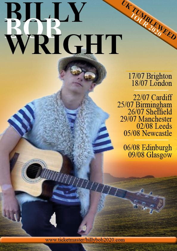
My reflection of my tour poster, click to see bigger picture.
