
Category Archives: Component 1
CCR2 – How Does Your Product Engage With Audiences and How Would it be Distributed as a Real Media Text?
When creating any piece of media it is essential to make sure your target audience will be able to engage with the product and relate to it. Below I wrote a script explaining different parts of my music magazine and what conventions were used in order to get full audience engagement.
CCR4 – How Did You Integrate Technologies (software, hardware, and online) in This Project?
When producing any piece of work it is important to reflect on many different things which impacted your work. CCr4 asks how did you integrate technologies in this project. I made a piktochart to show the different software, hardware and online sources I used to produce my music magazine.

Loading…
CCR3 – How Did Your Production Skills Develop Throughout This Projects
When producing any piece of work it is important to reflect on many different things which impacted your work. CCr3 asks how did your production skills develop throughout this project. I wrote a letter to a future A level media student to show the different skills I learnt and needed to achieve and deliver a successful music magazine.
After writing my letter to a future A level media studies student I made a slideshow to show photographic example of all the transferable, creative and technical skills they will learn. I also added a voice thread going through each slide to make it easily understandable.
Complete Magazine – Draft 3
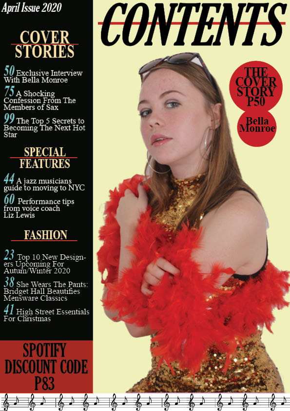
These are my draft 3 versions of my music magazine. I added and changed multiple things on each of the pages to meet a nearly perfected finished magazine which might only need a few more tweaks. On the front cover I changed things such as the background from a light grey to a muted brown colour to make the cover even more retro and vintage as it could be. I also changed the main cover line and moved it over the main cover star in order for me to add more coverlines and also draw more attention to the star.
On the contents page I made the most edits and changes. One change I made was I edited the image of the model in Photoshop by using tools such as sharpen to make her more clear. I also did things such as adding more effects to the text by highlighting certain words to make the page have a bigger variety of colours to stop it looking plain and boring. I changed some of the subheading for example I changed the fashion subtitle to an events subtitle to make it for music relevant.
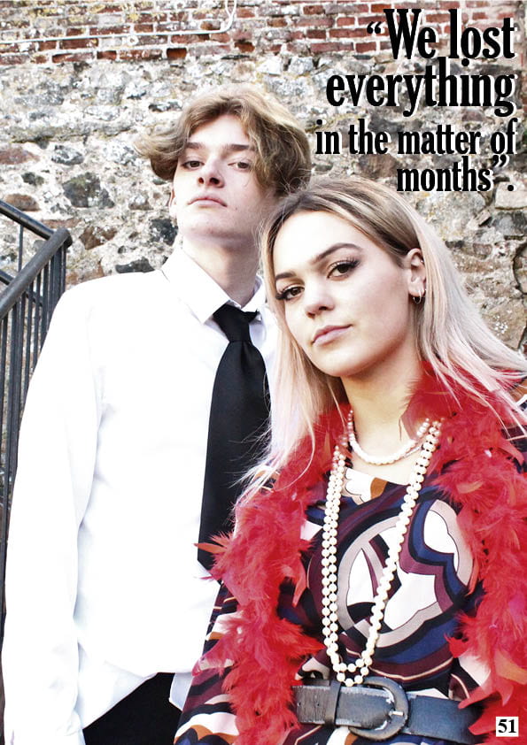
Finally on the DPS I edited some typos and wording to make sure there’s no errors. I enlarged the main image so that the models take up more space on the page so attention is drawn to them. I also added another quote to help fill the white space of one of the models shirt and added some text effects to the quotes.


After doing my third drafts my teacher did a screencastify for me so I know what improvements I need to make for my final draft.
Feedback:
Front Cover:
- Masthead needs to be bolder
- Pug is bunched up
Contents Page: PAGE NUMBER CONTENTS PAGE / White stripe around contents, links with masthead/ keywords could be bolder with some stripe / equal line spacing
- Add page number
- Add white to contents heading
- Keywords could be bolder with some stripe
- Equal line spacing
Double Page Spread: Quote could be moved down and justified to left / Caption the photo / Slightly thicker line under your writing?
- Quote could be moved down and justified to the left
- Caption the photo
- Slightly thicken the line under the writing
2nd Draft of Front Page
This is my second draft for the front cover page of my music magazine. I edited with the feedback I got from my first draft.
Thing I edited:
- edited the main photo on photoshop by cutting out the model and using the sharpen tool to make her appear more clear.
- added more colours to match the jazz colour scheme.
- edited the masthead to make it more eye-catching and used a variety of colours in it to make it less plain.
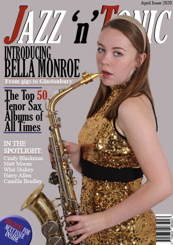
My Targets:
- Capital G for Gigs?
- bit more red in some of the cover lines?
- move the main cover line to over her body and then you have room top left for another coverline? move the main coverline down slightly from the masthead?
- price?
- look at the alignment of the blue lines?
- little logo of a musical note? outline of a trumpet?
Chosen Adverts
For the inside cover of my magazine I will need an A4 advert. I know this will not be marked however I appreciate it for presentation purposes to make my magazine look to best possible version it can be.
Advert 1
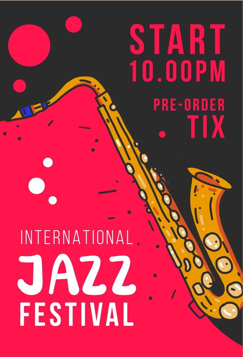
This is the first advert I chose. I decided to find an advert for a jazz festival as it will appeal to anyone reading my magazine of any age or gender as the whole reason they are reading my magazine is because they have an interest in the jazz genre. Choosing a festival advert was also appropriate because I have an events subtitle on my contents page. The advert also doesn’t have a too modern look, nor a too vintage look so it could attract the eyes of my target audience. The colour scheme of the advert is reds, yellows and black which also suits the genre of my magazine.
Advert 2
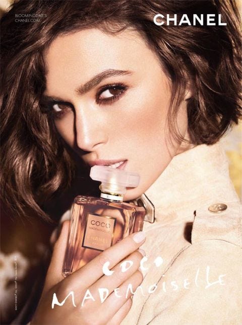
I chose this as my second option for my magazine advert as I think because of its vintage, retro look it will attract the demographic of woman of all ages who are reading my magazine who like old-school original jazz. I think the colours, model and perfume match the star image and chic look that some female jazz singers go for. The reason I chose this as my second option is because it is a woman’s perfume so it won’t attract both genders.
2nd Draft of DPS
This is my second draft for my double page spread. After doing my location shoot and making a first draft for my double page spread, I looked back at my targets and edited what needed to be changed to make my DPS the best it can be.
Things that I have edited are:
- the fonts – I used a different range of fonts to add more variety to the pages.
- I added my article instead of using placeholder text so that there is now relevant and interesting text for the readers to read.
- Edited the main image on Photoshop.

(click on image to see bigger).
My Targets:
- quote stands out…perhaps add another one?
- enlarge the main photo so that Max shirt is off as there is a lot of white and we need more of Izzy and Max face
- continued needs to be a bit separate so that it doesn’t look like it is part of the copy – different font?
- caption the inset or do you have one of them in a different costume?
- leave some space between questions as it is quite crowded
- could the questions be even larger size?
- lower case F in From
- typo article
Article Development
For my double page spread I had to write an article about my artists featured in the magazine. The article could be a biography, Q&A, 10 tips for life, album review or interview and I chose a Q&A. I drafted up ideas for my article on a template sheet then I read it through and corrected typos, grammar, missing words, punctuation etc.


2nd Draft Edited
I sat down with Max and Izzy at their home in London to talk about their third studio album, Time Out. We talked about the inspiration behind the album, family life and dealing with fame.
The sibling duo from Camden, London, released their second studio album, Kind of Blue late 2017 and from then their talent started to be recognised. After having three of their songs in the Billboard Hot 100, and then embarking on their 4 leg worldwide tour, there’s no stopping them.
“How did you feel when ‘Time Out’ was released into the world”? I: “It was definitely nerve racking, very bittersweet. We had been working on this piece of work for nearly two years and to release it felt like giving away something very personal and private to you, but the reaction from our fans was so heartwarming and made the hard times when writing the album worth it.” M: “I definitely agree with Izzy, as silly as it sounds to people who don’t make music, it was like losing something very close to you, I think it was equally difficult for the both of us as the problems addressed in some of the songs are things that both Izzy and I have dealt with.”
“What was it like growing up in London for you two”? M: “Growing up in London was very helpful but set us back with our music sometimes, don’t get me wrong we loved living in Camden for our childhood, it had it’s bad areas but it was an overall good experience of childhood for us. However London is a huge place for music producing and although there were multiple labels offering us deals, there was a lot of competition and other musicians who were fighting for those record labels too. I don’t want our fans or the public to think we didn’t work hard to get where we are today, because we definitely did”.
“Did you have any music inspiration when you were younger”? I: Amy Winehouse was definitely the main one for me, I just found her so unique, her mix of old-school jazz and modern music was so fascinating to me. Max was more into Frank Sanatra which I think really helped us find out sound as I was using more contemporary modern jazz sounds and max was using old-school sounds.
“When you first started blowing up how did you deal with the fame”? I: “When we started getting recognition and fame it was very exciting for us, everything we had been working up to had finally happened. However after the first few weeks of the initial buzz I started to realise I will never get the life I had before back. I think Max dealt with it much better than I did; I was in quite a dark place in my life where I had everything I could possibly want but I was miserable that I couldn’t get my life back, but sometimes you just have to let the past go. The love and support that our fans gave and still give is definitely what got me out of that dark place and really helped me see how grateful and lucky we are to be in this situation.
After the success of Max & Izzy’s sophomore album and the release of ‘Time Out’ the duo have a lot more success coming their way. With their fan base growing and The Time Out Tour coming up next year the sibling duo aren’t going anywhere.
Max & Izzy’s sibling bond shown in their music really portrays the importance of family to people around the world. Us at Jazz n Tonic cannot wait to see what the future holds for these inspiring artists. Join our subscription for next month’s issue with an exclusive interview with Sax.
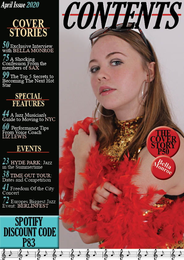
2nd Draft of Contents Page
This is my second draft of my contents page. I have made changes by adding jazz graphics at the bottom of the page, I have also cut out the model in order to place her on the contents page and add a coloured background. To improve my contents page I think I need to add a bigger variety of colours to the colour scheme as at the moment it is quite muted and dull mainly just using black, red and a pastel yellow. I also need to edit the model more on photo shop as you can tell she has been cute out and I need to edit things such as blemishes and brighten her eyes. I will also add effects to the text to make it look more noticeable to the reader.
(click on image to see bigger)
My Targets:
- Add more effects to text.
- Photoshop the model more and add effects to her face.
- Add more colours to the page – less reds and yellows.
- Possibly try a different layout.
- Try different fonts to fit the genre better.
- typos and punctuation and grammar check
- less on fashion and more on music/jazz in terms of coverlines
- Cover stories as a sub heading? Why not regulars, indepth, features?
- Find the jazz colour palette and the fonts from that era to add that vintage zing.