This is my mood board of folk genre tour posters. Conventionally it’s clear to see the main colour scheme for the posters are muted browns, yellows and reds. The fonts used on the poster are very old fashioned and are usually the serif fonts and are bold with all the letters being in capital. The images are mainly not in colour and are either in black or white or the artist is in white and they have one other colour to add their features. The masthead of the artists name is also the biggest piece of text on the poster. Analyzing these tour posters will help me when I make my folk tour poster as I now know what colour palette to use and where to place images and text.
My reflection of my tour poster, click to see bigger picture.
In this task I was given a magazine cover from NME magazine and had to recreate it using InDesign. I got Florence and the Machines cover (my remake is left, original is right). I have learnt how to use InDesign in this task which has helped me be able to use the conventional features when making my own magazine. For example I can now make main cover and cover lines and make them look realistic as if they were on a real magazine cover. I also learnt how to stretch and squeeze text to make it taller or shorter and wider or more packed together.
What I think I did well in this task was making sure all of the text was in the right place and made sure the margin was the same size for all the text. Another thing I think I did well was making sure the cover lines looked exact to the original. I did this by going back and forth with different text sizes to see which size looked the most similar. I also used the vertical scale and horizontal scale tools to change the height and width of text in order to make it look identical to the original. One more thing I think I did well was fitting the cover picture and barcode onto the cover well.
What I struggled with was making the masthead and main cover line look exact to the original. Because the text is so big I think it is much easier to notice if it isn’t the exact text size, colour or font. For example the NME logo is much more thick and bold on the original than mine is. I also found it hard to get the smaller text that is incorporated with large text to look exact to the original. For example with the text that reads ‘2 of 10 SPECIAL EDITION COVERS’ I found the word ‘of’ hard to make look like the original as the larger text overcrowded it.
Doing this task and learning how to use the basics of InDesign will help me in the future when I make my own music magazine as I now have learnt all the conventional features of a magazine and also how to make my own magazine cover using InDesign.
These are some videos that helped me learn the basics of InDesign. If I am ever stuck on how to do a certain task I will watch these and then try to do the task again.
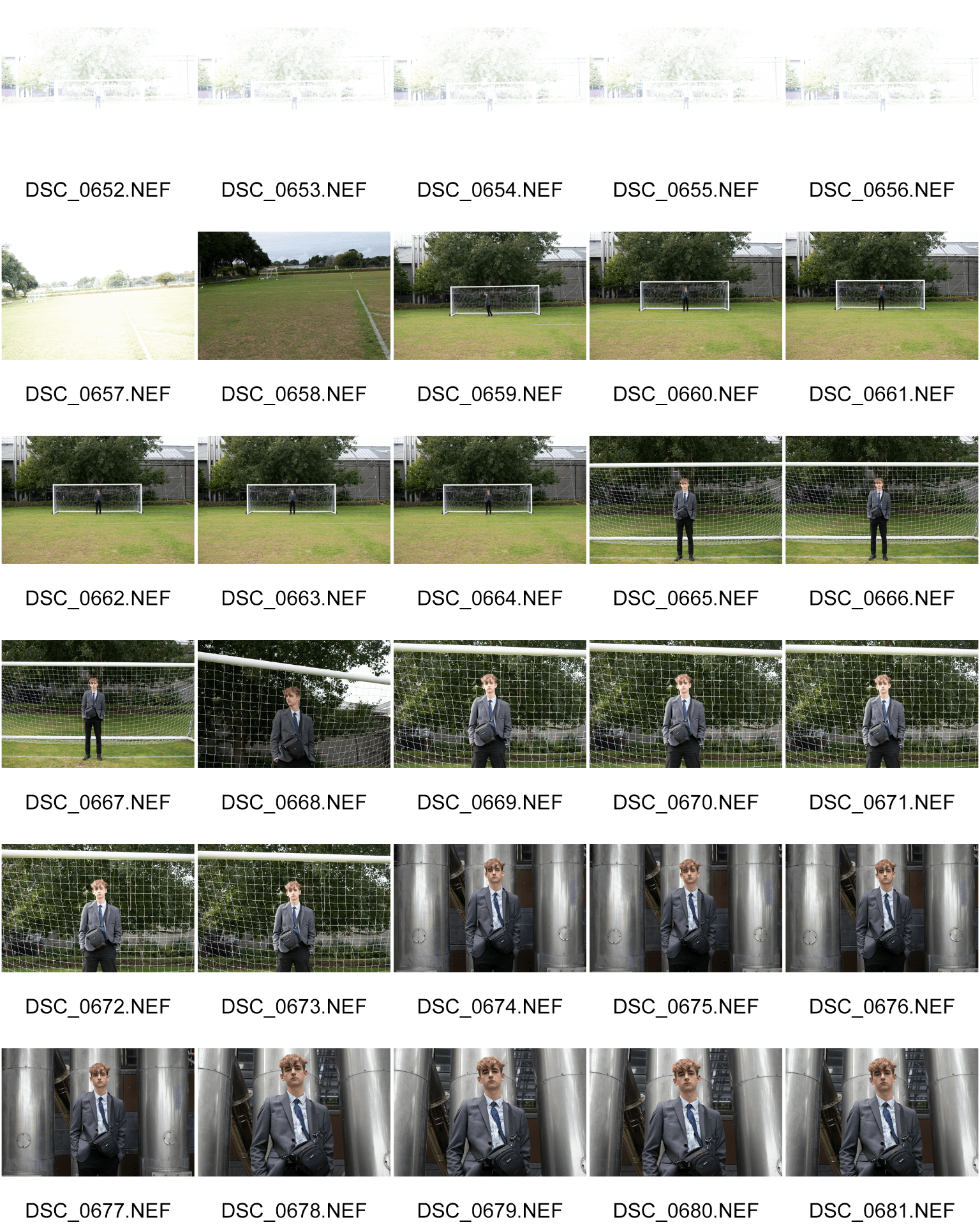
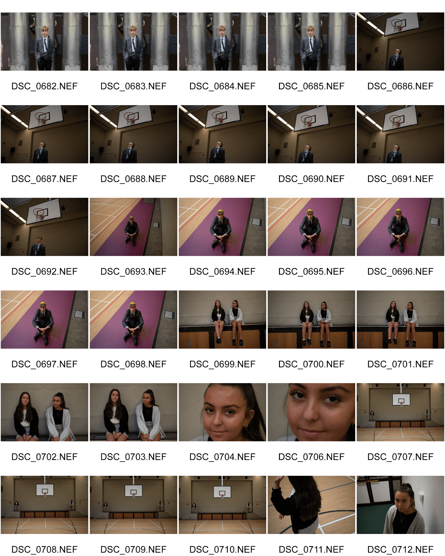
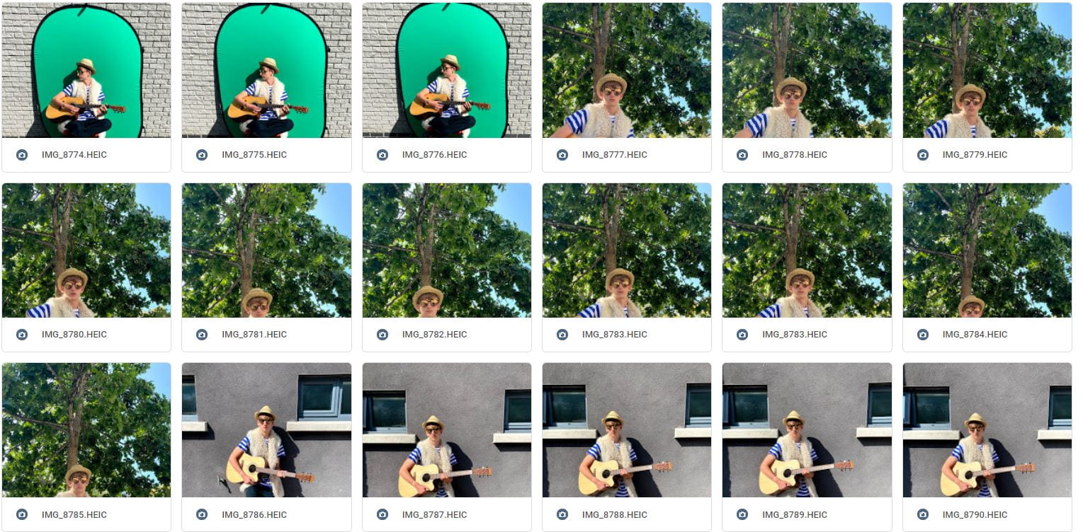
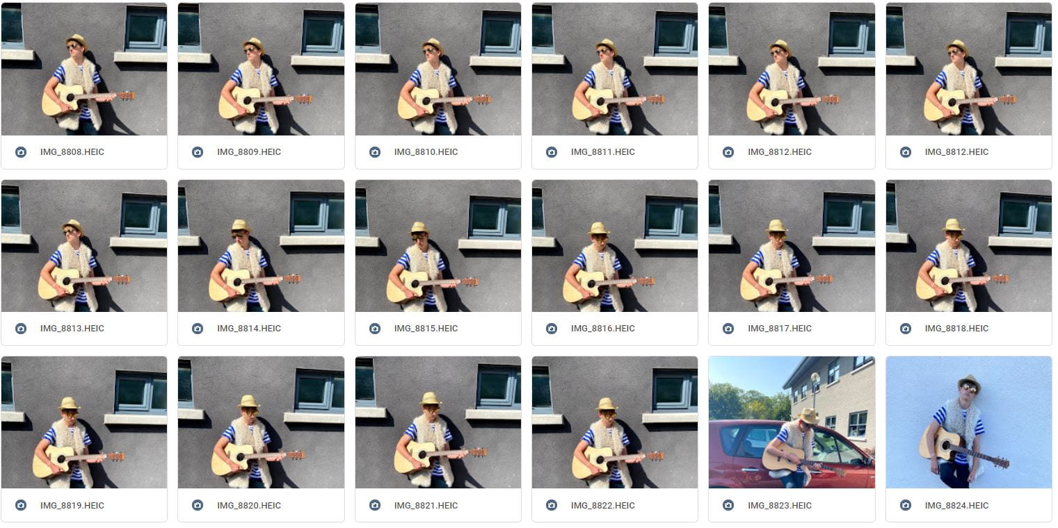
I can tell a story with a camera. In this task we were in a group and had to take at least 50 photos using different angles, framing and distance to tell a story. We used a mixture of low, high, long and wide angles. We also used a DSLR camera which I believed helped a lot as it captured detail which is useful when telling a story.
Our aim with the extremely long shots on the field was to show how the model was in such a large area of land but was so isolated and lonely. We also made the model have a straight/relaxed face so that the audience could interpret how the model is feeling. With the two shots we wanted to have the audience question what is happening and what is the relationship between the two models. For example the high angle on the stairs the models are both looking at the camera and aren’t showing a connection so it makes the audience question whether these are strangers or whether they know each other.
Overall what I have learnt from this task is that when taking a photo you have to consider the angle it is taken at and the distance the photographer is from the model in order to tell a story to the audience. I have also learnt that mise-en-scene and camera skills together can be even more effective when telling a story.
This my mood board for my groups tour poster. Using mise-en-scene we added all the aspects of folk music for example, make-up, hair, location, costume, instruments etc. What I have learnt is that when making a piece of media for a certain music genre you need to consider all the different aspects that make up the genre so that the piece of media can be at it’s full potential to attract a wide audience. I am hoping this will help me when making more media pieces in the future as I now know all the different aspects you need to attract the right audience and produce a successful piece.
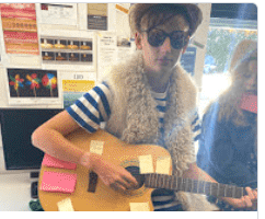
Today we did a photo shoot where we had to dress a model in a music genre that was randomly allocated to each group. My group got the genre Folk. We were able to use the best costume, pose, colour for folk due to our mood board helping us. After taking our photos we had members of the class put a word on a post it that they thought described our model well. Some of the words were laid back and quiet. I believe these words are quite accurate towards the folk genre and to the model. I think this task was successful because the audience understood that the model was folk a described him accurately. Overall what I have learnt from this task is that when creating any type of media based on a music genre you need to consider all the aspects of mise-en-scene to make a piece of media that will attract a certain audience.
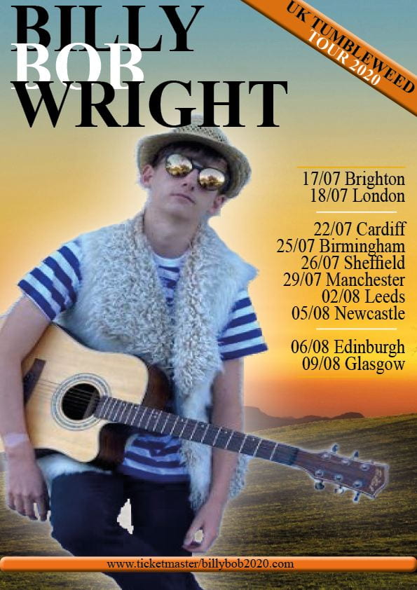
This is my Final photo for the tour poster task. I have chosen this picture as I think the framing and overall colours and tones are really good and match the folk genre well. I also like how the photo is taken at a low angle which I believe helps the audience to interpret a story of what the artist is feeling.
Overall what I have learnt about mise-en-scene is that it is very important to incorporate when creating a piece of media. I believe it helps attract a larger audience as it is focusing on all the things the audience is looking for (costume, body language etc.) When creating any piece of media I will now use mise-en-scene.
For this task we had to analyse a tour poster of our choice. I chose Drakes Club Paradise Tour. When analyzing this poster I looked at body language, color, fonts and costume, and when looking at the denotations I made sure to have helpful connotations with them. When choosing what poster I was going to chose out of the different options I realized that they were all very different in different areas which helped me learn how important it is to target the right audience when making a piece of media.
After looking at the poster and analyzing it it has made me realize that when making a piece of media, in this case a tour poster or music magazine it has helped me to know that when making a piece of media like this you need to focus on which audience you are trying to target and use certain fonts, colors etc. that will attract them and help the media become more successful.