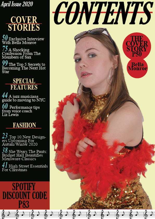
This is my second draft of my contents page. I have made changes by adding jazz graphics at the bottom of the page, I have also cut out the model in order to place her on the contents page and add a coloured background. To improve my contents page I think I need to add a bigger variety of colours to the colour scheme as at the moment it is quite muted and dull mainly just using black, red and a pastel yellow. I also need to edit the model more on photo shop as you can tell she has been cute out and I need to edit things such as blemishes and brighten her eyes. I will also add effects to the text to make it look more noticeable to the reader.
(click on image to see bigger)
My Targets:
- Add more effects to text.
- Photoshop the model more and add effects to her face.
- Add more colours to the page – less reds and yellows.
- Possibly try a different layout.
- Try different fonts to fit the genre better.
- typos and punctuation and grammar check
- less on fashion and more on music/jazz in terms of coverlines
- Cover stories as a sub heading? Why not regulars, indepth, features?
- Find the jazz colour palette and the fonts from that era to add that vintage zing.
