January 18

Article Idea Development

I am going to be talking about my star duo, as I have got some images that I believe are easy to talk about. An important factor in this article is that the audience are intrigued by the article and will want to know more than the basis of my story. Things that are currently trending are hip hops artists such as: Khaled, Drake, Justin Bieber. My article will start with a simple intro from the interviewer explaining what is going on. one of my images is of the duo at a local cafe this hook will allow me to go into depth on the stuff they are doing in Guernsey.

January 15

So… Hows Is It Going?

When creating my double page spread, I considered all aspects from my front cover page and contents page and tried to relate the page to both other magazine pages. This page for me was about incorporating ideas from my other pages to create a unique and edgy spread.

Throughout the whole magazine you need similarities and differences, hence why I included a faded shape behind to text to give the audience something to recognise, I have also used the same font throughout the entire pages for the masthead as using to many different fonts can be disorientating to the viewers.  moreover I have also learnt that the use of Mise-En-Scene used within images are crucial to attracting an audience, whether it is, props, colour and lighting or costume. all these factors contribute to making your magazine as distinctive as possible.

January 14

Language Analysis

This is my language analysis of ‘The Beat’ magazine. We have done this  as a way to gain a better idea when coming to create our music magazines, therefore analysing the article is enabling me to see what sort of features I will need to add in my music magazine to attract a certain audience and achieve the best I can. We analyse magazine covers as a way to identify the features we need to maximise the full potential of our magazine covers. Analysing magazines only benefits our understanding that allows us to use conventions from other magazines.

January 11

My Work In Progress

Here is currently how my Front cover, contents page and double page spread look. My biggest flaw as of yet is that my images on my front cover are not mine and need to go out and get more images to replace the current ones, I am also contemplating changing the background colour as I am not grasped by its colour in comparison to the text, moreover I most definitely altering the colour of my plugs, pugs and insets and it is not as eye catching as I once thought.

I am most impressed with my contents page and thoroughly enjoyed making it, the simplicity of the page drives the viewers eyes to the most important feature, the text. I did have thoughts about adding in another plug or pug however believe it would disrupt the eyes of the viewer and distort my page.

Finally within my double page spread I decided to incorporate shapes under the text for two reasons:

  1. to make it easier to read for the audience
  2. as it gives the page a sense of exuberance.

I also altered the colours of the heading so that the colours would link in with the image.

January 11

Design Skills 2

One thing I have learnt whilst creating my double page spread was how to change the colour of words in the same text box. Furthermore I then learnt how to arrange my text and shapes so that my text was in front of my shapes. although I have not gained many new skills in InDesign I have furthered my abilities within the areas I already knew how to use, for example creating borders around my images and laying out my images and text to leave little space. 

In Photoshop I didn’t gain any new skills as I used what I knew to cut out my image, this was using the magic wand tool and the eraser tool, it took time and effort as the background was quite complicated however I powered through it and came out on top, therefore we could say I have gained more experience using tools I already knew how to use, this will only improve future assignments as I am getting better each time I use the software.

this is the steps to putting a border around a shape.

January 11

A New Improved Double Page Spread

The first thing I altered on my double page spread was the title name, it was originally ‘Double Page Spread’ I changed it to ‘Girls On Tour’ to give it a sense of realism and to give the audience some specification of whats happening. Furthermore I then decided to add in some shapes with low opacity and layered them behind the text columns to make it easier to read, in addition to that I then changed the captioned image to an image more relevant to the article. It appeared that there was still too much space on the left page so I decided to enlarge my main star image as it as too small.

January 9

Draft 3 – The Double Page Spread

From this task I now have a vague idea of how I want my double page spread to look, hence why I have included columns with fake text and wrong images to show how it should look. From this i have been given peer feedback on how well I have done.

  • Describe the images of the star using adjectives – american, edgy, swag, hip, powerful, domineering, vibrant, cool
  • Which cover lines tempt the audience to read on and which ones stand out and why? the cover lines colour is clever as it links in with the american flag, it also stands out and takes up the correct amount of space. Although the name of the coverline should not be ‘Double page spread’
  • How do the cover lines reflect a music magazine? If they don’t, which ones need to be adapted? The coverline colour is reasonable however the actual text it’s self is completely wrong and should be altered.
  • What aspects do you consider conventional or unconventional? The page is rather conventional and contain a good range of text columns, images and captions. I am intrigued by the layout of your text columns.
  • Does the language and register in the headline create enough interest for the reader to commit to reading the copy? Yet again once you have changed the name of your cover I will be able to decide, although colour wise it will attract an audience.
  • Is the layout considering where the fold will be in the DPS? As of now it is not fully clear where the fold in your double page spread would be.
  • Does the image create enough visual intrigue for the reader to stop turning the page and read more? I think the american flag image is intriguing however i’m not captured by the captioned image.

Targets for improvement: 

Firstly I will be changing the coverline to a better suited name as it is completely wrong, moreover I will then change the captioned image as I have previously used the image. Next I will change the text in the columns to something appropriate. I then may consider adding in some other conventional feature to take up the space.

December 18

Design Skills 1

One thing I have learnt from designing my: Front cover and Contents page is how to alter the opacity of a shape, this enabled be to blend it in with the contents page to give it a distinctive look. I have also had problems with my front cover as my star was wearing glasses, so I had to use the clone stamp tool to blend in the glasses lens so the audience can’t see the background. This gave me the ability to use the clone stamp tool efficiently.

I also learnt how to edit my initial photo of Photoshop, this allowed me to edit the star onto different backgrounds and make it look more hip hop. To do this I had to use the eraser tool and the magic wand tool to successfully get a well rounded cropped star.

moreover I learnt how to resize an image in a way that does not stretch or disrupt the image, you do this by holding in shift when resizing the image.

Furthermore I learnt how to layer images and texts over each other to create an outstanding magazine. You do this by arranging your images and texts corresponding to the way you want it to look.


December 18

A New Improved Contents Page

This is my new and improved contents page, I had been given some peer feedback from some students in the class and here’s what I have altered:

  • I changed some of the fonts for my text as the page looked bland and simple, I have now included the ‘Funsized’ font to make the page look more exuberant.
  • I have also changed the colour differentiation of the page in order to get more approval and awareness for my page.
  • finally I added in the captions below my subheadings to finalise my page.
December 10

Draft 2 – The Contents Page

In addition to my front cover, I have now moved onto designing my contents page. In order to provide a distinctive and unique magazine I had to ensure that my pages were linked through the use of Mise-En-Scene. One of the main factors contributing to the linking of my pages is text, ultimately the use of using the same font gives the magazine a sense of sophistication.

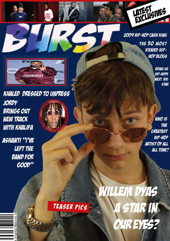
Notably, when designing this cover I had issues in deciding what image I should of used, this was due to taking many photos and liking more than one, I resolved this by gathering some primary research and got people to choose their favorite image and I then picked the image in my contents page from that. I haven’t included any: insets, plugs or pugs, in addition to the fact that it would disturb the viewers eyes away from my central image, however I have included: a main star image, page numbers, the typical ‘features’ text and a masthead.

Moreover, I have gathered some feedback from Alex Tapp:

Describe the images of the stars using adjectives:

  •  quirky, edgy, youth, unique, impassive, eccentric and apathetic

Which cover lines tempt the audience to read and which ones stand out and why?

  • The masthead ‘contents’ and the overlapping date is rather exuberant and astounding. The right hand side fade with the text in front is clever and authentic.

How do the cover lines reflect a music magazine? If they don’t, which ones need to be adapted?

  • The term ‘features’ is associated with magazines and gives the page a sense of realism. noticeably the page does not embrace in many cover lines and mainly focuses on the image to tell a story.

Which areas, aspects have distracting areas of integration of copy and images? 

  • As a result of not including many images or texts the page doesn’t look distracting or misleading, nevertheless it does look bland and tedious.

What aspects do you consider conventional or unconventional? (page numbers, inserts, captions, catchy cover lines) 

  • The use of the text on the top left of the page is conventional to the magazine style, moreover so is the layout of the numerals and text on the right side going down the page. you could also vary in the fonts you use to make the page look more exciting

Targets For Development?

For my next draft I will consider adding in more cover lines and try and make the page not look so dull and bland. furthermore I will change some of the fonts so that the page doesn’t look boring. Lastly I will add in the captions underneath the page number and headings to finalize my cover.