All posts by chloemclaughlin
Draft 6
These are the final pages of my magazine. I sat down with my teacher and she gave me one-to-one feedback about what final things I could improve on and the final little tweaks that would make my magazine great.

Things to improve;
- Move the plug are to make sure it is in the correct place as it look a bit odd and out of place.
- Sort out the box at the bottom as the writing is coming off a bit, maybe make it smaller.
- Make the Ariana Grande poster less bare and plain.
- Change all of the ‘and’ to ‘&’.

Targets to improve;
- Add something at the bottom of Emilia’s legs to fill the space.
- Make the spaces between the lines clearer as some of them look a bit off.
- Make the plug more interesting, maybe add a boarder?
Targets to improve;
- Make the quotations more interesting as they look rather plain.
- Make ‘2018’ in the masthead more vibrant.
- Change the colour of ‘simply’ in my masthead to make it match my other pages.
- Add the blue lines around the yellow box to make a boarder.

Advert
Now that I have created all 3 pages of my magazine, I think it would be in my interest to add a few adverts to fill some pages and to make sure that my audience demographic is achieved.
Draft 5
Below are my three pages that I believe to be my final ones. I may need to change some of them slightly but nothing major. I have left these pages here so that a fellow media student can give me some feedback which will be my final improvement.

Holly said that she likes the MES of my front cover because it shows off the personality of the artist that I am trying to portray. She said that my artist has a natural but bold statement in the MES.
To improve, Holly said that I should add a bold lip to my model in photoshop to add to the vibrant colours than run through my magazine. She also said to make sure that the writing in the plug is fully in the circle.

Holly said that dressing the models in all black implies that they have a sense of fierceness about them and confidence. Her slick back pony adds a sense of maturity to the page as some people may think that pop magazines are for the younger audience.
She said that I should add some colour to Allan’s t-shirt as my magazine is includes vibrant colours and the white t-shirt doesn’t really suit the MES. Holly said to put my page numbers on the right hand side as it would allow my magazine to flow better and be more conventional.

Holly said that the varied hairstyles on my model show a differentiation within my magazine and perhaps leads onto a differentiation within the artist and her music.
To improve, Holly said that I should set my paragraph settings to make them straight on both sides as it will make the article look slightly better. She said that I should make the writing in the yellow box smaller so that the box itself looks neater. She also said to make my title in the yellow box smaller as it looks quite squished right now.
Below is the embedded document that Holly wrote on with more comments and feedback that she gave me on the 3 pages of my music magazine.
Feedback on article
This is the article that I will soon be drafting and incorporating into my double page spread. My article is about my cover star who is a new artist in the industry and it demonstrates a Q&A format. I decided to add in some screenshots of tweets that people had sent in to make the article a bit more interesting and the Q&A a bit more realistic.
Peer voice memo
Below is a voice memo of my sister reading over my article with feedback at the end. It’s a good idea to get somebody else to read over your article before you submit it to make sure that it reads well and that you haven’t missed any spelling or punctuation mistakes.
Targets
Overall they liked my article but they did give a few tips and targets that I could improve on in order to allow my article to read as well as it can.
- Make the first sentence small and add more punctuation because there are no pauses.
- Take out the ‘I owe it all to him’ when talking about her Grandad because it kind of says that in the rest of the paragraph and I am repeating it.
- Take out the ‘haha’ when talking about the NYR because journalists wouldn’t say that they would put brackets and say (laughs). Make ‘OMG’ actually read ‘Oh My God’ because not a lot of people would normally say ‘OMG’ now a days.
Article idea development
Before creating the article for my DPS, I decided to create a plan for the type of things that I would put in it.
My article will be based on Dani who is my cover star and a life update for her audience. My article will feature a Q&A based format because I think that this type of format will fit my audience demographic.
Draft 4- Feedback and targets
Mrs Cobb looked through all 3 pages of my music magazine and created a screen castify that included the tips and targets that she thought would make my magazine reach the potential that it deserves.
Front cover;
- More block writing like the one in the top right hand corner.
- Make the bottom banner bigger and bolder like the one in the corner.
- Jazz up the background more to make it less plain.
- Make ‘Simply pop’ bigger.
- Make the writing inside the pug more center in the circle.
- Move the pug.
- Move the big cover line away from Dani’s face. Change sizing of the cover lines to make them look better.
- Put more cover lines on her shoulder.
- Change the spelling of Beiber.
Contents page;
- Jazz up the background more to make it less plain.
- Make Emilia bigger.
- Make contents smaller.
- Make ‘simply pop’ the same as on the front cover.
- Put a page number on the bottom of the page.
- Sort out the cover lines as they look messy.
- Add a block of color.
- Bring white into it.
Double page spread;
- Bring page numbers down.
- Who is the article by?
- Make facts about Dani more interesting. E.g. color and boarders.
- Articles need to finish at the same place.
- Put quote by her face on the right.
- Change font of headline.
- Add stand fist.
- Keep spaces between paragraphs.
- Cut her hair out better in the right photo.
Language Analysis
Now that I have completed all 3 pages of my music magazine to the best of my ability, I am able to start thinking about the article that will be on the double page spread. In order to do this article to the best of my ability, I will need to do some research. Below I will be analyzing an article that I have chosen from a select few.
The article that I will be analyzing is; Cash for questions. This month; ALT-J (11th July 2018) Paul Stokes.
I like the Q&A format of this article because I think that it will attract a younger kind of audience which is exactly what my target audience is so this is the reason that the article initially attracted me. I think that the Q&A format of this article will initially grip the readers because it gives them a chance to delve into the personal lives of the celebrities that the article is about. It begins to connect the audience with the celebrities on a personal level which will attract readers as they will believe that they know more about the celebrity than other people. As well as the article having an influence on the audience, it could also have an influence on future interviewees because they could read the article and the journalists personal touch will also be portrayed. For example, they may either ask an inappropriate question or a funny question and using this kind of format will allow the future interviewees to recognize weather it would be worth giving them information or not.
The journalist seemed very open and honest about the type of questions that she was asking ALT-J and in the article I think her personality came through with the type of questions that she was asking. The journalist has written the article in 1st person and I can tell this because she addresses the band and ‘you’ instead of ‘ALT-J’. The journalist has a sense of ‘keeping tabs’ on ALT-J because in one of her questions shes states that she heard about something that they had done in an interview prior to that one.
The language used in this article is simple and I’m not shocked by this because the audience demographic for the magazine is quite young and young people won’t be able to understand long and hard words. However, the magazine does use strong language such as ‘shitty’ when asked about their nerdy reputation and being naughty in school.
The journalist represents the band as genuine but also a bit cheeky because one of the band members tells us how he used to cheat in school when asked a question. The band are represented as quite modest in the sense that they say that they can often walk through large crowds and not get spotted. The journalist also represents the band as though they have a sense of humour because when asked a question about a previous interview, they responded to this by giving reference to Willy Wonka, which could adhere to some people’s sense of humour.


My work in progress
I have decided to edit and adapt all 3 of my pages for my magazine for the final time and when I have finished they will be my final product. This is because I want all 3 of my pages to look exactly how I want them to and how I had originally envisioned them to. Below is my improved front cover, contents page and double page spread along with what I have changed about them and why.

This is the final version of my front cover and I am very happy with it because I feel like I have got my genre across in the correct light.
The things that I have changed are;
- Added some more color to the cover lines and the plug at the top.
- Made the box at the bottom bigger, which then meant that I had to move the barcode and the price higher.
- Made the ‘top 10 styles’ bigger so that it was easier to read and had more effect.
- Added the Ariana grande poster bit to fill some empty space in the top right hand corner.
- Changed the simply in the masthead to white instead of red so that it went better wit the other colors and the background.
- Made my star image bigger to fill more of the space and make her more central.

This is my improved contents page which I am happy with because I like the style and the MES of my model.
The things that I have changed are;
- I added a plug to attract more attention towards my magazine.
- I made the number pages bigger than the cover lines to add definition to them and make them stand out.
- I added dots either side of my ‘contents’ to make it more bold.
- I added a small logo of my magazine which I got from the masthead from my front cover.
- I changed the shade of pink to make it match my front cover and make them work together a bit more.
- I changed some of the cover lines to make them more about music and my genre.

- Click on the image for a clearer version.
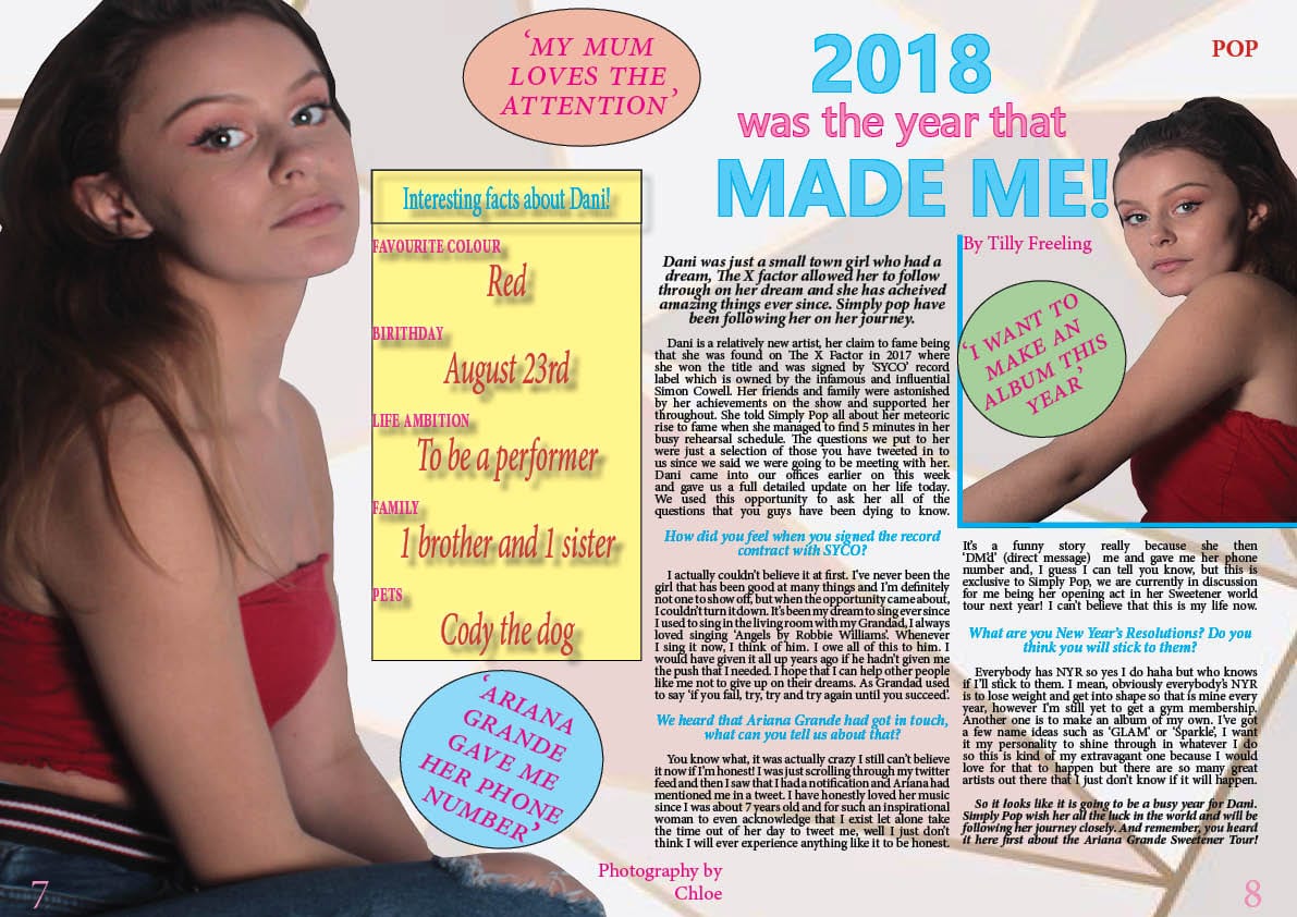
This is the improved draft of my double page spread and this is my favorite page of my magazine because I love the background and the layout of it.
The things that I have changed are;
- Changed the background to something more interesting.
- Changed the cover star because I wanted to cut it out better but I no longer had the same image so it needed changing, but I am happier with the image that I have chosen.
- Changed the heading because I didn’t have a photo of a man and the headline was a love story.
- Added the interesting facts and the boarder around it.
- Added another insert to make sure that my magazine fitted the brief of having 4 images that I had taken.
- Changed the font of the headline so that it fitted better with the rest of the page.
- Added who the photograph was by.
- Added the page numbers.
So…How is it going?
My genre for my music magazine is pop and through my front cover, contents page and double page spread I think that I have conveyed my genre in the way that I wanted to. I think that I have portrayed my genre in the correct light through the MES of my model and the imaged that I have taken.
So far, I am happy with the way that both my front cover and contents page have turned out, however I found it a lot harder to do than I originally thought because although I took 100s of images, I found it difficult to chose the right ones for both pages of my magazine.
The skills that I have learnt have helped me with my magazine because they have given me the opportunity to make my magazine look as professional as possible. They have allowed me to personalise every inch of my magazine to exactly how I wanted it.
The skills that I have learnt along the way while in the process of creating my magazine, I can take on to my future and where ever I go, even if it is not to do with media studies as the skills that I have learnt are transferable to more or less everything. E.g. time management, creativity, giving and receiving feedback.