Please click image to see the linked PDF
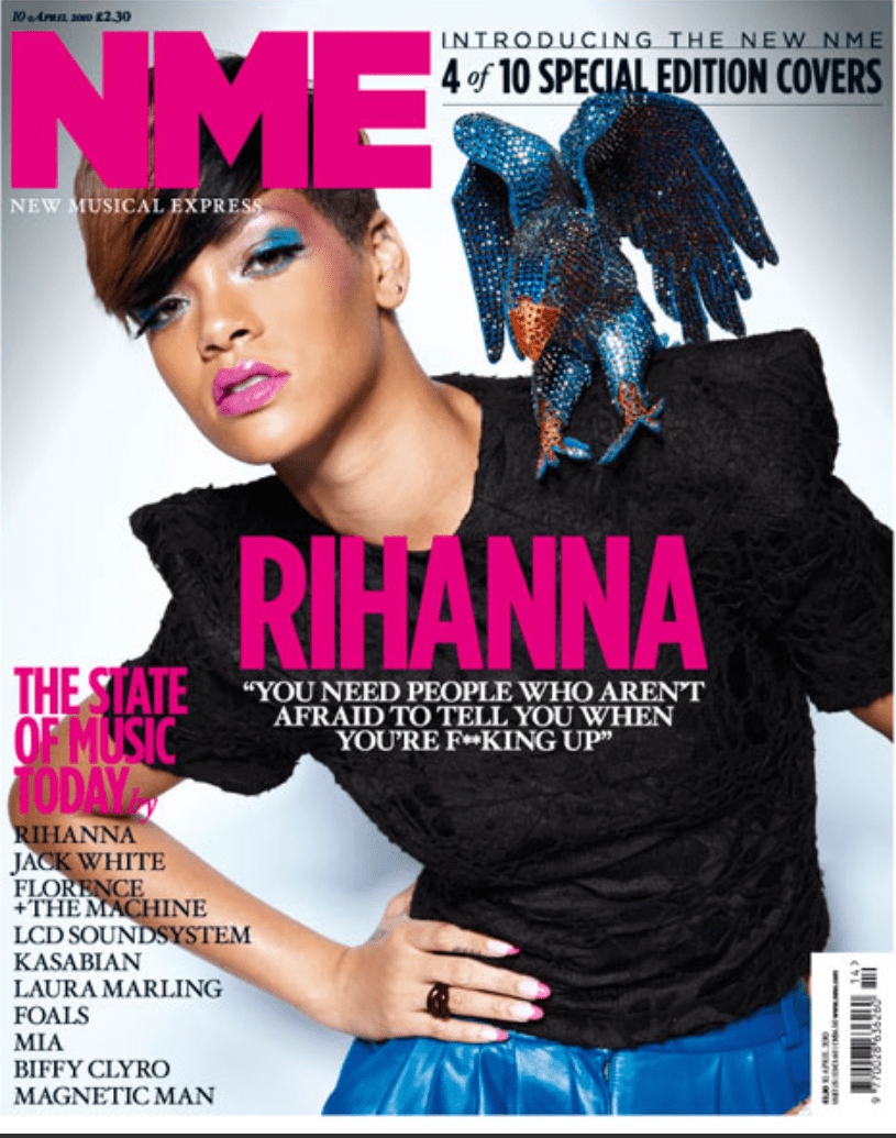
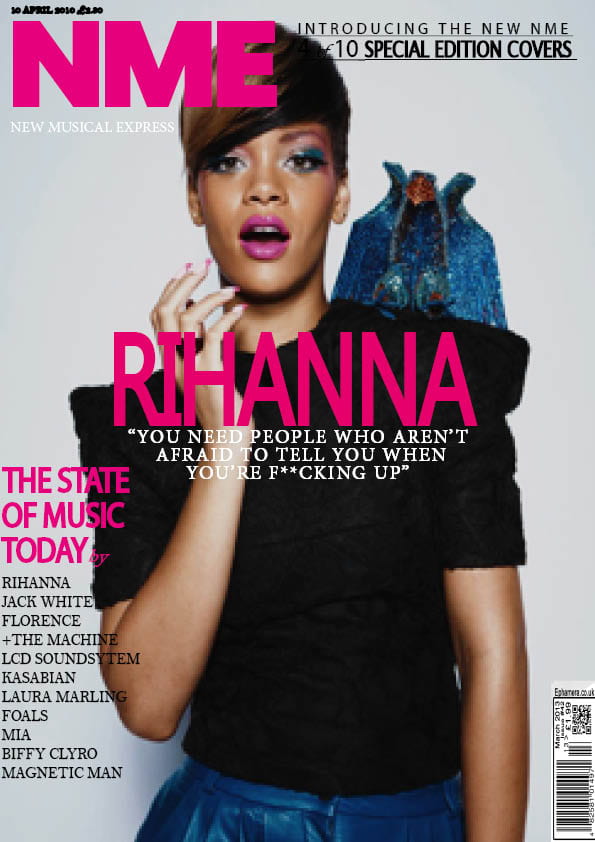
In this task I learned how to use Adobe Indesign to make a mock up of a published magazine cover. The basic skills that I learnt to was the use of gradients, background colours as well as adding text and images and how those images can be edited in a specific way to get the image desired. The task was to pick from a variety of magazine covers and try to recreate them as accurately as possible, I chose this NME Rihanna cover because there are varieties of fonts and colours which I thought would be useful practice. Another reason I chose this magazine cover was because I could identify the demographics and psychographics of the cover. I made the assumption that the cover would mainly appeal to women as the masthead and most of the captions are in pink, which is a stereotypical colour to appeal women.
Overall, this task will be one of the most significantly important in the creation of my music magazine, this is because this software will be used a lot fun the creation of mu music magazine and this introduction gave me the basics and a simple understanding of how to make an effective cover, this is because I now know how to edit fonts, move images to the desired place and make gradients which will all be used in the creation of my music magazine.
My Reflection:
Overall, I believe I carried pit this task very well and applied my skills very well however there are a few things that I think this cover could be improved on…
- Firstly, “the state of music today” caption, think the the font could have. been closer together and not as spaced out.
- Secondly, although the fonts are accurate I believe that they could be more accurate as they do not hold the same effectiveness as the original
- Finally, in the top right hand corner I think this type could be improved as I could not get the stroke on the font as accurate to the original, the line is also crooked as it would not lay straight due to the type of front and I did not know how to fix this, however with research I am sure I could learn how to do this.
However, here is what I believe I did well in regards to the similarity of the magazine covers…
- The Masthead is very accurate
- The caption that contained all different artists is almost identical in font, letter sizing and spacing
- The caption underneath “RIHANNA” is almost identical.
Finally, I have researched and found some videos about things I struggled with on InDesign, this should give me some more experience on how to get the best out of the programme.