Category Archives: Component 1

Draft of contents page

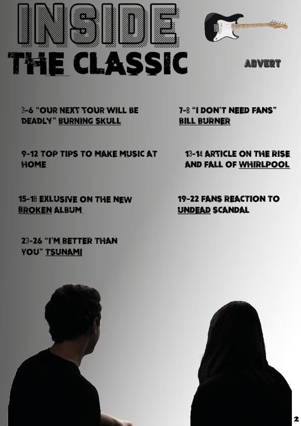
This is my my first draft of my contents page. They key conventions of a contents page are:

  • Editors hello
  • Page numbers
  • Hyperbole and superlatives in headlines
  • Images and word clues
  • Graphic illustrations and designs
  • Reminder of magazines name and mission statements

I think for a first draft is is good and it has some key features of a contents page. It has a:

  • Title explaining what sort of page it is
  • A cut out image
  • A good list of pages with real sounding articles
  • An extra feature which is an advert

There are some things missing however and also some thing I don’t like. Firstly I think it doesn’t really fit in with my genre and I want it recognisable as part of my genre and part of my magazine at a first glance, which it isn’t.  Another thing is the layout I wish I spent a little bit more time on the layout just to make it look cleaner and more professional. 

Overall I am fairly happy with this as a first draft but there are a number of things I want to improve in the second draft. 

A new improved DPS


On the top is my first draft of my DPS and on the bottom is my second draft. I made some clear changes but first the things I wanted to change were:

  1. My image as many people had said that it was too dark and you could see the models well, and also there was too much focus on the window instead of the models.
  2. The font needed some work to make sure it was clear
  3. I wanted to change the layout to fit the new photo
  4. Finally I needed to add some page numbers

I managed to achieve these things and in my opinion my new draft looks much cleaner and more professional. Although once again I am using placeholder text I think you can clearly understand what it would look like when the real article has been put in. 

A new and improved feature article

This is my old feature article draft compared to my new feature article.

This is my first draft of my article above.

This my newest draft of my feature article and it includes all the changes that I have made off the back of the feedback I received from my teacher. The changes I have made are:

  • Added context
  • Fixed errors i.e. capitol letter, punctuation and grammar etc.
  • Linked to band members
  • Added more information about artist for example why they are doing the interview in the first place.

I hope these improvement make the reader experience much better as I hope I have fixed the flow of the article, and hopefully it makes more sense and has more context.  One final thing I hope is that it much less brief and therefore if it was a real product it would be worth a buy from a customer.

I think there are possible a few extra things I could change to improve this in a later draft but on the whole I am happy with this version and think it could fit into my magazine well.

Feedback & reflection on draft DPS

I got my friend Lewis have a look at my draft above. He pointed out a few things:

  • The image might be too dark
  • You cant see the models
  • No page numbers
  • The images focuses too much on the window
  • weight the font less

He also said some positive things like:

  • He likes the font
  • He also like the colour scheme and font size
  • The layout are also good

After the feedback I have set myself some things to change in my second draft. I will add pages numbers,  I will also play around with font , I will change the the image to one that still fits my genre but makes the DPS much better and clearer and finally I will possibly change the page layout.

Draft Of Double Page Spread

The key conventions of a double page spread are:

  • An image
  • A stand first
  • Drop capitols
  • Quotes
  • Headline
  • A by line
  • Columns with equal guttering
  • Page numbers
  • Questions

This is my first draft of my double page spread. Although it is only filled with filler text at the moment it does still have some key features that you would expect on a double page spread article. Firstly it has a large image that not only covers the whole page but also has a dark area which has allowed me to write over the image but not cover any important part of the image. Also another feature I have is the drop capitol letter at the start of my article even though it is filler text.I also want to keep it very simple and don’t want to cover  the whole of the two  pages in text.

Just to recap the things I like about this draft are:

  • The dark edges that provide a great area for text
  • I also like the fairly simple look of the DPS and I like how it isn’t overpowered by text
  • Finally I like how the image is very mystical and the more you look at it the more you see, for example if you actually look through the window you see a graveyard and the bands name is ‘The Grave Diggers’

I like the dark edges of the image and it provides a great area for text there are some problems with the image I have used they are:

  • The images is dominated by the window that is the only source of light and so it can make the two models less visible
  • The positioning of the two models can also make them less visible and so they are not as centre stage as I would like.


Draft Feature Article

This is my draft feature article. I have read through it and I found some mistakes myself but I have not created a voice memo. Although it reads well and is overall a good article I made a number of mistakes which made the flow of the article not make sense and I also made some capitol letter and punctuation mistakes.

My teacher gave me feedback and these are the things I need to correct and change:

  • Correct stars over censored words
  • Add more context
  • Is quite brief so needs a bit more
  • Swap order and put the bio before the tips
  • Fix caps
  • Needs intro/ change order
  • Make it clear which band member is saying the tips.


Location Shoot Contact Sheet

These are the images I got from my location shoot. Over all I think I did a good job and got lots of images that can be used in my magazine. I think the best ones are probably the the shots that I got both models in and the lighting was  quite dark which fitted the genre well. I also  got some ones which looked very symmetrical and so  which in my opinion works very nicely.

I did however get so which don’t work. Some of the shots I got didn’t quite have the right background and lighting which made them very poor images for a magazine. I also got some shots where I should have directed the models more to try and get them doing a pose that I wanted which would have created a better image.


Language analysis

This is a document I made on an article and interview on Jams Levelle.  I go through some of the quotes that were said and why the writer may have put them in to show what the artist was like. I also talk about how  writers in general create intros and biography about people. This will be useful to me because  I can use this document to construct my own article. I can also use the quotes as inspiration for my article.

Article idea development

I used an article on James Lavelle to get most of my ideas for the article for my music magazine. I learned that the quotes I will have to think of will have to be extreme to fit my genre. Quotes that I could use could be about drugs or partying because that is the sort of extreme thing a ‘rockstar’ would probably talk about. The document below gives a more detailed breakdown on the article and also has some info on some general things in most music magazine articles.

When it comes to the more technical aspects of the article there are a few things I noticed with this. The writer or editor of this article would only pick out the best quotes or bits of information that they get. This is to give relevant information that the reader is interested about and also keep them engaged and keeps them reading, so it gives info but doesn’t waffle and only gives the audience the interesting bits. In conclusion it keep the information concise and short enough to keep the reader interested.

Production meeting agenda for 2nd photo shoot and risk assessment

Below is  my plan for my location photo shoot.  It includes all the details needed such as location and time, as well as what models from my class. It also includes what props and costumes I would want the models to wear. Pretty much it was my responsibility to gather the extra props and the models had the responsibility of their outfits and at the very least they should wear dark or black clothing because that could still fit my genre of rock.

The locations I had to choose from were the Priaulx Library, Candie gardens  and  possibly a nearby graveyard if it was possible. I chose the Priaulx library because many parts of the building were dark and old which can fit my genre very well and I would be able to work in different levels of light to get lots of interesting photos.


This is my risk assessment for my location shoot.