Category Archives: Component 1

Design Skills 1

I learned a few important skills in the making of these two magazine covers. Firstly I improved my photoshop and indesign skills because I learned on the job while I improved my magazine cover from its first to second draft, this will help me in the future because I will use the skills I learned to make better pieces of work the first time around.

On photoshop I learned to use these tools better:

  • spot healing tool which helped me fix some of the cutting out errors and help cover overall errors
  • History brush allowed me to fix errors
  • The magic wand tool allowed me to cut my model well

On indesign I learned to use these tools and techniques better:

  • Gradient swatch and gradient feather these tools allowed me to get a background I liked
  • All the shape frames allowed me to add images and text in the right area and shape the text how I wanted
  • Adding colours and using the pencil and eraser tool allowed me to add colours and extra detail where I wanted it

What impact did using these tools have on  my end product?

Using these tools allowed me to create a far better and more professional product.

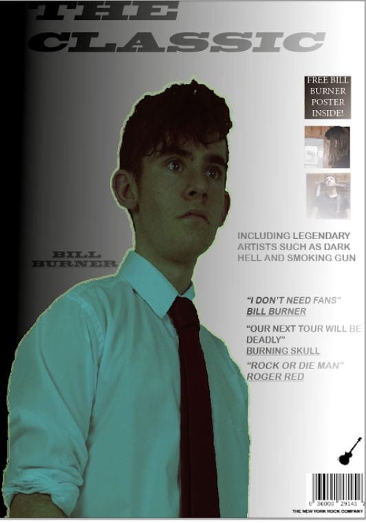
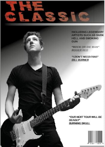
When I went from  my first draft of my front cover to my second draft I had to cut out a far more challenging image to cut out so I learned to use this tool and a few others  to cut out images much better and made my image much cleaner on the second draft.

This is another tool I used on both drafts. This  tool I used when I was on indesign and I used it to create my backgrounds.  On my second draft however I made a much cleaner and more professional looking background and I think that using what I have learned making my second draft I can create a much better third draft.


New and Improved front Page

This is my new and improved front page. I think that it is still not perfect but us a vast improvement to my music magazine cover. I would firstly like to talk about the changes I made.


  • I changed the font for the main title. This was because the old font wasn’t working and I needed a fresh masthead. I also changed the colour and it is the only part of the page in colour which makes it stand out even more.
  • The next change was the image. I used an image from the location shoot because I believe I took some that would be perfect for a solo shot on a front page, I also think this particular image works well for the style and genre.
  • Next was the layout of the page. Although it isn’t drastically different to my original page I think the new layout and simplicity looks much better and overall much more professional.
  • Finally the main bulk of text has not changed much but I did make sure it was clear and simple which it is and I also think it does look fairly professional.

All together I think that this draft was much better than my first draft but I still think improvements can be made and I hopefully can create a much better third draft.


Draft Of Front Page

This is my first draft of my music magazine first page.I asked my friend what he thought and these are the points he told me to think about:

  • Create a more professional looking background as it is quite basic and bland looking.
  • Some of the photos and information are too block like and I need to make them blend in with the page better.
  • Make sure the text is readable as some of the fonts and size of text makes some thing harder to read.
  • The image outline isn’t the best and probably will need changing to look more professional.

What I definitely want to change is the main image colour and background. I also want to change how the smaller images fit into the page and make them look less block like. Finally another thing I want to change is the background so all text is clear and it works well with the image.

Location shoot evaluation

For the location went on a day long shoot at a place called the priaulx  library, around Candie gardens and some people went to a place called St James. Every area had an old feeling to it which helped create good scenes and helped us with mise en scene. For my shoot I took picture of my models on the inside of the priaulx library. I needed to get dark and old backgrounds so used the old books and bookshelves in many of my shots as well as the dimly lit attic.

What went well?

I think the overall feel of the shots worked well with my genre and I created some good mise en scene with the combination of shots and costumes.  I also think I created some quality images that had the right amount of lighting and were clear and crisp.

What didn’t go so well?

I think that although I wanted some dark shots, some were too dark and might be unusable for the finished magazine. I also think I could have directed the models better to try and get a shot that I wanted to create.


This image has a strong chance of being in my magazine  because of the good pose the model is in as well as the lighting on his face.This image has a good chance of being in my magazine because I like how the models are opposite each other to the side of the shot and you can clearly see what they are seeing. This image has a good chance of making it in my magazine because of the good pose the models are in and I like the positioning of the models in the centre of the frame.

This image has a good chance of making in my magazine because it has good lighting and I like how the guitar is on the edge of the shot which tells a little bit of a story in the image.

FIRST SHOOT CONTACT SHEET


After my first photo shoot  I had close to 100 photos but these 5 were probably the best.The reason these are the best are because they are clear and in focus, they have good lighting which makes the star much clearer and the shots, angles and poses fit the genre and fit in well with the research I have done for the magazine.  However I will be doing a second shoot to add to the costume and makeup as this is quite bare. My aim was to make the model look cool and have a plain face with not much expression because this matches the genre. I think I did this well and plan to stick with that in the second shoot.

Mast Head Designs.

When creating my mast head design I wanted to created dark but creative designs. Every single mast head I have created is black with a few of them having a fading affect on them which makes them slightly grey. I think these shades fit well with the genre and I also think they wouldn’t look out of place on a real music magazine.

All of the 5 mastheads use the Blackoak std font. The first masthead   I made I created it by:

  • Playing around with fonts until I found one I liked
  •  I changed the boldness, letter spacing and letter slanting
  • Used a fading effect
  • I finally added a lighting bolt

The second font is very similar to the first one. Firstly I:

  • Created a simplified version of the first
  • I used the same font and size Title
  • I didn’t add an underline
  • I removed the fading effect
  • I  did however keep the lighting bolt


I created the middle masthead by:

  • Taking the previous design and removing the lightning bolt
  • I moved the word ‘the’ to the top centre of the masthead
  • I slanted the title much more than the others
  • I added a cartoon guitar and moved it into a position where it was floating but almost leaning on the title

This masthead is probably my favourite out of the the 5 I created.

I created the fourth masthead by:

  • Used the design of the second mast head but took away the lightning bolt
  • I spaced the letter and position of the words
  • Added a fading affect
  • Underlined it
  • Left it fairly simple

I created my last design by:

  • Creating a plain black design with the same font as before
  • I kept it simple with no underline or fade effect
  • Removed the ‘A’ and replaced it with a cartoon skull this was to be eye catching but I made sure the readers could still understand the word.

I think all these designs work well for the rock genre. I really like the ones with a little added cartoon to add a theme to the title. As I said before the middle design is my favourite because I think it portrays the genre the best and the quickest for someone that has never seen it before.

For the brand of my magazine I wanted to keep the the masthead simple and also focus on the word classic. I wanted the masthead to be:

  • Simple
  • Effective
  • Eye catching ( by adding small cartoons to title)

I wanted these things but I also think it was important to not over do it.

So… I am ready to photograph My Star

Brand values 

My music magazine is called ‘The Classic’ and I want my brand and mission statement to be built on the word classic. I want it to be simple yet eye catching, and something that could change a lot from issue to issue but still be recognisable. To achieve this I will need the masthead/title to stick to the mission statement of being classic and iconic.

Why I picked my star/model

I picked my friend Lewis to be my model and star of my magazine.  The reasons for this are that we get on well so it will be easy to direct him to get the shots I want. I also think he fits the genre and I think he can be changed easily into the rock style I am looking for.

Mission Statement

We aim to provide a magazine for all rock music lovers. We want to give fans interesting stories and information about their favourite bands and artists. We will feature any type of rock from country rock to classic rock.

What I want to achieve

The style and genre also has to reflect in the images on the cover. Things such as framing, shots and angles are very important to show a story in the image and also show a clear theme and genre.  I will use the all aspects of mise-en-scene to create the best images I possibly can. My aims are to create high quality images of a model in various positions and will use different angles and frames to capture those positions. I want to get a wide range of options for my magazine.

Production Meeting Agenda For First Photo shoot

Firstly in the planning phase I need to find a time that works for me and my model. I chose my friend Lewis as my model because he actually fits the character I want to create and we get on well so he will listen to my directions.

These directions will be to look chilled out or maybe even sad or angry. I also want him to slouch forward  and even sit on the floor, the reasons for this is to make the character look unhappy and not care about the photo shoot. All the props, costume, makeup and hair have been chosen because I wanted to create a star that looked similar to the band Green Day and I think I will be able to do this pretty  well.

When it comes to lighting I think I will try and create and image where the star doesn’t have a shadow, but I also think I will play around with the light and might even take some photos with low light levels. The equipment I will use will be lights, light softeners and also the camera.

So what am I up against?

This is the presentation that talks about the competition for my music magazine which includes online and physical magazines and also online posts and blog.  I haven’t added a voice thread over the top of this presentation but I have put a script in for what I would have said.

This presentation is important for my research into the genre and audience of rock music and will help me create the best and most authentic rock music magazine I can. I have learnt a great deal from this ranging  from what my models are likely to wear to what colours and themes I will be going with on my real magazine. I have also learned what typical conventions I should copy from these famous magazines and what I could do if I wanted to created a very different unconventional magazine.

star Image – Theirs and mine

When creating a star out of thin air, I think that the look of the star is really important. To first get this started we created a prezi presentation on a band or artist from the genre we have chosen to get an idea of all the things they show off to the public from social media to interviews. I had to try and understand the meta narrative of the stars.

Click the picture for the presentation .

In the presentation I explain how they have been shown in magazines and other forms of media and how their whole look and personas could have been manufactured for the sake of entertainment and this is called the Dyer theory. I also spoke about how they use their social media and how their main account of the band has had social media (black outs) which could be for promotion and also could be showing their rebellious personas.

I also created a mood board of what I want my star to look like and I took inspiration from the band Green day as I think they have a distinct style in the genre of rock and punk rock. This is a mood board for what I  want my star to look like.