In this task me and Elliott completed our 3rd draft of our Digipak. This draft is significant as this is where we actually made a physical product. After many drafts in Photoshop and In design we have finally created graphics we are happy with. Every image was carefully constructed to convey meaning. With this draft we still committed to going against the generic conventions whilst sticking to the technical conventions.


As I mentioned before this task is significant as we actually printed of our designs and placed them into plastic cases. This was interesting as we know had a physical product that looked like it could be in a shop.
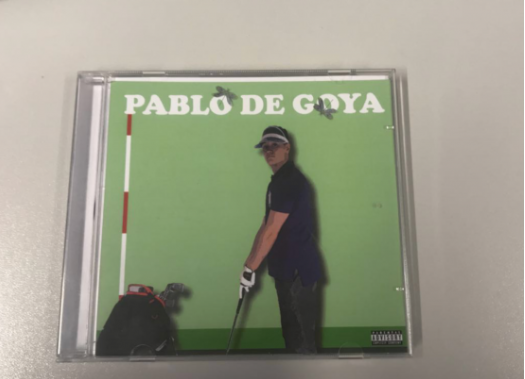
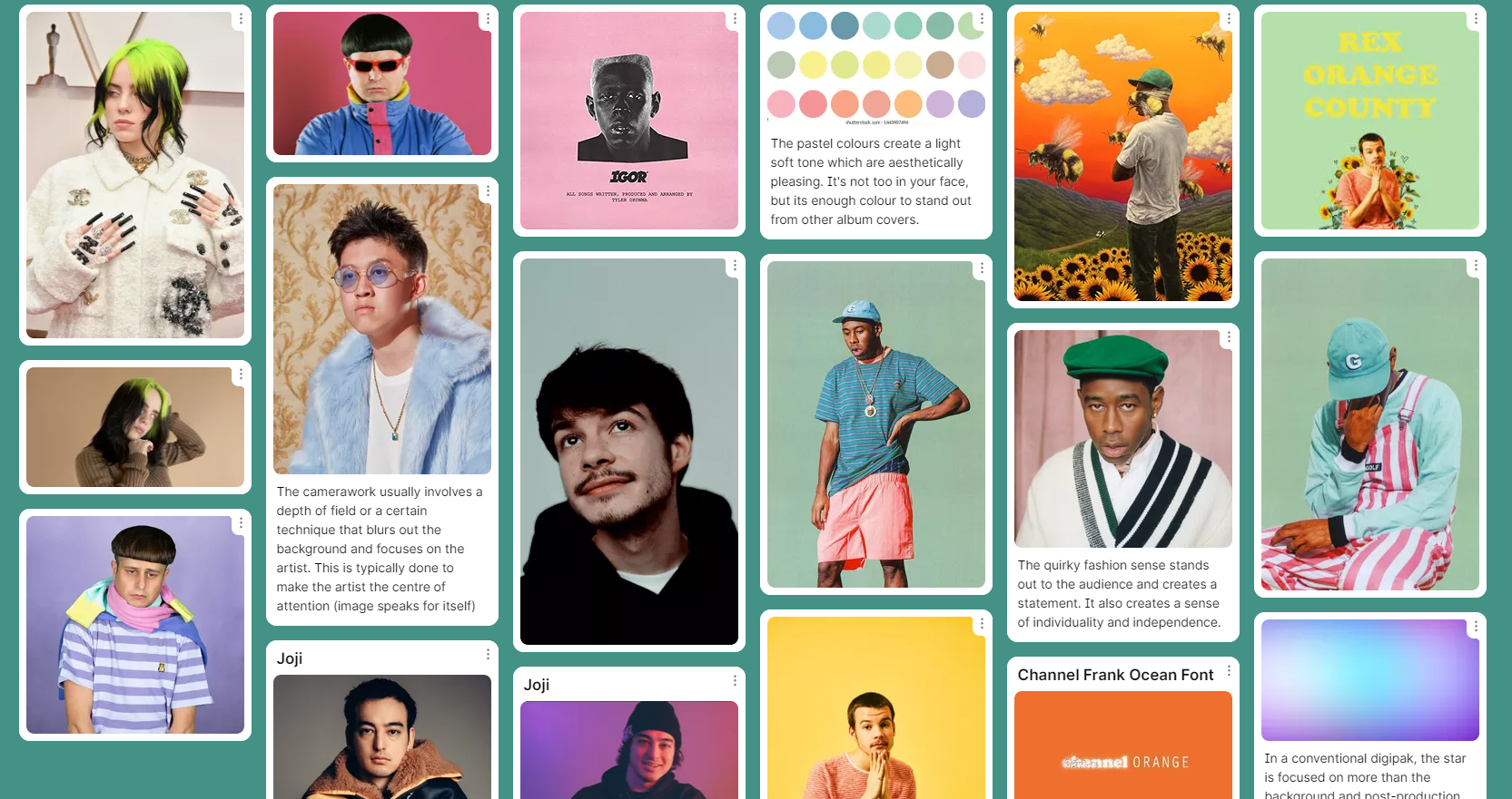
Front Cover
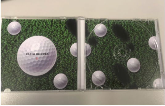
Middle Pages

Back Page
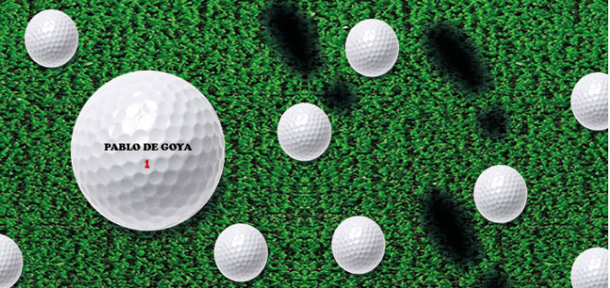
In this image below is a form of peer feedback. The idea was to show a group of people our digipak without giving them any information about our artist. They then got to select what genre they believe our digipak is.
As you can see the majority of people believed that our genre was Indie rock. This is not what our genre is and the viewers have not given a preferred reading of the media, rather they had an op-positional. This may be seen as bad thing but due to us deliberately using unconventional/controversial features. Due to this, it is common to get op-positional reading.
So all in all this task was interesting, and I am very happy with how our digipak turned out and the op-positional reading is actually a positive as we have often added unconventional features to be the same but different.