What went well
In both of my photoshoots, I took a lot of images that I really liked yet weren’t suitable for my front cover or double page spread, so the contents page was the perfect place for these images so I wanted them to look really good. On my contents page, I played a lot with the images I wanted to include and how to make them stand out. I first just placed them on the page but I didn’t like how they looked, I looked up and asked a classmate how to frame the images, but all I had to do was put a box behind the pictures to enhance them. Here is a screenshot of how they look placed like this on my first draft.
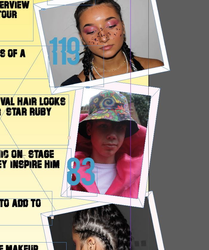
I have put the pictures at all different angles to look abstract. I have also gone over the side lines of the page so they look randomly placed and so I could fit my writing in the centre of my page without going on top of the images but I like the look of not all the images being perfectly on the page.
The tools I have used on this page is the spacing tools to make my fonts certain sizes and spaces between the letters. I have also used the align tool to measure the spaces between either sides of the images used with the background border.
I made the background light yellow to match my masthead but to also portray the indie pop theme by using a subtle, light colour. I like how my contents page ties in with my front cover and my genre because my cover star features twice on my contents page, stating the fact that she is a key person throughout this issue.
Even better if
My contents page will be even better if I make the changes I aim to make for draft 2, which include adjusting my text and colours to highlight the features of the page. I don’t think the blue works so I will change this to red which will make all my page numbers stand out too, which is good as this is the whole point of a contents page. This will really pull everything together and will conclude my contents page .