Adverts

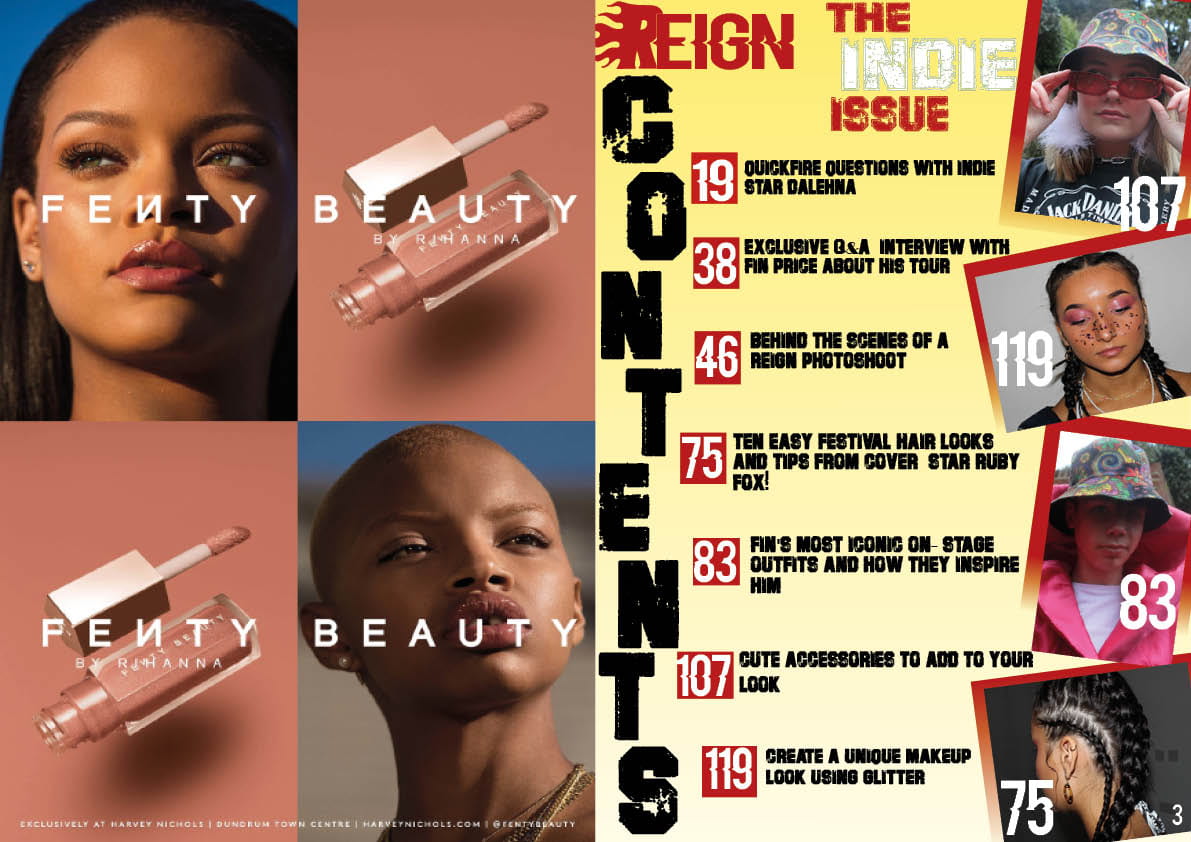
The last thing to add to my magazine is my adverts, these had to tie in with my genre so that they appeal to my target audience. I chose two different types of adverts to get as wide range of readers’ interests as possible.

The two I chose were;

  • Rihanna’s Fenty Beauty makeup range
  • Lovebox 2020 lineup along with information about the festival

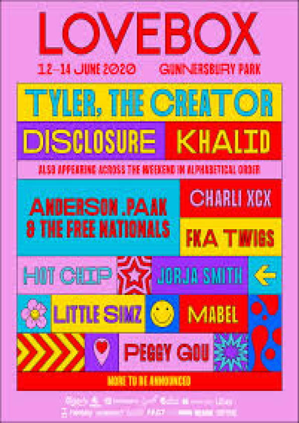
As my magazine is targeting teenage girls, hopefully these adverts will grab the interest of my readers, and hopefully these brands will make money off of my audience. I looked at the Blumler and Katz theory to remind myself of the features I want my audience to feel, the elements of these theories being personal identity, entertainment, information and social interaction. I pciked my adverts based on what would portray these 4 elements the most. I feel they do cover the theory as the makeup allows people to have a sense of personal identity, and the festival poster feeds the audience information.


A new improved complete magazine draft

After being sent my screencstify by my teacher, I have made some of the adjustments that my teacher suggested.

FRONT COVER

-Aligned the text either side of her head, so the writing faces inwards

-Made the cover lines slightly smaller

I did this to make the cover lines symmetrical either side of my model, this way it would be more pleasing to the eye and will look more formal

CONTENTS PAGE

-Added a red gradient to the background of the images to match the gradient on my front cover

I did this to incorporate the colours and design of my front cover to my contents page to portray my brand further and so as the reader turns the page from the front cover to the contents page, they will notice the colour scheme being incoporated throughout my music magazine, red and especially yellow is a common theme within the Indie Issue.

DOUBLE PAGE SPREAD

-Made the background yellow to make the page pop as I felt as though white was very dull especially as I cut my model out, there was no background anymore. Adding a colour makes the double page very vibrant and quirky.

-Added pink lines to create a bit of structure to the page and to also match my models’ coat

-Changed my pull quote to a different phrase, sounding less arrogant to portray a kinder, more Indie vibe

-Changed the font of my title ‘Fin Price’ because it was the same font as my masthead, my masthead is a brand and has to be unique and this font can’t be seen anywhere else throughout the magazine.

Complete magazine draft

Here is the first draft of my complete magazine…


I still have many changes to make however, some being;

-The colour scheme on my contents page

– The pull quote on my double page spread, I will change this to ‘If the crown fits, wear it’

-The background colour on my DPS, right now I feel as though it is quite dull

Once I have made these changes, I will have have completed my draft 2 and hope to be near finishing my product. Here is the screencastify sent from my teacher, reviewing the first draft of my music magazine.

A new improved contents page

After lots of adjusting and adding colours, here is my second draft of my contents page …

What I have changed:

  • I changed the whole colour scheme from blue to red. I feel as though this matches my front cover a lot more than draft 1 did.
  • I added the masthead to the top of the page to advertise my brand
  • Added red boxes around my page numbers so they stand out from my background
  • Added a red gradient to the background/border of my images to match the red gradient on my front cover and to tie in with the rest of the red on the page.
  • Changed the page number colours to white.

Making these changes, I have made the page more intriguing to the reader and nicer to look at. As it matches well with my front cover, this should draw the reader in so they find out what they can explore within my magazine.

Here is a voice recording from a classmate, Millie, analysing my new improved contents page.


Draft of Contents Page

What is a contents page? 

Magazine content pages indicate page numbers where each part/important feature articles start. The contents usually includes the titles of the pages and a description of its content. Contents pages can also include editor’s letters.

I was really struggling for ideas on how I wanted my contents page to look, so I drew out a draft on paper, which is shown here:

I was going to find a transparent picture of tape, which is what I attempted to draw in the image above, but I couldn’t find one that looked good so I put the images in a white frame instead.

Here is the first draft of my contents page.

How my contents page developed:

This is my first draft of my contents page but I have done so much editing of it I am really happy with the outcome. First I chose the colour for the background of my contents page which was a tough decision due to the amount of different colours i’ve used across my front cover and also my double page spread; but eventually I chose the colour of my masthead. Next I inserted all the images but I didn’t like how they overlapped at first so I put white boxes behind them so they look as though they are in a frame. Because the images took up the whole of the right side of the page, It meant the actual word ‘contents’ had to go downwards which I now really like.

What I am going to change for draft 2:

  • Make the contents of each page (black writing) a bit smaller.
  • Move small black writing closer together
  • Put the age numbers in a box to make them stand out
  • Add another page number or two to fill the space
  • Change the actual page number of the contents page from 7 to 3.

A New Improved DPS

I have taken my double page spread feedback on board, and made some adjustments in order to produce draft 2 of my double page spread. Here is a jpeg linked to a pdf of my new improved spread.

What I changed:

  • I moved the image to the other side of the spread as it opened up the page more.
  • I rearranged the layout of the words in the pull quote to adjust to the new placement of the image .
  • Removed the steps from the image using the magic wand and eraser tools on photoshop so I had more room to write.
  • Moved the title, stand first and article to the left hand side.
  • Removed the pink highlight over the text as it wasn’t the right colour for my theme, I felt a transparent highlight looked neater especially as I am changing the colours of the questions when I insert my real article.

The impact of the changes I made are that I believe the page flows a lot nicer and reads well, whereas before the text looked sectioned off which made the double page look like 2 separate pages when I wanted it to look like one large page. Also the colour over the text has been changed so my colour scheme is a lot more specific now, is clear and matches my star image.

What will I change for draft 3?

  • I will insert my real article into the columns instead of placeholder, as my article is a Q&A I will make the questions a different colour/bold so they stand out.
  • I will also remove all the drop capitals and only have one at the start of the article instead of at the start of every paragraph.

When I make these changes, I am hoping that the double page starts to come together especially when I insert my article instead of placeholder text, it will become more real. When I remove the drop capitals and insert the questions in a different colour, it will stand out and look like a Q&A as soon as you take a first look at the page which is what I want it to look like, to entice the reader to read.

A New Improved Feature Article

Now I’ve designed my double page spread with the placeholder text, I can now insert my real article. I have edited it lots and now it’s improved; here is my new improved feature article.

What have I changed?

-Changed the last paragraph, removed bits that didn’t necessarily fit such as talking about future family

– Added information about merchandise

– Corrected a lot of spelling mistakes especially ‘Indie-Pop’

-I adjusted my pull quote so the article doesn’t sound so arrogant.


All these corrections will enable my article to flow well when I insert it onto my double page spread. I will also change the colours of my questions on InDesign to match the colour scheme on my DPS, apart from that my article is finished.

Feedback and Reflection on Draft DPS

I asked my classmates for feedback on how my double page spread looked and what could be improved. I haven’t used my true article text in my draft however as I am still finalising it, so for now I have just inserted placeholder text to show how my real text will look. Here is a screenshot of my first draft of my double page spread.

I’ve put all my feedback from my classmate into a table so it is easy to read and clear as to what I can improve/add to make this double page spread better.

Giving myself some of my own feedback, I am going to try and put the image of my model, Fin, on the right hand side of the double page and all the text on the left. As he is holding the crown to the left, I feel this would suit the page better and flow nicely if it is on the other side so for my second draft, I am going to attempt that. Also if the image of Fin stands out more by moving him across the page, it will portray my message of him being powerful and superior even more.

Draft of the double page spread

After lots of trial and error, I have finally completed draft 1 of my double page spread. I am very happy with how this looks however I could definitely improve it. I have decided I really like the fonts and colours used, the stand first and also the small image in the corner as it goes well with the pull quote; so I will keep these the same for when I begin draft 2.

Some conventional features that my double page spread contain are having a stand first beneath the central, bold masthead. Also having drop capitals evens the paragraphs out nicely and makes my article read clearly and smoothly, however in draft 2 I am only going to have 1 drop capital at the beginning of the article, which is also a conventional feature.

Another plan for my draft 2 is to move the main image to the right side of the page and the writing to the left. I feel this will better suit my image as the crown will be hanging over the text. I will also make the pull quote smaller as it is standing out more than the masthead currently and this should not be the case.

I think I will also remove the steps from the image so I have more room for text. Either that or I will edit the edges of the steps to disperse the colour so it looks almost spray painted. This is so it is less ‘blocky’ than just a straight line.

Second shoot contact sheets and evaluation

We went on our day trip out to Candie Gardens and the Priaulx Library to take our pictures of our models, mine being Dalehna and Fin. My genre is Indie Pop so I tried to portray this through their outfits, poses and props. Here I have uploaded every image that I took of my models, and later I will select a few to use within my contents page and mainly my double page spread.

| feel as though I got a few potential shots for my double page spread, especially towards the end of my shoot, I believe my shots got better as the shoot went on as I began to really figure out what looked good.

Here are a couple of images I believe are strong and may make my double page spread as the main image.

Overall, I believe my second shoot went really well and was happy with the outfits, props which meant I liked the majority of my pictures. This shoot was fairly rushed and we had limited use of being able to sit on stairs/benches/the floor because of the weather but I am still pleased with how this turned out. I think that I met the aims of my production meeting agenda as I used all the outfits, props and poses that I planned to use therefore I feel this shoot was well planned and successful.