How did you integrate technologies in this project?
Category: Creative Critical Reflection 1
CCR3
How did your production skills develop throughout this project?
CCR2
CCR2: So.. How does your product engage with audiences and how would it be distributed as a real media text?
Here is my second CCR, there are 2 screencastify’s of me analysing every aspect of my magazine from audience, distribution, to advertisement etc.
CCR1
So.. How does your product use or challenge conventions and how does it represent social groups or issues?

So… How is it going?
What new transferable skills have you learnt? What went well and even better if…
Looking back on my progress so far, I have noticed I gave gained transferable skills, these are skills that don’t just apply to media, ones that will stay with me for life. Such as, organisation, communication, teamwork.
Here are how these skills have benefited me and why they are useful:
- Organisation- preparation ahead of schedule and planning all comes under the organisation category, I have had to do lots of planning and preparing before photoshoots etc.
- Teamwork- For the location shoot and when we film our music videos, I will/have been put into groups. This means you are out of your comfort zone by working with people you usually wouldn’t work with, and adjusting your ideas to fit the needs of everyone.
- Communication- I have learnt to communicate my ideas through my blog posts, my magazine such as the cover lines etc all to my audience and peers. I have communicated with classmates when giving feedback to them on their magazines, it also enables me to have to allow time for other people wanting my feedback and not to put myself first and to help others more.
These transferable skills will stick with me with the rest of the projects coming up in media studies and also are useful to have for my other subjects also.
Design skills 2
What went well
In both of my photoshoots, I took a lot of images that I really liked yet weren’t suitable for my front cover or double page spread, so the contents page was the perfect place for these images so I wanted them to look really good. On my contents page, I played a lot with the images I wanted to include and how to make them stand out. I first just placed them on the page but I didn’t like how they looked, I looked up and asked a classmate how to frame the images, but all I had to do was put a box behind the pictures to enhance them. Here is a screenshot of how they look placed like this on my first draft.
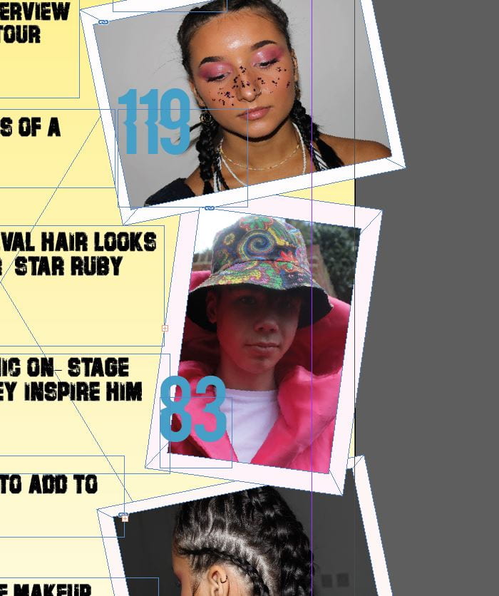
I have put the pictures at all different angles to look abstract. I have also gone over the side lines of the page so they look randomly placed and so I could fit my writing in the centre of my page without going on top of the images but I like the look of not all the images being perfectly on the page.
The tools I have used on this page is the spacing tools to make my fonts certain sizes and spaces between the letters. I have also used the align tool to measure the spaces between either sides of the images used with the background border.
I made the background light yellow to match my masthead but to also portray the indie pop theme by using a subtle, light colour. I like how my contents page ties in with my front cover and my genre because my cover star features twice on my contents page, stating the fact that she is a key person throughout this issue.
Even better if
My contents page will be even better if I make the changes I aim to make for draft 2, which include adjusting my text and colours to highlight the features of the page. I don’t think the blue works so I will change this to red which will make all my page numbers stand out too, which is good as this is the whole point of a contents page. This will really pull everything together and will conclude my contents page .
Design Skills 1
Over the due course of developing my tour poster and most importantly my music magazine front cover, I have picked up a fair few skills and tools that I can now use when creating my double pge spread, to make it look as effective and detailed as possible. After choosing the image I wanted to use on my double page spread, I realised my models’ jacket was very creased and it was so obvious. In order to use this image in my double page spread, I would have to figure out how to get rid of these imperfections. So I looked for a tutorial on YouTube and found the ‘blur’ tool. In which I proceeded to blur all the creases out of the jacket which worked really well.

I also noticed that in the images of Fin where he is holding a crown, the crown wasn’t very noticable as there was too much light shining on it. I made the whole image brighter to enhance the colour and boldness of the crown so it is eyecatching for the reader. I needed the crown to stand out as my pull quote is ‘The King of Indie pop’ so this had to tie in and relate to the image. I did this by adjusting the brightness/contrast, lightness and saturation. I had to change a few of these in order for it to pick up the crown’s key colours.

The impact of this was to make the overall image pop, not just the crown and massive pink gown. I feel after these adjustments, the whole lighting and colours of the image are now a lot more striking.
So… I am ready to photograph my star.
My music magazine and brand is called REIGN. I am hoping to portray lots of messages with my brand, I feel this will help me to focus on my target audience and their interests. Some of the vibes I hope my magazine gives off are; edgy, colourful, refreshing, power, confidence, independent, abstract.
REIGN mission statement:
‘The Reign brand focuses on its target audience and recognising the importance of power and confidence within its readers. It is built on its exclusive charts and reporting on the latest news, issues and trends across the Indie-pop genre of music. Reign has very strategic relationships with major companies across various industries because of its will to engage with its readers by including opportunities to their fans such as competitions, this gives Reign its brand recognition across the globe.’
It is important that I stick to my brands’ plan, being the mission statement, and portray this through my music magazine. I must include everything the reader is expecting ,and more! This is to leave Reign magazine with a good reputation and to exceed the reader’s expectations. Customer satisfaction plays an important role within my business. Not only is it the leading indicator to measure customer loyalty, identify unhappy customers and increase revenue; it is also a key point of differentiation that helps you to attract new customers in competitive business environments.
So… I’m ready to make some media!
When it comes to making my magazine I need to keep in mind all aspects that make a magazine the best it can be to look as realistic as possible. These include:
- Camera
- Mise-en-scene
- Typography
- Layout
- Colours and themes
- AIDA
- Blumler and Katz
If I cover all of these, my magazine should be very suited to my target audience.
CAMERA
When shooting my model I will keep in mind the angles which look good so I end up with an image that I am happy with. This is most likely to be a close up as I my model is going to have a detailed hairstyle and makeup therefore I will want this to be the focus of the image.
MISE-EN-SCENE
Mise-en-scene is an importsnt aspect of the music magazine as it covers the whole of Costume, Lighting, Action, Makeup and Hair and Setting. This will help me make up and dress my model so she is well suited to my genre and style of music. I am planning on doing a bold and bright hair and makeup look.
TYPOGRAPHY
This is important for especially the masthead and key words on the front cover yet also the double page spread of information as I have to pick an apropriate font that is suited to the theme yet also is legible to the reader.
LAYOUT
The layout of my magazine will be similar to a conventional magazine eg. having the image as the main focus along with the masthead being at the top of the page. I’m doing this because it may appeal to my target audience more if it fits in with the ‘norm’ magazines.
COLOURS AND THEMES
I am going to explore some conventional and unconventional magazines in order to expand my knowledge in common colour themes and palettes, I am looking to make my magazine as eyecatching and to fit my target audience as best as possible.
AIDA
Attract, Interest, Desire, Action. I will be thinking of my target audience throughout the production of my magazine and what will appeal to my audience the most.
BLUMLER AND KATZ
Blumler and Katz suggested that there were four reasons, collectively known as Uses and Gratification, this theory described consumers and an active audience. These four are Information, Personal Identity, Social Interaction and Entertainment.
So… How can image communicate meaning?
When experimenting with unpicking images, scenes from tv shows in class and even my own pictures I take, I have noticed that every part of the image is talked about and noticed by the viewer. This means the focus, the lighting, the mise en scene and the angle all have a big impact on the overall outcome of the image.
When wanting to take the perfect image, you have to make sure every aspect of your camera (aperture and shutter speed) is how you wish for it to be so the final image is perfect.We watched a few clips in class and unpicked them to gain an understanding on what we need to look for in clips/images for future reference. Many techniques were used such as the camera angle, the movement of the camera following a character and also the mise en scene used in the image. This helped my understanding of how important everything in the shot is.
Now I am able to unpick an image from a scene; to put this into practice, here is an image from the TV show Pretty Little Liars where the characters are trapped in a ‘dolls house’ with a stalker haunting them.

This is a good example of a midshot wide angle. This is because you can’t see the whole body of anyone and everyone fits in the shot so it is a wide angle.
The camera will have had a high shutterspeed in order to not let much light into the image. This is known because of the dark gloomy lighting. The aperture will also be low as the aperture is how much light is coming into the lense.
It will also have been a tracking shot because it will have followed the girls down the hallway. In the scene there was also a few panning shots between the 5 girls and the villain in black who was the other side of the room.
In the foreground there is 5 women looking very confused and scared, this may be because they’re looking out for the figure that is lurking in the background. The very dark gloomy lighting connotes the mysteriousness and tension of the scene.
Now I will unpick the mise-en-scene of the image.
C- The actresses’ costumes are very formal, these being floor length ball gown dresses. This is most likely to portray the fact that they are trapped in a dolls house and are supposedly dressed as dolls.
L- The lighting in this image is noticeably dark, this is intentional to give off a tense, scary atmosphere
A- Acting, the acting in this looks quite minimal due to the nervousness on the girls faces, in the scene nobody really says anything as they’re too focused looking out for the man dressed in black.
M- The makeup in this image isn’t the most noticeable as it is a midshot, however in other images in the scene the makeup is slightly more obvious. For example a few of the girls have dark eyeshadow to emphasise their eyes and to tie in with the style and colour of their dresses.
P- In this scene, there are little to no physical props being used, at least not visible in this image but within the episode props such as beds and teddy bears were visible. However, the man dressed in black in the background could be seen as a prop as he has no speaking lines, he is just a figure.
S- The setting of this image looks almost as if it were taken underground, this is because there is little light entering the building and as if it were coming from the roof. It looks like a spacious building because of the long never-ending hallway they are standing in. This setting makes the image look more real and as if the girls are actually lost.
Proudly powered by WordPress.
Theme: Flat by YoArts.