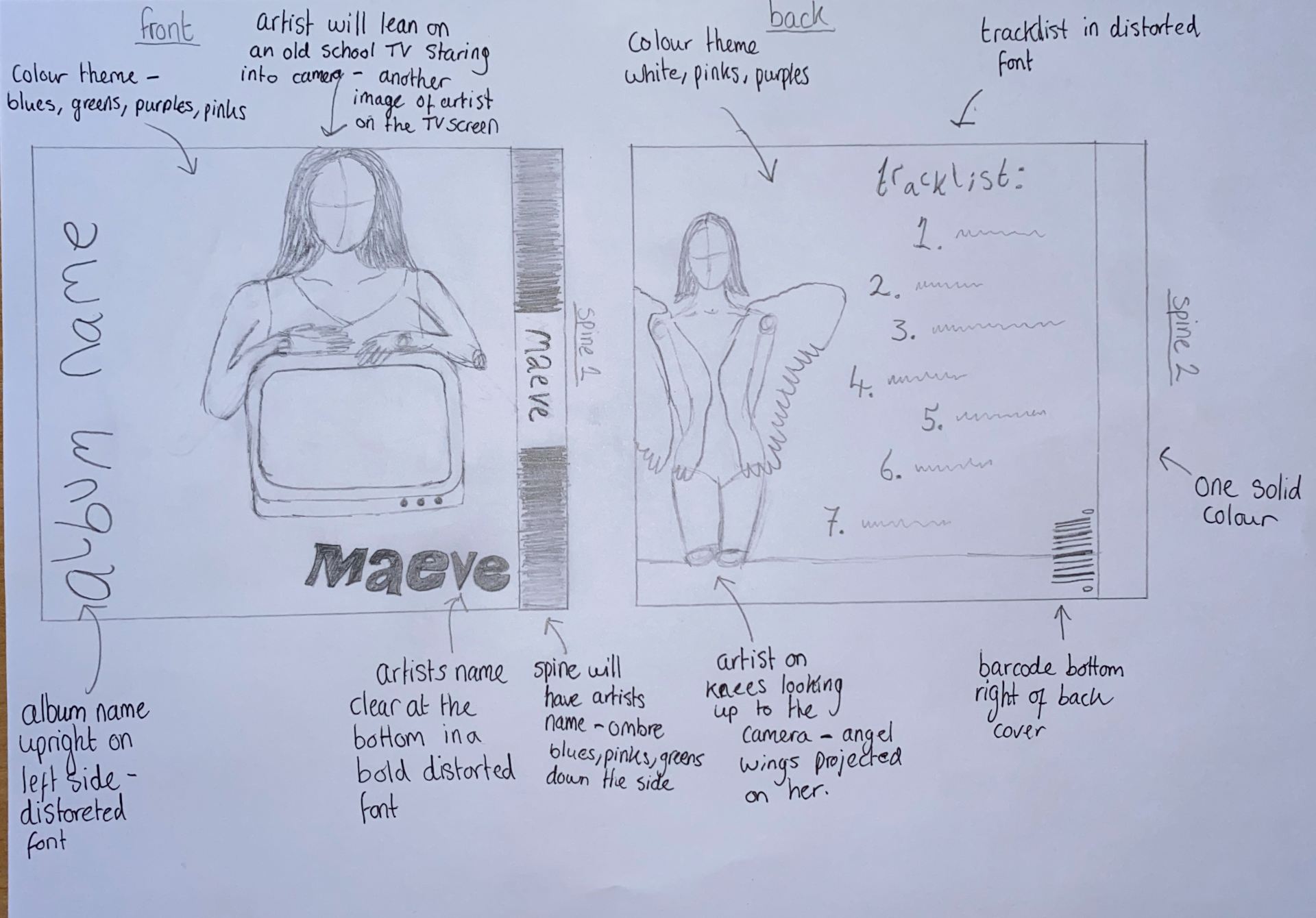
Here, my group has created a mock up of what we want our CD cover to look like. This shows how our model will look, what her star image will be and that we will be including a repetoire of elements that give our album a narrative. It will be similar to our music video in the way that it will be a mix of light and dark as well as vibrant colours, but it will be a whole new concept and narrative from the music video.
On the front, she will be leaning on an old TV, which we will possibly edit her onto, which creates an image of self-love and is extraordinary. The colours. will consist of blues, greens, purples, pinks and maybe black as we think that the mix of colours will differentiate the cover from the music video, but still convey and indie pop theme. This will be done either with lighting or in post production. On the back however, we will present the track list next to the artist, who is being presented as angelic and colourful. I was inspired by a Miley Cyrus album to handwrite (maybe a font) the album in a white pen against the vo=vibrant pinks and purples of the lighting. The first spine will have the artists name on it and will be surrounded by an array of colours, The second will be one solid colour so that people can differentiate the front and back. I believe that the narrative of the CD cover will relate to Hall’s theory of preferred reading as the audience will be expecting a colourful and eccentric album that also has a mix of light and dark themes.
These are some some colours i came up with on adobe colour that I think will look really good in our digipack and will create an indie pop star image.


I think that this has given us a really good idea of what we are trying to create and we can soon take photos and begin developing our digipack.