After receiving suggested improvements to make, I then did them. Below are the new and improved drafts of my magazine pages and the things which I changed.

FRONT COVER:
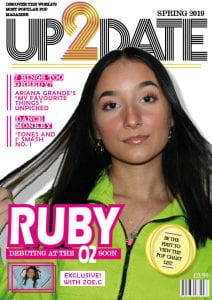
- I moved the masthead up. This then covered the plug so I then moved it to the top left corner. Lifting the masthead up enabled me to then make the cover image slightly larger.
- I took the word “edition” out of “spring edition 2019” as less is more. I then increased the text size which enables the wording to be even more bold and easy to read.
- I improved the cover lines quite a bit. I changed the colour of the font to pink so it could be read and I moved them up and into some empty space. This has enabled my audience to clearly read the information as the image is not making it hard to read anymore. This will hopefully entice them even more into picking up one of my magazines.
- I have flipped my cover image, increased the size slightly and moved it to the right. This enabled space for my cover lines to go.
- I moved the headline “Ruby” to the left and taken the bar code to the right. I did this due to the headline looking slightly odd on the left as all the other text was on the right. This improves the aesthetics of the magazine, hopefully pleasing my audiences eyes to pick a copy up.
- I improved my pug by adding the repeating pink lines and giving it a background colour. I have also made it larger so that it can grab the reader and interest them.
- I have changed my insert by making the colour of her jumper blue in photoshop. This has made it stand out from the cover image as they were originally wearing very similar colours. I have also made it into the shape of a rectangle with a second outline of a rectangle to follow the repeating lines effect. I have also taken the word “interview” out of the caption as less words to read is more enticing.
CONTENTS:
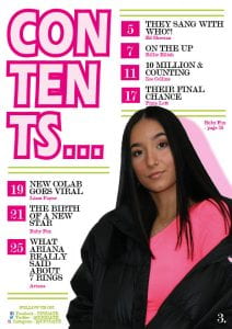
- I have moved the entire page up slightly to take out the empty space across the top.
- I have made my image slightly larger to catch the attention of readers even more.
- I have added the social media icons to add more fun and images to look at. The icons are also notorious so readers will be drawn to go to our magazines pages.
DOUBLE PAGE SPREAD:
- I have added the donut to form the zero in ten. This adds lots of fun and excitement which fits in with feeling of pop.
- I have increased the opacity of the colours of the shapes to make them brighter. This makes the colours fit better with my colour scheme and makes the page less dull.
- I have added a yellow triangle behind the quote in the top left corner. This makes it link with the quote of the right hand page. It also allows the quote to pop, making it easier and more exciting to read.
The final adjustments that I will need to make to my magazine pages are:
- Add some bevel and emboss to the caption on the front cover.
- Add some gold/yellow on the contents page to link to the front cover.
- Make Ruby’s caption larger.
- Take the dots after the page numbers away.
- Spelling of “exclusive” on the double page spread.