Following my own reflection and the feedback given by my peers I have been able to make some changes to my magazine to improve it. Here is my second draft of my music magazine:
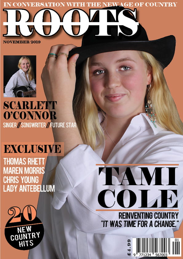
Some of the changes I have made include adding a different font, which makes the magazine more interesting to look at. I have also made a pug that includes colours from the colour scheme of my magazine. Overall, I think that my draft 2 is very much an improved version of my magazine front cover as the background colour is less distracting, there is more happening on the front cover and more colour variations have been added.
Some targets for my next draft may include:
- Add a photo of my model from my location shoot.
- Experiment with spacing and the layout.
- I could also edit my model so her skin tone matches the undertones of the background.