


The feedback from my draft 3 of each page
All of my pages together show how far my pages have come since posting my second drafts of each one and after thinking about the review and targets for each one. So, how are they different?
My front page: I have decided to get rid of the pastel background and go for a darker pink to therefore make this front page stand out, I have also added an opaque blue text box behind the title of ‘indie insight’ to therefore border the title and bring it out more.
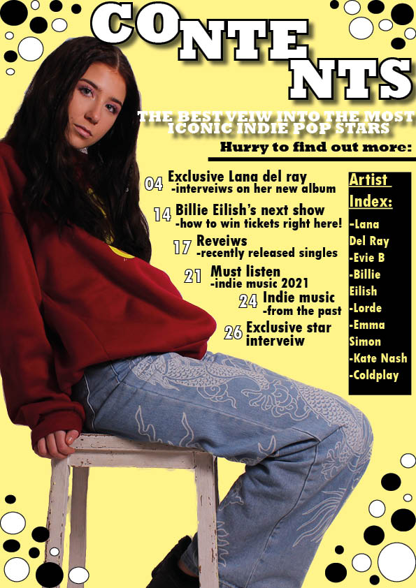
My contents page: I have used a yellow as an accent colour from her jumper and it is a bold, dramatic colour, I have also included more page numbers and as well as this I have added an Artist Index of featured artists in the magazine in a black text box with yellow writing to make the colours continue to stand out.
My DPS: The changes made on this page are the slightly darker background colour which deepens the page instead of mellowing it with the previous pastel cream colour and another change to this page is the small text box about her outfit to therefore give more information and make the target audience have something else to read about.