Component 1
Question 2: How does your product engage with audiences and how would it be distributed as a real media text?
Question 3: How did your production skills develop throughout this project?

Question 4: How did you integrate technologies (software, hardware and online) in this project?
Final Draft Draft 4
The online Flipsnack version of my magazine
All Pages of my final magazine

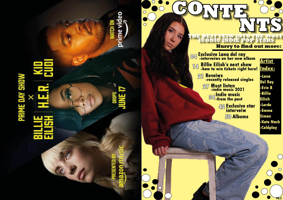


Chosen Adverts

Chosen adverts
For my magazine I chose to use an advert for a popular music company as it included the famous Indie star Billie Eilish which I knew would resonate with my audience, as well as this the particular advert contains people of the same age demographic to my audience. This advert compliments the colours which Indie pop displays as yellow is edgy and different which is why I used this colour for my contents page. This advert also targets my audience as people who would buy this magazine would listen to artists like Billie Eilish as she is a representative of the Indie pop genre and her name is included in my magazine therefore this advert is specifically chosen due to it promoting the genre.
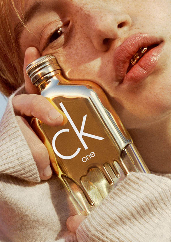
I chose the advert on page 6 because the colour shines but it will not detract from other pages as it stands alone. It is also a popular perfume brand with my audience demographic and the woman portrayed is a similar age to my perfect audience member which is why I included it. Therefore this advert would be something that my audience would be interested in and the colour pallet also resembles the Indie Pop genre as it is quirky and bright.
Complete Magazine Draft 3


The feedback from my draft 3 of each page
All of my pages together show how far my pages have come since posting my second drafts of each one and after thinking about the review and targets for each one. So, how are they different?
My front page: I have decided to get rid of the pastel background and go for a darker pink to therefore make this front page stand out, I have also added an opaque blue text box behind the title of ‘indie insight’ to therefore border the title and bring it out more.
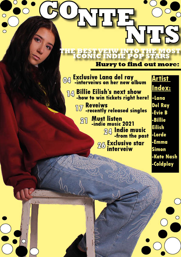
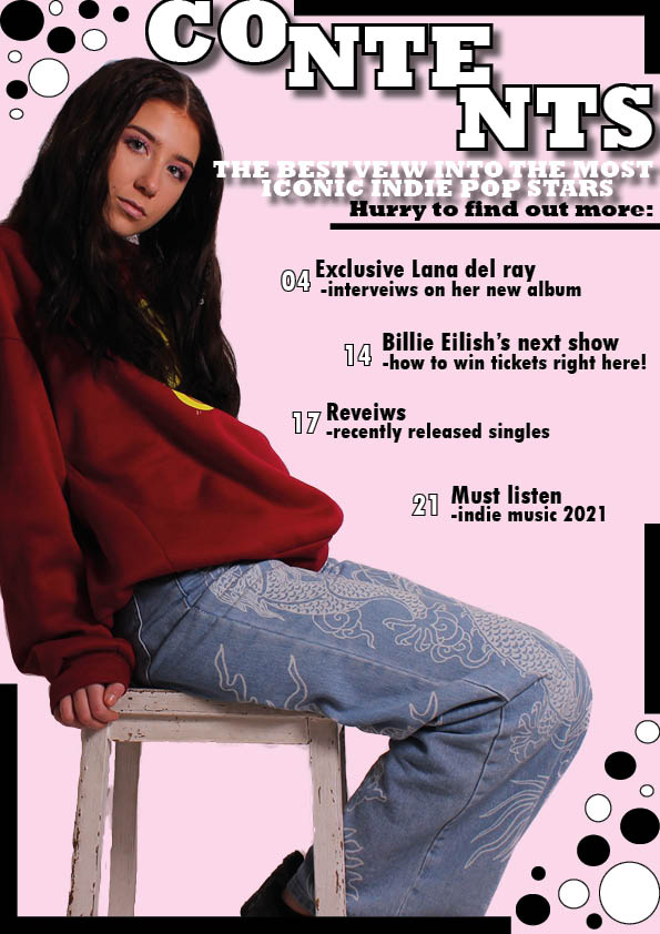
My contents page: I have used a yellow as an accent colour from her jumper and it is a bold, dramatic colour, I have also included more page numbers and as well as this I have added an Artist Index of featured artists in the magazine in a black text box with yellow writing to make the colours continue to stand out.
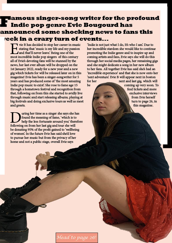
My DPS: The changes made on this page are the slightly darker background colour which deepens the page instead of mellowing it with the previous pastel cream colour and another change to this page is the small text box about her outfit to therefore give more information and make the target audience have something else to read about.
Second Draft of DPS

Whats new?
-The Main title on the left hand page is now staggered so that the design is more interesting and it now fills the black box
-The pug in the left hand corner has been replaced with a smaller pug as well as a spiral black and white background to add affect as well as contribute to the design to make the page intriguing whilst blending in to the black and white on the left hand page
-I have added not only white but black borders in the right page corner as it ties in each page nicely as well as makes something to look at and add something extra to the page
-Lastly I have rearranged the article so that it flows around her head and the writing almost encapsulates the person in which the article is about, tying into the article I have put a text box hinting to the page written about in the article to therefore add a reminder and small detail to this double page spread.
What is next?
-Next I would like to darken the background into a non pastel theme.
2nd Draft Contents Page
What’s new?
To make the Contents page fresh and more exciting I have:
-added new designs and shapes to add added attraction to the page, through the lines and circles as well as the contrast in colours and shapes it catches the eye without causing the page to be chaotic
-I changed the spacing of the page numbers and references to therefore catch the eye and create some different layout textures to the page
-I Moved the title ‘contents’ higher up at the top of the page, this therefore highlights the title better and the fact it is a contents page is clearer.
What’s next?
For this page I’d like to:
-add more page references
-include a pug to add more to the page and make the page varied in what you can look at and therefore more intriguing
2nd Draft of Front Page
The second draft of my magazine front cover:

What’s New?
- Highlighted colours in her eyes and defined colour of the glasses, to give a brighter and quirkier image which represents Indie pop well, as well as moving the image slightly further back to therefore pull her eyes to her name more.
- More text which stands out and is clear to read, including drop caps to draw the attention from the audience.
- The inclusion of other names that will be mentioned in the magazine at the bottom of the page.
- A change in font and colour of ‘Enter the world of Indie Pop with…’ to therefore allow it to stand out more but not detract away from the main title.
- A circular pug with less writing instead of a diamond shape with more writing, which therefore gets to the point and makes a clear statement.
- The addition of a pull quote stating ‘Look into the future with..’ which therefore introduces the name ‘Emma Simon’ and the star image.
What’s next?
- Next I’d like to make the top of the page bolder as the bottom is a lot more full and creative then the top, by doing this it will make my magazine clear and I would like to stay away from it being too chaotic and busy as it will therefore not be interesting and not as effective as it could be.