- How do your products represent social groups or issues?
- How did your research inform your products and the way they use or challenge conventions?
- How do the elements of your production work together to create a sense of ‘branding’?
- How do your products engage with the audience?
Throughout producing our music video I learnt a lot about what conventions music videos consist of. In ours, we wanted to portray the star following our mission statement. We started by doing thorough research into Altman’s ‘blueprint’ ideology but, the most valuable research we did was on music video conventions. These included either a narrative, performance or both, the MES, Star Imagery, a soundtrack and a range of camera shots. One music video that I chose to study was Sinead O’Connor’s music video for ‘The emperor’s new clothes’. This music video had a conventional style of it being confessional and in an anonymous studio.
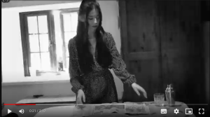
 A key convention we used in our music video was MES. We chose to set our video in the 1950’s and to portray this era we used red lipstick, a petite, winged eyeliner and a spotted dress. This had a huge impact on our Music video as it tied together our addition of the b&w and grained texture in editing, this was to portray the sense of darkness and past time. The next convention we used was a major prop, we encoded our storyline through different camera shots of this prop, conveying its importance. We used a conventional style, from the alternative indie genre, of performance and narrative where the star entered a confessional state in the performance element. We researched Lacey’s ‘repertoire of elements’ and applied the conventions before the production. This included Iconography, which we represented through the use of a pie as our fixed prop, this allowed the storyline to maintain the theme of domestic oppression. We used Lacey’s ‘similarity and difference’ whereby a convention of the Indie genre is for the music video to be bright and colourful, we chose to have our narrative in black and white.
As a group we produced this mission statement for the basis of our Digipak ‘she is an outspoken individual, who tackles the darker issues in the Indie pop genre that others may not want to address. She pushes the boundaries and creates a unique and immersive environment for her audience’. When we had gathered ideas for our digipak we decided to lean further towards Alternative Indie, we chose to represent the Star Image as noticeably ordinary and relatable. Due to this choice we implied the emotional side of our Star in our commercial marketing campaign.
On the front cover we chose to signify the immersive environment that her music creates through lowkey, chiaroscuro lighting. We decided to imply the emotional side of herself through the Masthead of the Digipak, we used a drop shadow on the polysemic text to imply power and dominance. In our music video she lived a mundane, bleak lifestyle, we represented a similar ideology through the title. ‘Artificial’ is taken from the idea that she feels as though she cannot produce her own happiness. We portrayed her personality using Barthes symbolic code whereby we took three photos to convey her personality and create an ordinary, Dyer, feel to her and her music. At the end of our Digipak we wanted to convey that she is moving on to stardom. We used Barthes Semic code to connote this idea with the use of boxes and surrounding props. We wanted to signify, De Saussure, her desire to create a positive life for herself which is similar to how we represented her character in ‘Me and My husband’. We implied this idea further on the last panel, the pink font represents femininity and the song titles juxtapose that feeling of happiness as they are emotional and raw, ‘Late night emotions’ and ‘ending dream’.
Social media Pages are forms of commercial marketing campaigns that can be used to create buzz and awareness around the Star. The goals of every marketing campaign include Attraction, Interest, Desire and Action. For a Social Media Page to gain attention it must be attractive by potentially having a colour scheme, it must be interesting and create desire which can be done through behind the scenes posts and merchandise and it must be engaging to create action. Shirky argues that audiences in today’s society like and want to interact with the Media that they are seeing, meaning that if a Star’s SMP is interactive it will be engaging and participative it will gather more interest.
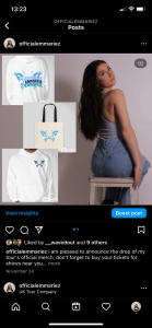
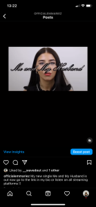
In our SMP we chose a range of photos that represented our Star’s personal life and her political views. Gauntlett argues that the media doesn’t shape, but it reflects our identities. We made our star’s political identity known because we wanted our SMP to gather interest from our desired audience demographic, Hall. We encoded anticipation through the use of a variety of behind the scenes posts to create a buzz and awareness around the music video. We used all of Blumler and Katz’ ‘Uses and Gratification’ theory in many forms. We represented social interaction through a link in the bio of the SMP, this is to forward the audience onto merchandise websites and tour tickets, we used this further through Q and A’s where followers could ask questions. The Star’s Personal identity is conveyed through posts including her friends, animals, feminist ideology posts and a charity post which represents what she stands for. Entertainment in our SMP is portrayed through teasers of the music video and behind the scenes posts, lastly information is given through tour posters and countdowns to her music.
To establish a brand identity for a specific audience demographic from the initial preliminary task my group made the decision that our Star would represent strong, independent and feminist ideologies. We chose to incorporate this idea in our mission statement,‘she is an outspoken individual, who tackles the darker issues in the Indie pop genre that others may not want to address. She pushes the boundaries and creates a unique and immersive environment for her audience’. Although we wanted our Star Image to stand out we also wanted her to remain present and ordinary, Dyer, for her audience so that she could be relatable.
Our music video communicates the ideologies of our mission statement through the narrative storyline. The main character is a signifier, De Saussure, for a woman becoming an individual again, although at the start she is weak and reliant, she becomes strong and faces, what Levi Strauss would argue is, her own binary opposition. The mission statement explains; ‘she pushes boundaries’ this is amplified through our use of narrative and performance aspects.The front cover signifies, De Saussure, an immersive atmosphere which is an ideology taken from her mission statement, she ‘creates a unique and immersive environment for her audience’. On the inside panel the photos depicted create an ordinary atmosphere, Dyer, for her audience and her Star Image is represented as present and relatable as well as fun and individualistic. The artist’s SMP includes photos to represent her individual personality, charity posts for women’s refuge which is a women’s charity conveying her beliefs further, and her political views on feminism which are posted on her page tie together the sense of femininity which runs from the Mission Statement through the Digipak, Music Video and SMP.
