For this post I had to select 2 adverts that will appeal to the demographics and psychographics of my target audience. The adverts also have to be appropriate and to suit my music magazine. I made sure to use 2 particular adverts that are relevent with my target audience.
When designing adverts you have to take into account the Blumler and Katz theory, (information, social interaction, entertainment, and personal identity) within an advert you have to make sure the information appeals to your target audience. For the social interaction if the advert appeals to the target audience then they will show other potential people within the target audience which may also appeal to them. If the advert is entertaining then this will make them more inclined to remember the advert and to talk about it. When creating adverts you need to make sure it is personal for your audience as this will make them more interested and feel that it means something to them personally.
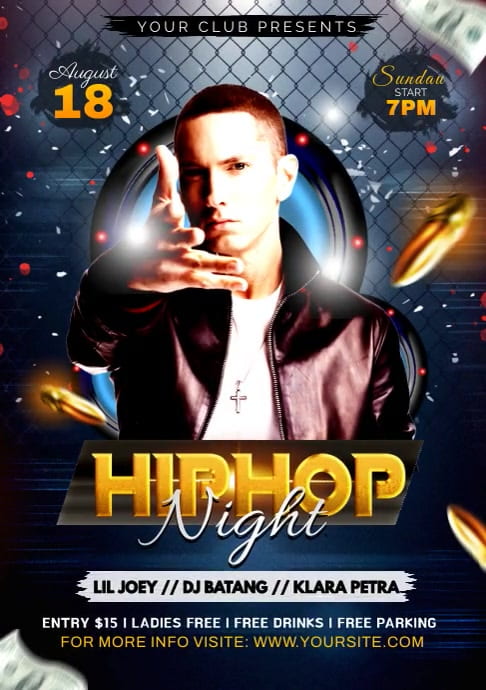
The first advert I have chosen I think works well with my genre of HIP-HOP, as the particular artist conveyed in the background looks gangsta. The artist is also looking straight at the camera which makes him look assertive. He is also recognisable as being a famous hip-hop artist which will act as a hook to my audience. The bright colours also make it stand out for the audience and makes it clear what it is trying to advertise for the demographics of the target audience.
For my second example I chose a HIP-HOP festival poster, this signifies bright colours which makes it stand out for the targeted audience. The words “Woo Hah” are memorable and have connotations of fun. It is also clear with the information on the words being in bold to make it clear for the target audience on where to see the key information.

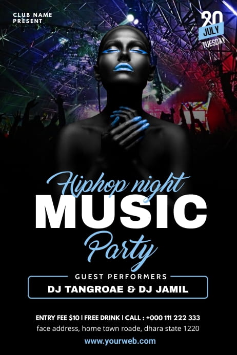
For my third example it features an advertisement of a Hip-Hop night party. I chose this example because I like the particular fonts used as it works well for the genre of Hip-Hop. They also put some of the fonts in bold to make the key information stand out for the audience. They also use bright colours for the fonts, so this allows the information look more eye catching for the audience. I also like the contrast between the fonts, as the words in bold look generic while the words in light blue look sophisticated. This makes the target audience interested in the party.
Doing this particular task has helped me to see how to make my target audience remain interested in what I am promoting. I made sure to impliment this into my magazine and take into account the adverts I have chosen and make sure I follow them so my magazine can be successful.