
Category: Component 1

Below I’ve recorded my letter on voice memos, this allows me to check if it makes sense and incase if it doesn’t I can edit it. This will allow me to make my letter more clear and to stand out more.
Categories
Final Draft Reflection
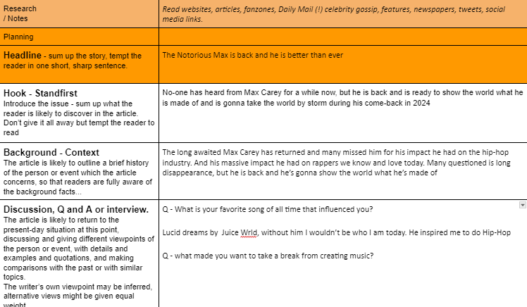
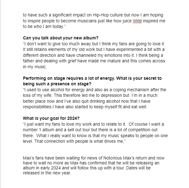
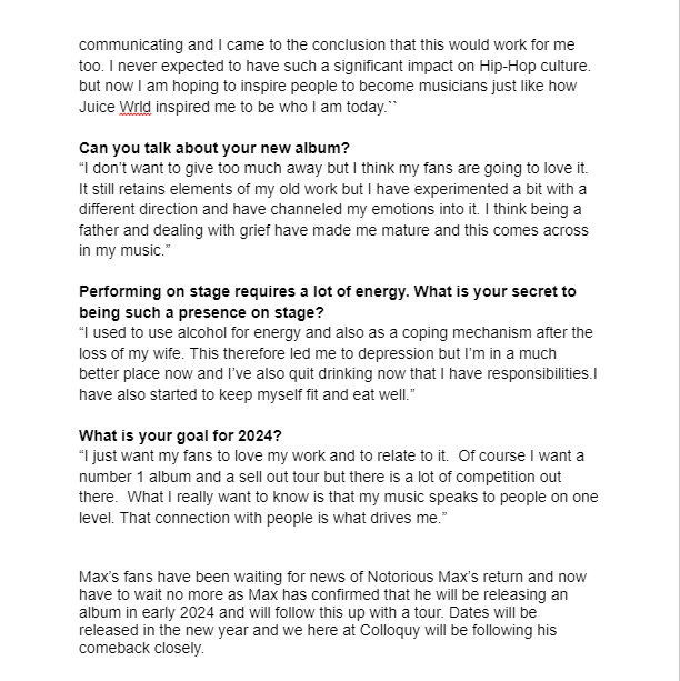
This is my final draft for my magazine:
Front Page:

Contents page:

Double Page Spread:
What’s new:
Front page:
- Added a plug
- Added a date
- Made “MAX” bigger
- Before it said “THE BIG THREE” I got rid of “THE” and made “Big” bigger. I also changed the colour of the font.
Contents page:
- I made sure the the pages featured corrispond with the contents page.
- I centred the words in the middle
- I changed the spacing between the words and the page numbers
- I put the social media in a different place.
- I made it so the page numbers get gradually bigger.
- I added “Max” and the page number he features in my magazine.
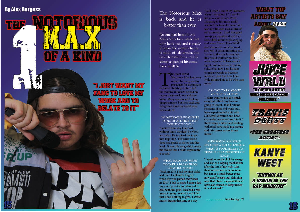
Double page spread:
- I added drop shadow for the colours featured on the right of what top artist say about Max
- I added a quote from my featured article
- I changed “Max” to yellow
- The “By Alex Burgess” I put in a different place and made it white.
- I made the page numbers smaller.
- I changed the positioning of my cover star image on the left.
Reflection:
During the designing of my magazine I have learnt how to use technology to create a professional looking product. It was important to make it eye catching for my audience so that they would be interested in reading it. I did this by using Indesign to add bright vibrant colours and to make words bigger and in bold and in a style which reflected my genre, such as by using drop shadow. I also learnt how to use Photoshop which involves editing photos by making them brigther and changing the colours. For this I think I have fulfilled the brief as I have made sure it is eye catching and immediately recognisable as my genre. One of my lightbulb moments was when I had my photoshoot for my cover star as I had a problem with costume and had to use props from school but actually found costumes which suited my genre perfectly. I really enjoyed picking out the costume and making my cover star portray particular poses. I also liked designing on Indesign as it was creative making it stand out using particular fonts and colours. I found it difficult to sometimes move the words as I would edit them on Indesign to move them up or down and this make it difficult to click back on to it incase if I wanted to edit it. A problem I had was when I needed to upload it to my blog as it sometimes wouldn’t work. If I were to give advice to myself if I were to start again I would say don’t make it too eye catching as it won’t make the key information clear for the audience. Also use particualar fonts that fit with your genre.
Categories
Draft 3 of my magazine


After seeing what I need to improve from my teacher, I have got a few things I need to change and add to help make my magazine appeal more to my audience. I will make sure to apply the improvements for my final draft, so I can have more success when creating my magazine.
What’s new:
Front cover:
- I changed the colour of the font to white and blue.
- I made the main cover star smaller.
- I made the text placement more centred.
- I made “the big three” bigger.
Contents page:
- I changed the look of the font.
- I made the fonts white.
- I put social media in a different place.
- I made the page numbers smaller.
Double page spread:
- I changed the page number to a different colour.
- I added the title of who its by.
What I need to improve:
Front cover:
- Needs a plug.
- Add a date.
- Add an artist with the typeface.
- Make “Max” bigger and in a different colour.
- “The big three” get rid of “the” and make “big” bigger and change the colour of the font.
Contents page:
- Make the cover star black and white featured on the first page of the contents page.
- Make sure the pages featured corrispond with the contents page.
- Centre the words in the middle.
- Change spacing between words and page numbers.
- Add a quote for the cover star on the first page of contents page.
- Check for typos.
- Change the questions so it’s not all about Max.
Double page spread:
- Make the page numbers smaller.
- Organise the boxes with the three stars so they don’t overlap, make quotes bigger and centre them.
- Make photoes look less squashed and make them taller.
- Featured article questions put them in lower case.
- Typo in one of the questions.
Categories
2nd Draft DPS

This is my second draft for my draft feature article. Compared to my first draft, I have added more of the same coloured font, as it will be more clear for my audience where to look at. I also changed the font colours featured on the right side of my magazine, this helps make it stand out for my audience. I also made sure to make the font realitvily the same, so it is not to eye catching and doesn’t stand out to much. I also added my work from my draft feature article. For my cover star featured on the left I made him bigger so this will make stand out as he is a main feature in my magazine.
What I’ve changed:
- I have added my draft feature article
- I’ve made it relatively the same colour
- I’ve changed some of the colours to white for the fonts
- I’ve added the page numbers
What’s next:
- Add who it’s by
- make sure everything is in line
- make sure the page numbers corrispond with my contents page
- change colour for the page numbers
Categories
Chosen adverts
For this post I had to select 2 adverts that will appeal to the demographics and psychographics of my target audience. The adverts also have to be appropriate and to suit my music magazine. I made sure to use 2 particular adverts that are relevent with my target audience.
When designing adverts you have to take into account the Blumler and Katz theory, (information, social interaction, entertainment, and personal identity) within an advert you have to make sure the information appeals to your target audience. For the social interaction if the advert appeals to the target audience then they will show other potential people within the target audience which may also appeal to them. If the advert is entertaining then this will make them more inclined to remember the advert and to talk about it. When creating adverts you need to make sure it is personal for your audience as this will make them more interested and feel that it means something to them personally.
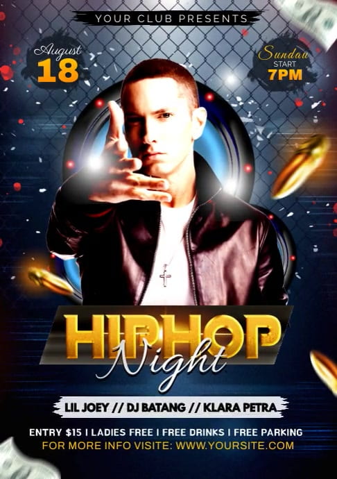
The first advert I have chosen I think works well with my genre of HIP-HOP, as the particular artist conveyed in the background looks gangsta. The artist is also looking straight at the camera which makes him look assertive. He is also recognisable as being a famous hip-hop artist which will act as a hook to my audience. The bright colours also make it stand out for the audience and makes it clear what it is trying to advertise for the demographics of the target audience.
For my second example I chose a HIP-HOP festival poster, this signifies bright colours which makes it stand out for the targeted audience. The words “Woo Hah” are memorable and have connotations of fun. It is also clear with the information on the words being in bold to make it clear for the target audience on where to see the key information.

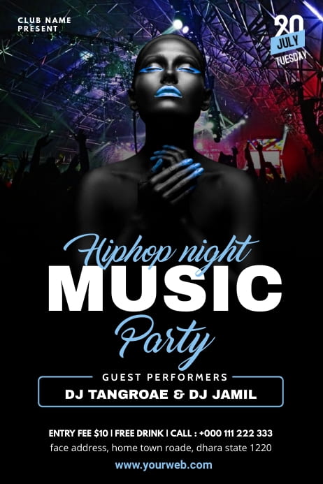
For my third example it features an advertisement of a Hip-Hop night party. I chose this example because I like the particular fonts used as it works well for the genre of Hip-Hop. They also put some of the fonts in bold to make the key information stand out for the audience. They also use bright colours for the fonts, so this allows the information look more eye catching for the audience. I also like the contrast between the fonts, as the words in bold look generic while the words in light blue look sophisticated. This makes the target audience interested in the party.
Doing this particular task has helped me to see how to make my target audience remain interested in what I am promoting. I made sure to impliment this into my magazine and take into account the adverts I have chosen and make sure I follow them so my magazine can be successful.
Categories
Draft Feature Article
Below is my first draft for my featured article, that I will add into my double page spread sheet for my magazine.


Below is a recording of my draft featured article, this has allowed me to reflect on stuff that doesn’t make sense and to amend it in case if it doesn’t. I then had to make a second draft fixing everything that didn’t make sense. I also got given feedback from my teacher on what I could improve upon, so it stands out better fot my audience when I put it into my magazine.

After amending my mistakes for my draft two, this has allowed me to make my article make more sense and to help create meaning for my audience when I have added it to my magazine.
Categories
2nd draft contents page

This is my second draft for my contents page, while doing this it has allowed me to improve on some of the key features I missed within my first draft and help make it more eye catching for my audience. Within my contents page I made sure to use different fonts for my key information and which pages it will features in. I also didn’t use too many fonts, which helps makes the key information stand out. I didn’t use too many different colours, so it is easy for my audience to see the key information. I also added the social media featured in my magazine which helps make it more authentic.
What’s new:
- I have added page numbers
- I have added the key information within my magazine
- I made the coverlines in the same font and colour
- I have added my social media
- I used a new coverline for my model
What’s next:
- Try use a different colour for the font or the background as using the same one doesn’t make it stand out as much
- I will try and make the image smaller on the left and add a coverline.
- The image on the right I will make it bigger to make it stand out for my audience.
- I shall move the social media as it’s in the way of the key information.
- I will move the key information and the numbers to make them in-line.