Chosen Adverts

These are the two adverts that I have chosen:

I have chosen these two adverts as I feel they are the most appropriate for my target audience.

Here is my dating profile for my ideal target audience member:

I have chosen the Starbucks advert as I feel that my target audience would be attracted too this advert. It also fits in with the bright colours of my contents page. It also fit’s with the dating profile I created prior to choosing the ad where I have written that my target audience member enjoys basic and simple things. Starbucks fits into this bracket.

The reason that I chose the H&M advert was because I felt it was simple and attractive and show’s the look of the stereotypically attractive woman, which my target audience would be aiming to achieve. I have also identified that my audience would have an interest in fashion and style, naming places they shop such as NEXT, ASOS and I had even named H&M.


Complete Magazine Draft 3

Above is my complete third draft for my music magazine:

Filmed feedback below:

In the video, the feedback I was given was to improve my magazine according to AIDA and creating more desire with pull quotes, changing some colour too be more appealing and resizing text to be more readable when put up in a shop.

Targets for Front Page:

  • Create a outer glow around Star Image
  • Make the text in the rainbow easier too read
  • Add a price to the front cover

Targets For Contents Page:

  • Add more articles
  • Change background colour.
  • Move image of Double Page Spread star image.

Targets For Double Page Spread:

  •   Limit to only three fonts.
  • Make sure all shades of red are the same
  • Remove hyphons

2nd Draft Of DPS

Things that I have changed:

  • Increased size and emphasis of masthead as to show off the design.
  • Added magazine cover masthead too DPS.
  • Increased size of cover star as too fill in the black page.
  • Added columns and changed the font for the main paragraph in order too fit the usual convention of an average magazine double page spread.
  • Added page numbers.


Things to change:

  • Next I would like to add more graphics too the page in order to drive more attention to the page. I feel as in it’s current state it would seem too bland.

2nd Draft Of Contents Page

What I have changed:

  • I have added more images in order to complete my minimum of four images.
  • I have removed the rainbow from the bottom as too make the page feel less cluttered.
  • I have cut out the star image and placed him at the bottom of the page.

What I will change:

  • The of the text as it isn’t very attractive too the audience in AIDA.
  • Addition of more features in order too create a call to action.
  • Pull Quotes in order for more desire too continue reading.

2nd Draft Of Front Page

What’s New:

  1. A Bar Code
  2. A Price
  3. A Publication Date
  4. Changed font’s and colors of cover lines.
  5. “PLUS!” on the rainbow.

What’s Next:

  1. Play with colours of text as well as size.
  2. Add a outer glow to star image.
  3. Make the Masthead stand out more.
  4. Drive more Attention towards the magazine.
  5. Give text a drop shadow to be more attractive to the audience.

Second Shoot Contact Sheet(s)

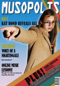
These are the contact sheet’s for my second photo shoot. For my second photo shoot I had Georgia Mae modelling. I decided too go off location for this shoot for two reasons. I felt I could achieve a unique image by taking images in the evening/ night light. I also felt that a location such as Grande Roque would create a interesting backdrop for the images. I am very happy with the photo’s except for some have come across blurred or are not fully in focus. However with the wide range of photo’s I had taken it was easy too choose a photo that I felt was appropriate for my double page spread. For the shoot I had too costumes. The first costume was selected as a brighter more fun costume too suit the stereotype of POP, the second outfit was a batterd suit, which I selected due too the fact through researching POP artists, many tend too go through a darker or more edgy phase, for example:

Four photos that I felt were most affective for my double page spread were:

I felt these four photos were my favourites because they all displayed the artist clearly. I especially like the first one as I feel it would be striking for the viewer and allow a lot of room for the article too be written around it. I like with the second one how the scarf flows from the camera too the model and I love the rainbow across the face of the model in the third image.

In future when doing photo shoots I will ensure that my photo’s are less blurred as on many occasions when taking this shoot, I had not got the camera settings prepared. This is something I would like too work on.

Production Meeting Agenda For 2nd Photo Shoot

This is my production meeting agenda for my second photo shoot. This will ensure that I am prepared for my second photo shoot process. I have elected to do this photo shoot off school premises and in my own time. I have successfully prepared costumes and props and are prepared with lighting equipment if we run out of time with the sun. This should ensure that everything goes to plan with my shoot.