Social Media Page Draft Two

For our final draft of the Social Media Page, we felt it was very important to rectify some of the errors we had made in first draft of our SMP. For example, this is the lack of captions below our posts. Click on the image below to see our SMP.

What’s Changed:

  • We now have posts within on our Highlights, for example the Star Image’s values and thoughts on the environment and explanation of some of the symbolism of the Phoenix.
  • A Kaleidoscope highlight with all the posts relating the Kaleidoscope album.
  • A Tour Dates Highlight, detailing all the places our artist will be going in 2023.
  • An updated website showcasing some of the merch that our artist is selling.
  • Better images of the CD case.
  • Removed some of the images/ videos that were perhaps unclear.
  • A post detailing some Cross Media Convergence, using The Matrix Awaken as our example.
  • Adding captions to all of our posts.

Reflection:

I believe that we have now completed all the relevant criteria and conventions necessary for our SMP. I believe that the Social Media Page has gone very well and we have included extra features to get the audiences attention such as a website and examples of cross media convergence and synergy. We have also now created a call to action through having information on how to purchase merch underneath the posts etc.

Social Media Page Draft One

Now that we have successfully created both a Digipak to represent the themes of our Album and a Music Video to help advertise the album. We must now create ‘Riff Rife’ and give him a personality of his own in order to successfully market and advertise to the audience a personal identity (Blumler and Katz), and give them a deeper understanding of Riff Rafe as a Star Image, including his ideas and belief’s in order to encourage them to purchase our products.

Screenshots of Draft One:


Self Assessment

This is the feedback we received from our teacher on Draft One of our SMP.


What’s Next?

  • We will add content to the Highlights such as information on what is coming up in ‘Kaleidoscope’.
  • Adding captions to our posts.
  • Fixing some of the posts which are not up to our quality.


Reflection:

I feel that through completing this task I have realized exactly what my SMP page is missing and just what I must complete next in order to successfully have all the features of a conventional SMP. Moving forward, I’m going to be aware of including synergy, cross media convergence, and captions. I must also complete the website so that it is fully Riff Rafe oriented.

Final Digipak Draft

Below is the final draft for our Digipak:

Kaleidoscope

By Riff Rafe


What’s Changed?

  • We have removed some of the boarder from ‘Riff Rafe’ on the front cover in order to make it easier to read.
  • We have turned the back inside cover, to be in the shape of the CD.
  • We have re-planned how we lay out our information on the back page, as to make it feel less crowded.
  • We have also added the multi-coloured stroke to ‘World Of Fiction, as to have one on either side of the Phoenix.
  • We have added a title to the spine so that it can be read in a shelf of CD’s.

Reflection:

I am very happy with how the final draft our Digipak has turned out, I feel that we have successfully communicated the conventions, ideas and values of EDM within our Digipak.

Digipak Draft 3

Below is the third draft for our Digipak.


What has Changed?

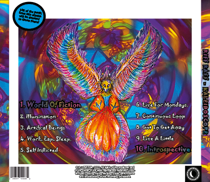
  • As planned we have changed the colour and font of the masthead and name of the Star Image. We have decided in purple as it is a very popular color in the genre of EDM, fitting with the conventions.
  • We decided on this font as it felt the most hand-written whilst still being easily read.
  • We have made the decision not to place the text over the bird’s wingspan as this looked poor and have instead elected to have the song list down the side. This is what it looked like previously:
  • We added the barcode, charity message, record label logo and copyright information.
  • We decided to give ‘Introspective’ a special coloured gradient as to show this is our most important song.


What’s Next:

  • Still am not entirely happy with the masthead or star image name, more adjustments I feel are required for that.
  • I would like to spread out the barcode, record label logo, copyright information, and charity sticker as I feel it is all too bunched together.


Once we had finalized the third draft of our Social Media Page, it then became important to see how it feels when placed within a CD case.

In completing Draft Three it has given us the opportunity to ask others what genre students think our Digipak cover fits into. These were the results:

Digipack Mockup draft 3

We have had a very positive result when looking at the votes for what genre our digipak cover fits into, with Trance in the lead and EDM just behind. This shows that we have successfully used the correct conventions for our genre.


Reflection:

As we are now on the way to our Final Draft, I am very happy with how the Digipak has turned out and I also feel I have learnt many skills in regards to Photoshop and InDesign, and that our Digipak is very in keeping with the conventions of EDM. With only a few changes to be made, I feel we are very close to our final draft.


Timeline and Marketing Ideas

As we begin to plan and layout our social media page, we must begin to make a timeline of what our artist will be posting and how he will market the brand in which we are creating.

Please click on the image

Reflection:

When planning this social media page many theories about marketing came to mind and helped us when considering how this social media page should be layed out. One of these theorists was Gauntlett, who claims that we audience members have a fluidity of identity, a constructed identity, a negotiated identity and a collective identity. Constructed Identity suggests that we use media to construct our personal identity, so in realizing this we have attempted to portray ‘Riff Rafe’ as a fun carefree person who lives life to the fullest, we hope that our target audiences will take this aspect of his identity and adopt it themselves.


Digipak Draft Two

Below is the second draft of the Digipak:

What has changed?

  • We have added the masthead and the name of our Star Image to our front cover.
  • We have created a yellow boarder to the front cover as to allow the Digipak to feel more fleshed out.
  • We have added the inside covers, first one is a distorted image of the protagonist from out music video, the second being a fate recreation of the cage inside the person’s head, with a wingspan similar to the phoenix. This is where the CD itself will be placed.
  • We have removed the white colouring from the Phoenix, this feels much better, and allows the colours to be much more effective.

What’s Next:

  • We are currently unsatisfied with the colour/ font of the masthead, so we will explore more options for Draft 3.
  • We must add the song list to the back cover, we are planning to place this down the phoenix’s wingspan.
  • Another addition to the back cover includes information on how proceeds from the Digipak will be going to a charity called ‘Green Peace’.
  • Other additions to the back cover includes the record label logo, a barcode and copyright information.

Reflection:

I feel this second draft has changed the game from the first draft, the digipak already feels much more fleshed out and closer to completion. The back cover feels much more striking and in fitting with the conventions of EDM has used bright neon lighting. For the masthead we have curved the text to fit around the kaleidoscope pattern, this feels striking and I am confident with this effect. I feel our InDesign and Photoshop abilities are becoming more and more refined as we reach our third draft.

Digipak Draft One

Below is the first draft of our Digipak front cover:

The main thing in which we have done here is that we have manipulated the image so that both the photography of the kaleidoscope’s pattern, and the main illustration of the phoenix breaking free from it’s cage can appear together in order to create one image.

What’s Next:

  • Next, we must begin work on the inside covers, and the back cover of our Digipak.
  • We must put text on the front cover in order to create a Masthead, we aim to do this with a font which looks like it has been written rather than typed as to fit with the hand-drawn aesthetic that we have portrayed so far.
  • The front cover feels a little empty at the moment and we plan to add something around the sides such as a pattern in order to make the album cover feel more rounded.
  • We must fill in the between the spines for the inside covers.
  • The back cover with the phoenix feels wrong, we attempted to place a white coloring over the phoenix, in speculation that it may make text easier to write for when it is placed, however we feel this doesn’t work in execution

Reflection:
I am very happy with how the Digipak is appearing this far, and in re-learning my abilities within InDesign and Photoshop from the creation of our Music Magazine, I feel that I am going to be more efficient in this digipak’s cover than previously with the magazine.

Audience interaction with a social media page – an analysis

In order to further understand how an audience interacts with a social media page, it was important to study real life examples of EDM stars. My partner & I studied the social media page of DomDolla, and we recorded a screencastify outlining what we found.

Reflection:

It was very difficult cutting out a lot of information of which we discovered about audience interaction with a social media page into 6 minutes of footage. For example, the importance of AIDA within a social media page and how artists have to attract the attention, interest and desire of a prosumer before the prosumer will then take their call to action. When creating our social media page it feels important to make use of these gratifications. Domdolla also makes an effort to show how fun his life and how fun of a personality he is, this allows for people to find a personal identity within him, we hope we can reflect this within our social media page by posting videos festivals, travelling and our star image having a good time, it is also important we convey this in a way which will be appealing to our target audience. Another factor which is very important when we create our own social media page is that we successfully market our album and our star image as a whole, we will do this through posts of posters and artwork/ trailers relevant to our album titled ‘Kaleidoscope’.

Social Media Page Terminology

Now that we are beginning to create a social media page for our star, it is important to look at how real-life stars present themselves online so that we can accurately understand the conventions of a Social Media Page. For this task I studied Marshmellow’s social media page as he is an EDM artist.

Reflection:

When studying Marshmellow’s social media platform, it becomes quickly obvious that he uses his social media page in order to promote his art to his target audience, and to allow his work to reach further audiences, whilst seeming just like everybody else. Within the social media page he posts photos with other influencers, in order to create awareness of each other to each other’s audiences. Another relevant factor is that he further ensures to now show his face throughout his page, this is important for both his brand and fitting in within the conventions of EDM where the artist comes after the art. There are also other conventions of EDM seen within the social media page, such as bright neon colours and trippy visuals. Another convention within artist’s social media page’s seems to be them at concerts having fun or performing. This can be seen within Marshmellow’s social media page.