Here is my contact sheet for my second shoot

Here is my contact sheet for my second shoot

click here
Copy of Production Meeting Agenda
Creating this Agenda helped me massively to have everything organised and to plan my second shoot efficienly. This also helped my model as they could just look at the Agenda and see exactly what equipment and clothing they will need for the day. On the plan I also included some inspiration photos so we will both have a rough idea of what our photos are going to look like.
Orlagh has now decided to take her music career to the next level as she is becoming one of the top Indie Pop stars of this century. As her extraordinary music escalates with fame it was her decision to go on tour with her newly released album. With this thrilling news, Orlagh is overwhelmed with excitement as she has decided to pair up with one of the most famous stars in the music industry and collaborate and go on tour together with them. Orlagh states “I have never been happier to be in such a good place with my music career and being joined by one of the most incredible stars of the music industry to go on tour with”. With her new tour being planned, this has been a hard decision for Orlagh as she has struggled a lot throughout the years with getting used to the fame and this has not been easy for her. Here is a bit of a back story behind the scenes of fame and how this amazing star became so popular. .
Growing up Orlagh lived as an ordinary girl in a small home town with a strong passion for singing and songwriting. Although she kept her music hidden, as she grew she began to perform in live gigs in pubs, small festivals, and any opportunity she could get to show off her music. After hours of hard work and small performances she finally got recognized by music producers and was asked to be taken on and was given a record label. This was when her music career started to build. After her first single was released her fame went up. Thousands of people recognised her and were inspired by her music. While her single reached the charts, she thought it was time to create an album. She did her first ever tour with her first album and tickets were sold in hours. Although after her first tour things went downhill.
On top of all the love from her fans Orlagh did get a lot of hate towards her.This was a struggle for her as she wasn’t used to it and became famous so quickly there wasn’t much time for her once she became so popular and busy. From being so busy on tour and making music she was getting overwhelmed and went into a dark place. She put her music career on hold which her fans were devastated about but for her, personally it helped her massively. From all the support and help from her family and friends one day Orlagh decided to take a turn and get back to her passion. When getting back to what she loved Orlagh stated “Although I was in such a dark place for so long, I couldn’t be happier to pick myself up and get back to the one thing I love”. Her fans and family were over the moon and were eager to hear what they had in store next for them. After coming back, Orlagh raised millions of pounds for charities that she loved and supported. Mental health charities were a priority for her to raise for as she said “I would never want anyone else to feel the darkness I felt and lose the love they have for their passions. So this is why I am raising money to help the ones in need”. Many, many people were inspired by her incredible work with not only music but raising money for people struggling.
After all this hard work Orlagh got together a new album which has now been released and is going on tour with it in 2023. Rosie wants to inspire and promote the Indie Pop genre and show how incredible and unique her music is and inspire the other people out there. To find out more about Orlagh’s world tour in 2023 and find out about tickets, turn to page 14 in this magazine and get ready for the announcement of the new star collaborating with orlagh!
CONTENTS PAGE PEER ASSESSMENT
What type of shots have been used to create a variety of shot distances and how has the camera been used to communicate meaning?
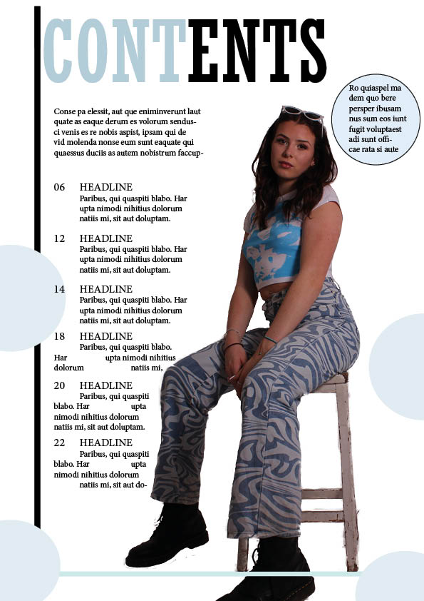
A mid shot is used in order to capture both the position of the model as well as the chosen costume to convey its relation to the genre. This demonstrates an understanding of positioning and lighting which results in an image that is conventional to the indie pop genre with a clear display of body language.
What choice of Mise en scene is appropriate for the star image and genre?
The outfit worn by the starn is simple patterns and is appropriate for the indie pop genre. It has light blue tones which complement the colour scheme of the front cover. Lastly the positioning of the model is using the rule of thirds and gives a strong star image.
How far is the font used readable and reflects the genre
The bold, sans serif font is clearly legible and generates an aspect of volume representative of the music found within the genre while the placement of these fonts does well to highlight features in the front cover.
What technical conventions of a Contents page are present and used effectively?
There is no strong lexis used within the headlines that is conventional to the genre and all conventions of a content page, instead there is fill text. However there is good use of contrasting colours of darker and lighter tones of the headlines and heading.
How has Indesign been used to layout the page to convey a brand
The layout of the page has a generous appropriate amount of space for headlines and body text. The space left available has been maximised in order to create a fulfilling front cover without too much going on which could draw the reader away.
How well have the text and visuals been integrated together?
The colour palette of the images and text parallel nicely with contrasting tones and there is an appropriate amount of space consumed by both text and images ensuring one is not overpowering the other.
Where has photoshop been used to manipulate the photos to enhance the star image or genre?
Photoshop has been used to cut out and place it in indesign, it is a bit rough around the edges resulting in a less professional look however the placement and lighting used is fitting for the genre as the star image can be seen clearly boosting the star image.
How is the language used appropriate for the genre and target audience?
The language is not yet written however I can tell the target audience will be able to identify the genre through the conventional norms of indie pop included in the front cover.
2 slides on planning a contents page
5 Catchy Headlines
Reflection
The Contents page helps the reader navigate a lengthy book, magazine, report, and other documents that have multiple chapters. A contents Page gives the audience a wider knowledge of what the magazine will be about and whether they should read on. It is a really important factor within a magazine and this is why its key to make it to the best to your ability. This is why looking at previous contents pages and selecting ones we like is so important as it gives us inspiration and ideas on what to include in our own magazine. Contact sheets may seem like a small aspect of the magazine although it is a very necessary part as it gives crucial information to the audience. It is usually near the very start of the magazine as it contains all the important information and helps the reader navigate and understand the text they are reading. The headline is one of the most important parts of any piece of writing within the contents page of a magazine. This is because its the headlines job to engage the audience and capture their attention so they ignore other distractions and want to find out and read more about your magazine. The headlines draw the reader in and give them small snippets of exciting information on what will be included in the magazine or a small fraise to engage them in so they know where they are going. To have the best headline it needs descriptive language, be eye catching to the reader, create interest and desire towards the audience and be exciting and help set the tone of your magazine. They help the reader determine whether its their sort of magazine or not just by looking at small but also descriptive headline.
reflection
We chose 10 different magazine front covers that we personally like the look of and ones that we may like the fonts, layouts, graphics and photo manipulation. I chose ones that have features that inspire me to recreate and use in my own personal magazine cover. All of my 10 photos I chose all include a lot of bright, popping colors. I find color is a key thing depending on your theme as it draws attention to the audience as it stands out. Another thing all these magazines have in common is mastheads. They all include at least one big bold heading which gives a brief look into what the magazine will be about and what genre. Each close up picture of the front have lots of detail to which makes it busier and more appealing to the audience. The more detail the better especially on the cover star as it makes the cover more exciting and stands out more. All these covers have given me inspiration into what I may want to include in my own and different features that are important to include to have the perfect target audience.
For my next draft…
On my next draft I am planning on making some changes to the design and adding some more features to make it stand out as much as possible. I rushed this first draft so I have quite a few new ideas I am planning on including in the next. One of the main features I am thinking of changing is the masthead. I feel like the one I used in my first draft is very basic and simple and I could include a more unique and exciting one to attract the audience. I am going to explore some different fonts and see which ones work best. The masthead is a very important feature within the front cover so I am also planning on maybe changing the name of it. I feel as though a one word masthead would look better on my magazine rather than two as it will make the masthead stand out more and look more appealing to the audience. The name I already have is quite basic so I would like to change it to something with more power and more importance.
Contact sheet and best photos

Reflection
Here are four of my of my favourite images from my shoot and a selection of photos on a contact sheet. A main reason on why I chose these four images are as her body language and facial expressions work perfectly for the front cover image as they are confident and edgy which fit the indie pop genre. Expression and body language is so important for the cover star as this is the main design feature on the magazine for attracting your audience. The calm and warm colours of blue, pink and white convey and represent the genre indie pop. With light, quirky colours within the costume will give a good idea to the audience on what genre the magazine may be about. This is important as the cover star is the main feature they focus on especially on costumes, features and props. By narrowing down our 100 images into 4 helps us choose which one we want to use for our main cover. By looking close at features, lighting, body language and angles are the things we need to look for within each picture and which ones tick each box.
Overall I feel like my first shoot went really well and I am extremely happy with the photos. They match my genre perfectly with the outfits, props, colours and body language. When going into my shoot I had everything planned out including what props I was using and specific angles and poses I wanted my model to try out for the shoot. I am very pleased with the outcome and I’m excited to cut out my pictures and include them in my magazine.
Reflection
Mastheads are one of the most important design features of a magazine cover and this is why its important to find the perfect one to fit with your genre. They convey the mood, tone and brand of the magazine. Having a catchy masthead is important as it will bring interest to the audience to get them involved and to read more. A main headline gives the audience a good idea of what the magazine may be about and what genre it is. This is key as the readers can clearly see weather its their sort if magazine or not just from looking at the cover. It is the first thing they spot so you should make it stand out and attract their attention as much as possible. Having different options to choose from is easier as you can find which one ticks all your boxes for the perfect one. This is why we made a list of a few of our favourite ones on InDesign.
I feel as though my favourite headline out of this list may be the 3rd down. I like this one as its elegant and soft which conveys the genre indie pop. For my masthead I am also contemplating whether to think of a different masthead name and have one word rather than 2. I prefer the idea of 1 word as I feel like it will go more with my front cover and stand out more to the target audience.

Reflection
When doing a photoshoot its a good idea to have a detailed plan of what you are going to include and the equipment needed within the shoot. This is why I took some time to thoroughly think through and plan what I need for my shoot. I planned exactly how I want my model to dress and wrote down who’s responsible for bringing what so everything is all organised. I needed to think about exactly what I need to capture and take the perfect photo for my front cover. Also thinking about how I am going to portray mise-en-sense through my model.