
component 1
Question 2: How does your product engage with audiences and how would it be distributed as a real media text?
Draft your ScreenCastify commentary:
Introduce your magazine, name, genre…
Off Beat is the name of my magazine, the genre is Indie Pop and within it it includes a range of info about famous Indie artists and exclusive articles on some of the newest artists this year.
Describe your brand values / quote your mission statement?
In ‘Off Beat’ we aim to have an inviting, creative and interesting magazine cover to attract our perfect target audience. Our cover should give the audience a good idea of what our magazine will have in store for them. This includes latest news updates and interviews with famous indie artists to get the audience to feel involved and catch their attention. This is only a fraction of it! Off Beat is a creative and unique brand that wants to create the best possible music magazine for the perfect target audience. Having an amazing magazine cover gives a massive advantage as this will attract and stand out to the public as it’s the first thing they see. In this magazine we have a whole new upgrade with some of the most famous indie artists and hearing all about their success and career along the way. This is a whole new way of getting fans and followers to come along on the journey and to read on!
Who are your target audience?
My perfect target audience may be aged between 15-25 and predominantly female. Mainly interested in fashion, music and have a strong liking for the Indie pop genre. They may also be interested in Indie artists for example Billie Eilish and Lana Del Rey as these artists are featured within my magazine. U Gov was a very useful site when figuring out our target audience. It showed us a good percentage of what sort of age range people listened to certain artists and genres which helped us massively when figuring out what sort of ages my magazine will be attracting.
Why would that audience buy your magazine?
When producing my magazine I needed to think about the uses and gratification of my target audience member. I wanted to make sure my audience could be involved with discussions and contribute to conversations regarding my magazine. By understanding what will grab my audience’s attention and make them feel intrigued to read my magazine was key. Looking at the different features to attract my audience was very important when planning and designing the magazine. AIDA stands for attention, interest, desire and action. You had to always be aware of AIDA and think about it when producing our magazine. By finding the correct age for my target audience then looking into what their interests are was a major thing to remember and look at when designing. By looking at colors, mastheads, cover lines, artists names, these were all prime things to think about to see whether they fit the gratifications of the audience member. The main focus of your magazine is being able to sell it, and being able to sell it means you need to attract the correct people. Due to my magazine being Indie Pop, obviously the people who I want to attract will be people interested in this genre, so by using the color scheme of Indie and Indie artists will clearly grab their attention. Headlines and cover lines are crucial for your front page. This is what helps people decide whether to buy your magazine or not as this gives small bits of information about what the magazine will have inside for you. If your front cover isn’t appealing with boring information and a dull appearance then this will not reach the requirements needed to attract your audience.
Who would you want to work with to distribute your magazine?
Conde Nast would be my perfect distributor to work with for my magazine. They are well known, and a popular distributor with some of the top magazine companies in the world. These include Vogue, The New Yorker, Vanity fair and wired. By working with Conde Nast I would be able to promote my magazine to the world and connect with the music industry in many ways. In a lot of their magazines the style of them are very similar to my magazine. A lot of their magazines have the same vibe and feeling to mine with a good display of colors and designing.
What sort of advertiser would you hope to attract?
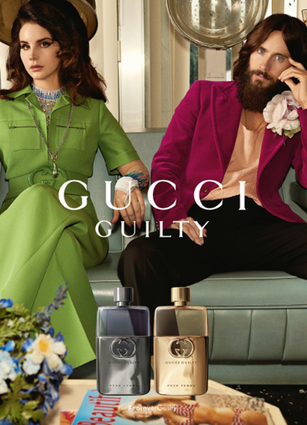
When choosing my adverts for my magazine I needed to think about my audience’s demographics and psychographics to see what sort of ads will grab their attention and to see what they are interested in so I can apply this to when I chose them. My first advert was an Urban Outfitters Advert. I chose this advert as this brand was very popular to the “Indie” style and was a common interest within my audience’s likings. Urban Outfitters is a well liked and fashionable global brand which matches perfectly with my magazine genre with the bright, popping colors and eye-catching cover. By attracting the Urban Outfitters advertiser would be great to promote my magazine to the audience while also promoting a popular brand at the same time. My second advert was a Gucci advert featuring Lana Del Rey. The reason I chose this second advert is because Lana Del Rey is a famous Indie artist in the music industry and very popular within my audience demographics. This advert also fits perfectly with my genre as it’s promoting a world wide famous perfume brand while featuring a famous Indie star.
What strategies do you have for distribution? How will you link your print content with online content? Have specific ideas, examples, stats and facts to back up your proposals.
When thinking about what strategies you have for your distribution you need to have a good range of specific ideas, examples and stats and facts to back up your proposal. You need to try to get the best possible sales and promote your magazine in the best possible way. My age range for my magazine is very into social media which means I can promote my magazine through ads and talking to friends online. I can also use social media to advertise my magazine and the freebies that come within it when you buy. Having small interesting parts of the magazine being advertised on the media like instagram and twitter for example latest news about artists. This will catch the reader’s attention and will give them a taster of what the magazine includes.
Question 3: How did your production skills develop throughout this project?
Still need to upload recording
Dear future A level media student,
I’m Belle, an A level media student. I am going to talk in detail to you about what you will learn in media studies and the important technical and creative features you will learn when doing this subject. I am going to tell you about all the different skills you will need and different softwares you will be using throughout the year, such as Bridge, Photoshop and InDesign. You will also be expected to acquire some production skills which include Technical, creative and transferable skills.I will be talking about my experiences with these softwares and features and what other skills you will be using.
From the minute you start media studies, You will be learning lots of technical skills throughout the year. The first project you start with in year 12 is designing a music magazine. Although you may think it’s just designing a magazine, It’s not as simple as that. The three main software’s you will be using to produce your magazine are Bridge, Photoshop and indesign. Firstly you will start by having your own blog to upload your work on. On your blog you will be posting your work and including reflections underneath explaining what this blog post is and what you have learnt. Another important factor you will be learning in your blog is embedding JPEGs and PDFs. These links help you embed your posts so you and the examiner can easily click on them and see your posts clearly. Once you have taken your photos and uploaded them from your shoot it is now time to start photoshopping. Photoshop is a great software when editing and cutting out your star to then be placed on your magazine. The Select and Mask tool is Adobe Photoshop’s powerful selection tool with advanced mask refinement options. This is the main tool I used when using photoshop. It gives you complete control over your layer mask and allows you to precisely define the edges of your selection.
Within creative production skills you will also learn lots of skills to do with design, makeup, Mise en scene, photography skills and body language. These were all included and made an impact when doing photoshoots as these are important features which are also involved when making our magazine to attract our target audience. When doing my shoot I made sure to include a range of props and accessories. The photos with the accessories and props were by far the best photos as it allowed the star to represent the genre and convey the sort of person they were through Mise en scene. Body language was also a key feature to think about when doing a shoot. By the use of chairs, stools and other props these helped position the star without feeling awkward and made them look relaxed and natural. Face expression is also something to think about when photographing your star. Depending on your genre it is up to you to help the model and direct them to what emotions and expressions you want them to use when shooting them. This is important as your star is the first thing the audience will see when looking at your magazine.
You will also learn to use a range of transferable skills within this course which you will also be able to use not only in media studies but in other aspects of life. For example writing, listening and responding feedback, software skills, planning shoots and reflection and evaluating writing skills. These are all important transferable skills that you learn to use which can prepare you to use them in future life if needed. When it is time to do our main shoot, it is important to plan so you know exactly what you are doing and what equipment you will need. By making sure the model was organized and we had all the equipment needed we made a production meeting agenda. By making one of these insured I had everything in place ready for my shoot. It helped me by remembering props, what makeup to bring, clothes and any other equipment we were going to use or need. In total we made two production meeting agendas for both shoots as they were extremely helpful. It was all placed in a simple table which I would fill out then give to my model so they can tick off and make sure they have everything ready for the day of the shoot.
Overall media studies is a great subject to take especially to work and develop your technical, creative and transferable skills. If you have found any interests in anything I have talked about, I recommend taking media studies.
Question 4: How did you integrate technologies (software, hardware and online) in this project?
Chosen Adverts
I have chosen two different adverts for my magazine that would attract and interest my target audience. I used my audience profile to find ideas and inspiration to take into consideration when choosing my adverts. For my magazine I chose to pick 2 adverts that was suitable to my magazine, for example using companies or artists that were featured within it.
For my first magazine I decided to choose an advert for a popular clothing brand as this specific brand matched the demographics when finding out my perfect target audience. This advert targets my audience of people who are interested in the brand Urban Outfitters and fashion. This specific advert contained audiences of the same age demographics that were interested in this specific brand. This advert also fits the colour scheme of my magazine with the bright and vibrant colours contrasting against the other page.
Advert for page 2
For my second advert I used a Gucci advert which featured Lana Del Ray. This was conventional to my magazine as Lana was featured frequently within my magazine due to her being an Indie artist. She was also one of my audience members favourite artist so this was important as this advert will attract their attention.
Advert for page 6
Complete Magazine Draft 3

Refection
Whats new?
- I have changed the background colour to a lilac purple
- I have added lines between the cover lines to separate everything out and make the magazine come together
- Moved around the stars name to underneath the masthead
- I have taken away the writing along the right side as it was taking up too much room so I replaced it with more relevant and smaller text
- added small features and details like fading lines on the side between the masthead and star name
Whats next?
- I am planning on playing around with different fonts and changing the text around
- I need to enlarge the writing to make everything clearer for the reader
- I am going to add some shadows to my model to make her stand out and look more professional
- add page numbers, dates and prices to the cover
- correct spelling
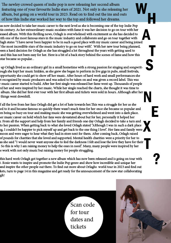
2nd Draft of Double Page Spread

Reflection
Whats new?
- I have now changed the placement of the writing “whats new” and changed the writing to having it in a straight line down instead of the water fall effect. I feel like it stands out much more and the heavy block writing makes it much easier to see.
- I have moved the small cut out picture to the left side of the page. I have been planning to change this and I feel like it looks much better here and brings the page together more.
- I have moved the article into columns which spaces everything out more.
- The barcode and scan code bubble I have now moved to the left side of the page with the small photo above it.
Whats next?
- Now that I have moved the barcode and small photo, there has been a gap left on the bottom right. I am planning on either getting a catch fraise or another quote to fill the gap here.
- I am going to re arrange the placement of the text in on the left side of the page as it needs to be spaced out better.
- I also need to make the intro of the article in the blue box much bigger and bolder.
2nd Draft Contents Page

Reflection
Whats new?
- I have moved around the layout in order to fit more content
- I also did this to fit more page numbers as it is important to have a good, strong amount of pages so the audience think the magazine is worth buying
- The pink background adds vibrance and excitement to the page with the blue circles bouncing off it
- On my first draft I had place holders in place of where the writing will be and I have now changed these
- I also got rid of the box of place holder text at the top as there was no important content I needed to include in it
Whats next?
- I am planning on making the writing more bold and vary the sizes of text compared to the subheadings so they stand out more
- I am going to change the circle with writing in at the top and move this text to my double page spread as it works better and makes more sense to be there instead
- I need to be careful not to make it too crowed and maybe add some text boxes or lines to separate the writing
- I will also add some text at the top giving the reader the smallest bit of info about an exclusive article to catch their eye and want to read on
2nd Draft Front Page

Reflection
What’s new?
- I have moved around and added more text as this has made the magazine more full and appealing to the audience
- I found my masthead too basic on my first draft so decided to change it and use a more stronger and bold font and a more catchy headline.
- I have changed the placement of “The new star off indie pop” as it was too small and by placing it along the side makes the magazine more full and eye-catching to the reader.
- For “album review” I had a play around with different fonts and make the lettering different shapes and sizes . I think it makes it more unique although it may look like too many fonts on one page
Whats next?
- I think for my next Draft I need to minimise the writing on the side and make the masthead a lot larger as this is a very important part of the front cover.
- I am also going to make the masthead more bold and colourful so it pops and looks more appealing to the eye
- Overall I am going to make all the text much larger and try include more colours to the text to make it look more like a magazine
- I will also add more features to fill up any unneeded space so the magazine will come together
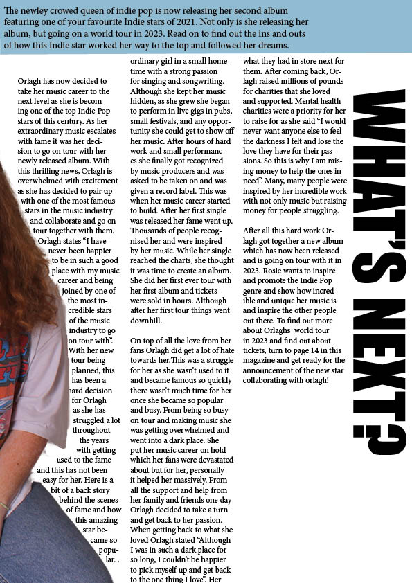
1st Draft Double Page Spread

Reflection
What I like
- I am happy with the placement of my page with my stars name and heading on the left and a quote underneath her name
- I also like how I have spaced out my article and not cramped it all together, it is nicely spread out with a small stand first above it in a separate box
- The writing down the side as a small heading works well as it is unique and gives the reader a sense of excited to read on to see whats happening next
What I will change/need to do
- I am either going to add a second quote beneath the one underneath the title or I will move the small cut out picture of Orlagh to the left and leave one quote
- I am also going to move the article and Orlagh further apart as I can’t have it too close to the cut in the page
- I am going to arrange and add more text or images to the bottom right beneath the article to make it more busy and fill the gaps