Final CCR Essay

Critical Reflection Essay:

  • How do your products represent social groups or issues? 
  • How did your research inform your products and the way they use or challenge conventions? 
  • How do the elements of your production work together to create a sense of ‘branding’? 
  • How do your products engage with the audience? 


While researching to find the key conventions of music videos in the indie genre, we looked at previous famous music videos to reflect and catch what the similarities are between videos and the main conventions included. We found many similarities between videos, all within the alternative indie genre. For example some of the main conventions the videos incorporated were editing to the beat of the music, distinctive props and unique makeup and clothing. One artist which is part of the indie genre is Billie Eilish. We looked at her music videos and captured some of the main conventions included in her videos which were required to catch the audience and their attention. For example her videos have a deeper meaning which is significant to the song lyrics. This stood out to us and gave us inspiration to follow a similar pattern with connecting the narrative to the lyrics. She also includes a lot of close up shots within her performance clips. We wanted to use some of the generic conventions that we recognised in the previous music videos to grab the attention of the target audience.

Within our music video, we acknowledged and recognised the formal and general conventions that needed to be included to make a good music video.  Conventionally in music videos the narrative and lyrics echo the theme in the narrative through amplification, illustration and disjuncture. We used the narrative to tell a story of a broken girl who murders her cheating boyfriend. This storyline fits the expectations of the audience and what would grab their attention. We kept the formal and general conventions of indie alternative, particularly the costumes of our model in the performance clips and how the star is represented particularly through Mise En Scene. We used Mise En Scene to indicate her moods and the disposition of the setting. We particularly imply this with the lighting in our video. Subsequently after killing her boyfriend, the lighting in the scenery drops to a dull, eerie, lowkey light. This portrays the model’s mood and feeling which instantly changes to a side of darkness and sinfulness after killing her boyfriend. Within the alternative indie genre, there is always a main issue or theme, usually a problem or relationship and we incorporated this strongly within our video.


A successful package is required to have a good representation of the star in each and every product. Our star Orla,  is represented as the rising star of alternative indie, acting as a radical feminist and an independent woman with strong beliefs. Her angelic, elegant and independent characteristics formed in her identity are strongly shown through our procuts. She is known for her seductive attitudes and behaviour as well as her unique fashion sense and extraordinary identity.

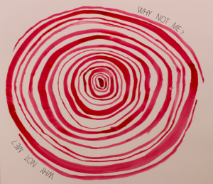
We wanted our star to be represented for her unique style and to show off her extraordinary identity within our digipak. We wanted to portray this by showing Orla to be a confident individual with her distinctive sense of fashion. Her elegance and angelic persona is shown through the front cover of our digipak, dressed all in white with a pair of graceful feathered angel wings. The angel wings imply importance, goodness and power. In this image, she is looking at herself in the mirror, reflecting on the possibilities of who she could be. We have shown this by colour. The reflection of herself in the mirror is colourful and bright, but in real life we used black and white to show she’s nothing compared to the image in her head. Her red lip on the front cover is a conventional feature to our star. It’s seductive and passionate and shows confidence within her persona. The red lip is a repetitive feature as well as being a symbolic code to her identity (Bathes).  We show her elegance and gratefulness particularly through the typefaces on the front cover of our digipak. We have used subtle but powerful fonts for our album cover name and star. They are graceful although printed in black, implying strongness and power. Behind our CD is a rough cut of a bloody fingerprint that we produced for the third panel of our digipack. We aimed to evoke rage and distress through the employment of this device. Around this image, we included the lyrics “why not me”. This links back to our music video in which she continues to sing these words repetitively. Implying the vision of her wanting to be something she’s not. It suggests that she is trapped in a claustrophobic existence, in denial of the person she cannot be wanting to be someone she’s not and repeatedly questioning herself on it


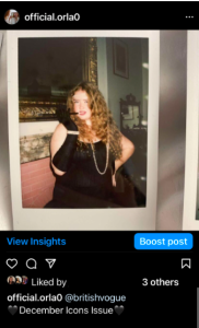
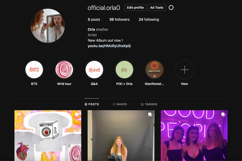
Any marketing or advertising campaign’s primary goal is to engage the interactive audience as without this any product will have the least amount of success possible. For our social media page our main goal was to ensure that the viewers had lots of opportunities to interact with the star and their social media page. There are many different ways to sell your brand on a social media page and to find exciting, unique ways for followers to interact and connect with the star. We explored these different features and looked at the most effective ways for the audience to interact with the star. Stars have active audiences who are continuously looking for engagement, fulfilment and interaction particularly through a social media page (Blumler & Katz). Within a social media pge viewers were given the chance to connect with the star while also communicating with one another and exchanging interests. The audience now has a platform to communicate and show themselves not only with the star but with one another, allowing them to become prosumers (Shirky).

We ensured that across our social media page we had a good variety of ways that the audience can interact with the star and the brand. We made sure the social media page  included what Blumler and Katz said are necessary components to interest any audience in a media text. Blumler and Katz made it clear that social interaction was an essential part of a social media page. Before incorporating opportunities for the audience to interact, it’s important to make sure your page is visually engaging so it will appeal to the audience, this way the audience will be drawn to the page and want to interact. By using this information, within our page we included a Q&A for followers to ask questions to communicate and learn more about the star and her life. There is also a behind the scenes highlight for the viewers to find out more of what goes on when the star isn’t performing or posting about her new album and upcoming tours.  We have made a post dedicated to the star’s merchandise with a link inserted meaning followers can easily access and buy the stars merchandise. This is a good way to get followers to connect and engage with the star by buying their merchandise and wearing clothing dedicated to them. By wearing the merchandise the audience are making an important statement about their personal identity. The audience are consuming the stars’ synergised products by buying the brand. A comment section is an important way of interaction in social media pages as it brings fans together to engage with each other and communicate about their similar interests on the stars page.

It’s important that you have a range of methods to create a good brand that’s noticeable and appealing to attract your target audience and to engage them across social media platforms. The aim of creating a good brand is to attract your target audience and for them to spread the word and to get new people to check it out. It’s important to look at the demographics and psychographics of your target audience to see what will grab their attention and what similar interests do they have. When creating our mission statement we expressed our artist as extraordinary and mysterious and we portray this through our products.The audience will be motivated to support the brand with their money, time, and attention as a result of the information presented is exactly what they are wanting to see. By providing the right information and posts will encourage the audience to connect with the brand. 

To represent our star we perceived her to be an independent feminist who’s known by her metro sexual fashion and subversively surreal pop culture. She comes across as someone who’s strong, but in reality she sees herself as something she’s not. We clearly show and encode this specifically through our digipak front cover with the use of black and white. We use this feature to compare the star from her vulnerable side to her strong independent side. The coloured side shows her feminine side, with the red lipstick implying power and self confidence, whether the black and white portrays weakness and vulnerability. We also relayed this message in our social media page to show her radical feminist views by posting feminist quotes and showing her contribution and work with charities that work with vulnerable women. Our branding shows the stars extraordinary identity and Blending avant-garde fashion.We particularly show this through our social media page by expressing her fashion specifically through bigger brands and fashion icons that connect and collaborate with the star. We also showed this in our performance part of the music video particularly though her fashion and makeup. We use subtle but also a mix of striking clothing which makes her identity unique as this catches the target audiences attention through the star herself. 


Social media page draft 2

Here is the second draft of our social media page

Reflection-

Following on from our first draft, we have continued to develop and add posts to our stars page. We have added more highlights giving her fans the opportunity to see some behind the scenes videos and pictures. We have also added some posts showing her collaborations with different brands and updates about her upcoming album release. By including posts of some of her upcoming releases keeps fans intrigued and on their toes for when her new single and album is coming out. This is a good way to keep fans engaged and making sure they are continuously checking her page for updates. We have made sure to be frequently posting whether its updates or behind the scenes as its important to eep a continuous cycle of posts to draw the audience in and keep them involved. One of the final highlights we included was raising awareness about a charity which is extremely important to our star personally.  By co-oporating and working with charities is a practical method to show a giving and active star image who supports her fans and they individual identities.

Our final post was the release of the stars new album ‘Dysmorphia’. We had previously posted updates about the album and her upcoming single before the launch of the whole album itself to keep fans updated about when and where they can stream the album when its released.


Teacher feedback-


What works well-

  • The direct link in our bio taking you straight to the music video streamed on YouTub
  • Working and collabortaing with the brands Vogue and PIXI beauty is a good use of synergy
  • good variety of posts including advertisement of merchandise, behind the scenes, personal posts and collaborations

Targets for improvements-

  • Several more posts including tour poster, snippet showing the realise of the music video and album realise.
  • Keep our stars signature banding name the same on each collaboration or post
  • Teaser post of the music video
  • Need to develop a better sense of branding for our star
  • To create a better branding we need to use the same typefaces, colour scheme, pictures, and photos throughout all of our content

Overall we have a few improvements that need to be made within our social media page to create a good branding for our brand and keeps the audience engaged. We have produced an appealing and interactive platform for our star which displays her interests and collaborations with bigger brands. Its also place for her to interact and engage with all her fans in different ways.

Music Video Final Draft

Here is our final draft of our music video

Reflection-

Overall I’m happy with the outcome of our music video. We have included a range of transitions and effects which makes the video exciting and intriguing for the audience to watch. We have cut our clips to the beat of the song making it flow better and making the storyline connect. We used mise en scene well  to film our narrative scenes and other technical conventions which are needed when filming a music video.

There are a couple things I wish I had done before starting the process of making the music video. A few of these include…

Creating a more thoughour shot list before we started filming. I think we could have used a few more angles and different shots and by planning our shot list better may have helped this. Another thing is the lighting. Part of our video was set at night time, although we filmed this in the day time and it was hard to get the lighting right. We could have planned this better and filmed this specific scene at a different time to get the correct lighting.

Social Media Page Draft 1

Here is a first draft of our social media page

We have made a good star with making and uploading on our social media page. From creating a timeline for our page has helped us plan out our future posts and the order we are planning on posting them in.

Reflection

Currently there are 5 posts up on our stars social media page. We decided our first post should be introducing our star while also giving an insight into some of her work and features. The first post was about her feature with vogue and her debut with the magazine. This gives the audience a look into the sorts of brands she collaborates with while also sharing her experiences with her viewers. Following on from her first post, the second post was about her newest collab with PIXIE with her new line of skincare. We also created a small story highlight of her collaboration with PIXIE so she can post frequent updates without having to make a whole new post and followers can go back and re read these updates. One of the main reasons behind a social media page is so the audience can interact and follow what the star is doing on a daily basis. This includes behind the scenes and what she does in her spare time with friends and family. We also included post about her most recent merchandise while also including a link to the shop on where to purchase them. This is a good way to interact and engage with fans and encouraging them to buy the merch. We incorporated a series of ‘highlights’ showing fans different collaborations, behind the scenes, tours and other personal interests.


Digipack Final Draft

Here is the final draft of our digipack

Reflection-

Here is our finished draft of our digipack. When creating this digipack we recognised all the general and formal conventions needed to create a successful product. Our goal was to create a digipack that fits within the demographics of our audience, and to make each panel appealing by using various designs to attract the audience. We focused on looking at the conventions of the indie alternative genre and incorporated these features. For example to find the most appropriate colours and typefaces to use in our digipack we looked at previous indie alternative alum covers and posters to get inspiration on the sorts of colour pallet and fonts we will include. I think our digipack has come together well with the use of unique and different ideas to create a digipack out of the ordinary. Each feature within it represents our star exactly how we perceived her to be.

Overall I’m happy with the outcome of our digipack and I am pleased how well all our products work together to portray our star and her identity and to build the ideal alternative indie package brand while highlighting the genre.

Digipack draft 3

Here is our third draft of our digipack

Reflection-

Moving on from draft 2 we have added more indepth details to each panel which has made a big impact in our digipack coming together. The front cover is looking a lot better as we have changed the fronts, finalised our album cover name and gotten rid of the unnecessary white border. I am really happy with how the front and back cover are looking. Particularly on the back we have added all the key conventions which include a barcode, copywriter, spine and the trackless.

Targets for improvements-

  • Change the colour of the writing and move the placement of ‘Orla Ray’ to make it more central to the page.
  • The first inside panel could do with some more detail, for example some repeated shapes in the background or some writing around the model. It is very simple and has very little meaning towards our star, so incorporating some quotes or lines our artist says could also be another feature we could include to make it more meaningful.
  • We could add some more songs to the back cover and enhance the writing to make it fill the TV screen.We could also change the colour of the tracklist to make it stand out from the TV as its hard to read black writing on a grey fuzzy background.

Focus Forward-

When achieving our draft 4 we have a good idea of targets and improvements that need to be made to better our digipack.To make our digipack appealing and to draw in our target audience, we must concentrate on the back and front covers and incorporate all the essential conventions.


Timeline and Marketing ideas

Here is a timeline and marketing ideas for our Instagram page

Reflection-

We constructed a timeline of posts for our social media profile while leading up to the release of our album. We are planning to include brand deals, thrilling deals on tours and merchandise, and interactive elements throughout the timeline. For instance, we might post a Q&A on our star’s Instagram feed so that fans can engage with her and ask her questions about upcoming songs and album releases. This is a good way of attracting our target audience and how we want to market our brand. Her views and follows will have many opportunities to interact and engage with our star.


Digipack Draft 2

Here is our second digipack draft


Reflection-

For our second draft we now have an image for each panel in our digipack. Although there has been minimal changes to the front cover, we have managed to do another shoot to get our final images. I am really happy with the shoot and how the photos turned out and they work perfectly for our digipack. The inside panel works really well with the hand painted picture. It has a deeper meaning behind it symoblising a bloody finger print, relating back to our music video.

Targets for improvement-

  • Add writing around the finger print painting
  • Add the track list in the TV screen and any other conventional features on the back panel
  • Change the border on the front cover and move the album name
  • Use photoshop to brighten colours and add some effects

Focus forward-

We need to focus on our back and front cover and add in all the key conventions needed to make our digipack appealing to attract our target audience. Fonts are our main focus for the front and this is one of the most eye-catching things as this is the first thing the audience sees, meaning it needs to stand out and be bold.


Digipack Draft 1

Here is our first draft of our digipack


Reflection-

Here is our first draft of our digipack which we designed in adobe InDesign. Overall I think Our digipack needs a lot of work done, and we also need to do our final shoot for our back panel. I am happy with the images used particularly for the front cover, and I think we can use the main conventions and features to make our front cover stand out and catch the eye of the audience. By looking at previous digipacks from well known artists has helped us gain inspiration and recognise the key features that are included to make a good digipack.

Targets for improvement-

  • We need to carry out a second shoot for our back cover image so each panel has an image
  • Chose a real album cover name to fit our star and genre
  • We need to change the fonts to ensure they fit the genre and style of our digipack and keep this consistent throughout
  • Add more detail and relevant features to the inside panel
  • Change the border and find something else to put instead of just white

Focus Forward-

The main focus forward is to get our back panel finished and to get all the main conventions added. We will be using photoshop to  enhance the photos and use colour correcting tools to make the colours pop.  The general and formal conventions are very important features meaning we need to make sure they are included. For our back panel we are planning on having a photo of an old TV, with the trackless in the screen of the TV. We will then need to include the main features on the back panel, for example a barcode, copy-write and a record label brand.