Audience interaction with a social media page – an analysis

Here is a screen castity of audience interaction with a social media page

Reflection-

To comprehend how a star in our genre makes use of social media, we created a screen castify looking at the how the audience interacts with an artists social media page. Understanding the broad conventions was one of the most useful things we have looked at in this task. We looked at the formal and general conventions and the use of ADIA to analyse the important factors and in what ways the audience can engage and interact with the star. By doing this has helped us to recognise the important features that are required on a good social media page to help get the audience involved. To understand the key features and choices made on the Instagram page, we also applied the Uses and Gratifications theory by Blumler and Katz and the paradox of the star theory by Dyer.


Social Media Page Terminology

Here is my Social Media Page Terminology analysis of Billie Eilish

Reflection-

By analysis and recognising the key conventions of a social media page has enabled me to know how social media is used to engage with the target audience in different ways and how they promote their music. Its important for the star to have their page easily accessible to their audience and to use marketing strategies to help their viewers to interact with their page in different ways. to make sure they attract the right audience with the same demographics, they need to upload information about their lifestyle, beliefs and to update their page regularly to keep followers entertained.


Evaluation of shoot or graphic design

Evaluation of shoot photos and graphic design

Reflection-

When preparing for this shoot we had a good idea of the specific images we were planning on photographing for our digipack panels. The purpose of this shoot was to get the remaining images for the inside and back covers since we had already under taken the shoot for the front cover. To get inspiration for our remaining covers, we looked at previous didgipacks to get a good idea of the main conventions and features which need to be included.

Our first image was a hand painted picture, symbolising a finger print covered in blood. We thought this was good idea for the inside pannel as its unique and different and has a deeper meaning relating to our star. although our star is seen as being elegant and angelic, there is also a sense of darkness to her, which is portrayed in our video. We aimed to evoke rage and distress through the employment of this image. We wanted to continue the symmetry from the front cover shoot onto another pannel. We took a photo of our model sitting on a stool and then we are going to use photoshop to flip another photo so it appeared as though they were side by side and chance on of them to black and white. We decided to photograph an old fashioned tv for our back cover, which would eventually play the album’s tracks in their entirety.


Contact Sheet- Digipack Shoot 1

Contact Sheet

Favourite images

I like this image as our model has a strong eyeliner match with the camera, bringing tension and power to the audience. you can clearly see her and her reflection through the mirror showing she is the main star.

This photo is proportioned well, with the mirror in frame and half her face in the shot. The wings show power and importance and they go well with the white shirt. The lipstick contracts well and stands out against the white.

I also like this photo as the red lipstick stands out and the wings are clearly seen in the shot. She is looking straight at the camera which is a good eyeliner match. I like how the mirror is on an angle but she is facing straight on.

 Reflection-

Overall our first shoot for our digipack front cover went well. We came out with some good empowering images showing off our model portraying that she’s the main star. Some of these photos will work really well for our front cover. We took in consideration the conventions of our genre and the aesthetic that goes with it.


PMA and Risk Assessment for DP shoot

Risk Assessment

Reflection-

To ensure the safety for our models and team when shooting off site, we created a risk assessment addressing all the possible risks and how we will carry out our shoot safely.  By doing this made it clear that we have a good understanding of danger around us and that we need to take precaution for possible risks.


Production Meeting Agenda


Reflection-

We had to plan and organise our time well when planning a shoot specifically due to all the equipment we required. By creating a meeting agenda helped the group visualise all the necessary needs for the shoot. Including where it will take place, the timing of the shoot, what equipment will be needed, and a few photos for examples.


Digipack mockup

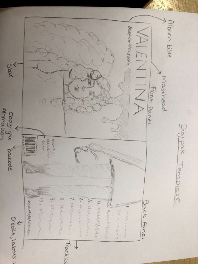
Here is our hand drawn mockup of our digipack front and back

Reflection-

Front cover

We have created a possible design for our digipack for the front and back pane. We have taken into consternation elements of our music video and how our star is represented and how we can apply that to our digipcak cover. For example the blood in our music video was a key factor, meaning we had an idea to induce some blood on the cover. Not necsassily referring to the one song “Washing machine heart”, but to all the song in her album, as they all have a similar theme and she is portrayed in the same way throughout. Our idea is to have our star looking at herself in the mirror applying her red lipstick, with blood dripping from the mirror pane. This will be a mid/close up shot just from her waist and above. We will have the album cover title at the top, and the name of our artist along the bottom. We had a range of different names for our artist, but decided to go with the name Valentina. We think the name fits her style and genre well as it is a unique name.

Back cover

Our idea for the back cover consist of showing off our artists style and how she is represented in her alternative indie genre. Our look book helped us a lot with this as we  looked at a range of different artists similar to Mitski and the different features, colours and  graphics that are included in our genre. We plan to have our artist stood with a unique and quirky outfit which all be taken as a mid shot from her waist down. She may also be holding some sort of prop, for example glasses which fit the alternative genre. On the right side of her we are planning on having a list of all the tracks, numbered down the side of the back cover. We will also include a barcode at the bottom, copyright information and the credit and labels.


It is important to create different ideas and a good plan to make sure we include all the important conventions and elements needed. We now have a rough design for our digipack and shown how our star is represented through style, colour, text and graphics.

Digipack Conventions Analysis

Digipack Conventions Analysis

Reflection

By looking at album covers in the genre of our song, enabled us to identify the formal conventions and the main features required on a digipack. We looked at the formal and technical elements included and recognised generic conventions which are designed to particular genres. For example on most digipacks it is common to have the star image on the front cover so the audience can identify who’s album it is and also to include the name. Although this album cover I analysed does not include a stars name however does include the star herself, Lorde. There are lots of formal conventions that need to be included on the back cover. For example barcodes, trackless and numbers, copy-write and small print are all things that are conventional when designing a digipack. By analysing a professional digipack for an artist has allowed us to understand formal and technical elements and given us inspiration on what makes a good didgipack.

The Look Book – the package

Here is our Look Book of our genre

Made with Padlet

Reflection-

By creating a look book has enabled us to create a moodboard of looks, styles, colours and graphics to do with our genre to help us when creating our digipack. We have looked into detail all the different conventions and elements that make up our genre. We looked specifically at other indie alternative artists similar to Mitski to gain inspiration from their style and identity and see the similarities between artists from this genre. This padlet will help us in putting the key ideas into practice while ensuring that we accurately and appropriately represent the star.


Our Mission Statement – The Package Brand

Here is a slide including our mission statement and the package brand

Reflection

When beginning planning for our digipacks, we made a marketing strategy and mission statement to recognise and understand our star image, the audience and who are the competition.

We looked at who the audience is, a call to action, who are the competition and our mission statement. By doing this helped us to identify our target audience while also looking at other brands that would advertise our star image. We understood the demographics and psychographics of our target audience and found ways in which the audience will engage with the star. To find ways in which the audience can engage with the star image we used AIDA. When looking at current artists album covers, we found depending on the genre there are strong similarities particularly with the design, colours and titles. It is easy to identify and  recognise different genres just by looking at the album covers.

Focus forward

By making this slide has helped us recognise the key details and information we need to create a digipack which relates to our target audience. We have looked at the main factors to create a  branding for our star image.


Peer Feedback

Peer Feedback

Reflection-

What Went Well…

  • Narrative is shown well and is clear and simple to understand throughout the video
  • Acting and lip syncing is really well performed. The model did a great job when filming, there were some really effective performance shots.
  • Location shoot was good as the lighting and composition was thought out well and was really good quality.
  • Editing of the clips are all on beat and works well with the music.

Improvements…

  • The video could use some more close up shots in the performance clips for more of a variety of shot distances and frames.
  • Could try playing around a bit more with filters and transitions as it lacks slightly in editing.
  • There is not much camera movement, a lot of the clips are very static although this could be added in post. 


Receiving peer feedback has helped us identify the most obvious aspects of our video that still require work, as well as what we have done well or perhaps what it needs more of. For example, one of the comments we received suggested that our video would benefit from a wider variety of shot types and distances, which we have already started to do in Premiere. This assignment has also given us the chance to carefully examine other music videos, compare them to our own, and consider what they may have that we don’t.