Click on image to see the PDF
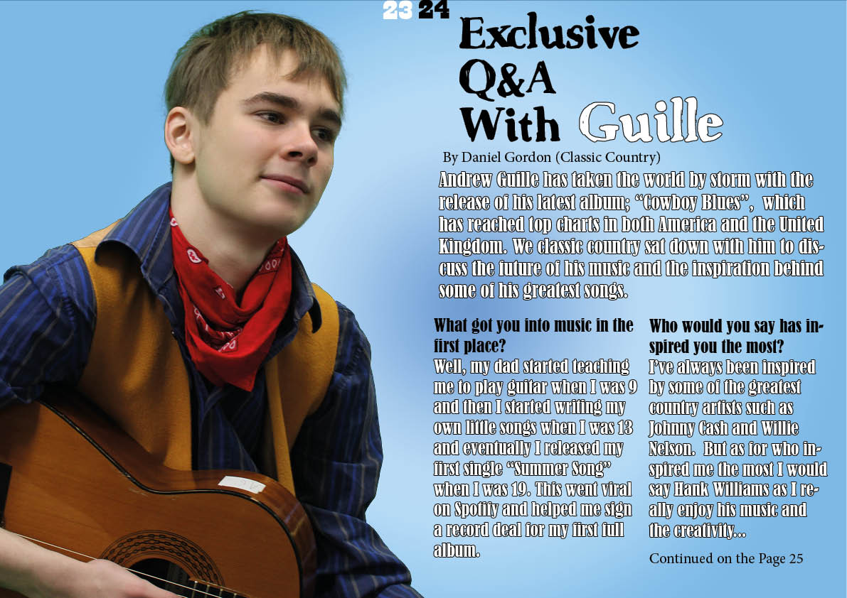
This is my double-page spread. I have made using photos from my second shoot and combined the pictures I took with the draft article I wrote to create a realistic-looking double-page spread. In order to improve it for the next draft I have made a reflection of what went well, what went wrong, and what I like about it;
5 Targets:
- Improve the background as the background is very simple and the white gradient makes the text hard to see
- Maybe choose a different font for the article
- Add a quote from later in the article somewhere to help attract readers attention
- Move the “Exclusive with Andrew Guille” as it is very close to the page numbers
- Add a byline that includes the photographer.
3 things I like:
- The image looks very well-suited for the genre
- The opening paragraphs of the article fit well on the page
- The title font looks very good.
5 What I need to do:
- I need to improve the background
- I need to have a look at different fonts for the article
- I need to try moving either the page numbers or the title
- I need to add a byline that includes the photographer
- I need to find a suitable quote to put on the double-page spread.