Digipack Final Draft

Please click on the image to view the PDF

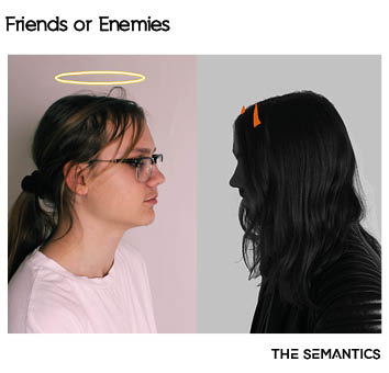
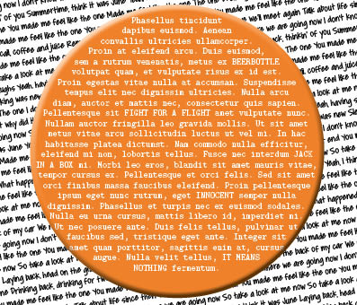
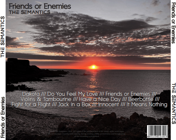
This is the final draft for my digipack. We have:

  • Changed the size of the horns to be more prominent and visible
  • Added two lines above and below the image on the cover page
  • These bars have the colours of the image flipped on one side to add some variety and to allow them to pop out more
  • Slightly changed the text and the formatting of the text in the shapes

Other than that we left change to a minimum as we felt it was mostly complete and only required some simple refinement to ensure it is the best it can be.

Digipack Draft One

Please click on the image to view the PDF


The above google slide is a relflection that I have done that describes what is both positive and negative about my first draft. In doing this I practiced analysing my own work  and being critical as well as noting down what needs to be improved so it can be fixed by the time I create the second draft.

Some targets for me to have done for my second draft include:

  • Changing the front page to maybe have one of the two in black and white or even flipping the image
  • Creating and adding two middle pages and a spine
  • Possibly moving the song titles text to a different point


Digipack Photo Shoot Contact Sheet and Evaluation

We had a photoshoot for our digipack. We took photos that we had planned out to ensure that we got multiple angles and multiple different poses so that we had a variety of shots we could use for both our album cover and our social media page. I think that we got a good variety of shots that could be useful across both products.

In the future we will attempt to continue planning our shoots to ensure that we always get all the shots we need.

Digipak Mock Up

This is a mockup of what my digipack should hopefully end up looking like. We created this by analysing other covers in the genre and making judgements from our work  to ensure the star image is consistent throughout all of our related products. The front cover will be two men staring at each other with their looks and clothes clearly contrasting each other to demonstrate the contrast as shown in the title; Friends or Enemies. While the back pane will be a picture of a sunset edited slightly to be darker and more contrasted. It will also have the conventional song titles and barcode.

Digipak Conventions Analysis


To prepare for creating my own digipak, I have analysed the technical conventions and repertoire of elements that are conventionally used by another artist in my genre. I picked the album Eyes Open by Snow Patrol.  In this task I have learned the general layout/blueprint of an album cover as well as this, I have analysed the graphic on the front and what the cover connotes.

From this analysis I have learned that most artists that are indie/alternative tend to use some form of graphic on their album cover rather than a standard photo of the artist. This helps give the connatations of the star that they are more focused on the music instead of focusing on the star themselves which is quite a conventional stance for the genre. I also found that the ghostly/ethereal graphic on the front helped the listener know what to expect when listening to their music.

Focusing forward I think that, having done this task, I now have a much better idea of how to go about designing my digipak and how to use a graphic to convey a star image while also establishing the tone and genre of the album.

My Look Book – The Package

Made with Padlet

To prepare for our digipak me and my group created this look book of the conventions of the genre so we could get a better idea of what our stars style and brand should be. This includes inspiration from other artists in the genre and examples of integrated advertising as done by others. Based on this we have decided on a repertoire of elements that we need to use for our artist so they appeal to the audience of the genre and narrowed that down into 5 main descriptors for our artist:

  • Indie
  • Relatable
  • Dark
  • Unique
  • Casual

This task has helped us create a “blueprint” for how our artist should act and be presented through our digipak and social media page. This will ensure that our artist fits well within the genre and fits with the standard conventions.

Our Mission Statement – The Package Brand

When creating the digipack there are many things that we need to keep in mind, for example we need to make sure that the star image is continuous throughout all aspects including the album cover and the music video. This means we have to have a clear brand and unique selling point.

We have made a presentation to do research on our audience and to create a mission statement:

During this research we uncovered information about our audience such as the widely spread age of our fanbase. This means that we can use this information when creating a social media page as the star needs to be able to appear to many younger and older fans by being relatable and likeable whilst still being coherent within the genre. Knowing more information about our audience will allow us to know how best to use integrated advertising to promote our band.

Making this slideshow has allowed my group and I to understand the important of researching our audience and having a clear and coherent star image throughout the whole digital package we will be creating.

Skip to toolbar