My Tour Poster

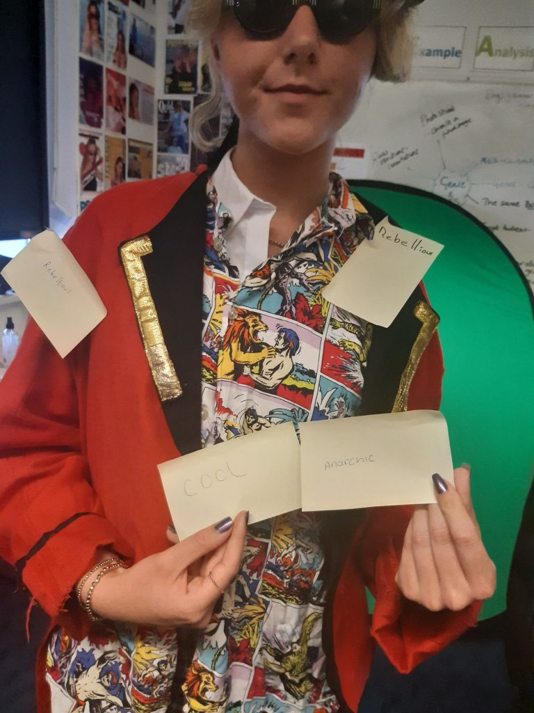
Here is some research I did of other punk music posters:

Here is my punk music poster:

Click on the image to see the PDF


Using Adobe Photoshop and inDesign I have created a tour poster for a fictional punk artist known as disordely conduct, The poster fits many of the established conventions within the punk genre while also being semi-unique with the outift used for the model which makes it not look like a direct copy of any already established posters. I modelled the layout to include small amounts text to keep the poster simplistic. I attempted to use colours that are associated with the genre while also making it look different enough so that I wasn’t copying any one poster. I used two different custom fonts for the poster with one being used for the masthead and the “World Tour” line of text, I also used an image of a brick wall behind her to match with the general themes of the genre. I tried to make the typography appear legible while also being well suited for the poster. I thought about AIDA (Attract, interest, desire and action) and chose to aim my poster to attract the audience for the genre and get them interested with the image and fonts to eventually get them to want to buy tickets for the tour. I did this by first taking an image of someone dressed up in a punk outfit and doing a pose that suited the genre, then I put the image into photoshop and inDesign and I removed the background. Then I inserted a background of a brick wall behind her and used custom fonts to insert a masthead and information about the tour.

I have learned how to utilise photoshop and inDesign to create a tour poster as well as how to insert custom fonts and edit images to create media. This will be useful in the future when I create media as I now know how to edit the images and make them look well edited and realistic whilst also being able to insert fonts and edit images and insert them into different images to make people look like they are someone else. This will be very helpful in the future when I make my music magazine.

My Magazine Front Page Swede


Please click on the image to see the PDF

Original Image

I have used InDesign to recreate a poster of Bob Dylan. First I placed a similar looking image onto a page on inDesign and inserted text boxes for the masthead and the plugs. To create the shadow effect on the masthead I created a grey version of the title and placed in just behind the normal one by right-clicking on it and pressing send back. I also used the same method to place the words “the music magazine” over the title like it is on the original one.I also placed extra images on top of the original for the barcode, pug and the Kidology album art. I tried to recreate the exact same layout while trying to match the original proportions. While trying to recreate the masthead from the original magazine cover I went through multiple different fonts and typefaces before finding one that I though matched the original one. To get the original proportions right I had to make sure that while I was sizing the different images to not go over the size of the original while also not covering any previously placed text. This was an issue with the barcode but I was able to fix this by resizing all of the text on the side and changing the size between the words. Finally I was able to find similar coloured images and texts to recreate the original so it looked as professional as possible.

Whilst creating this magazine cover I have learned a lot about the layout and details of posters, for example I now know how all of the little details can be very difficult to place right but if you do not place them right it makes the whole poster look poor. I found that a few things I did well during the recreation of this magazine cover were;

  • editing texts and images
  • carefully placing text and resizing it to fit the original
  • adding in the small pugs and matching the text to them.

On the other hand I struggled with:

  • inserting images,
  • moving images and carefully resizing them
  • getting the text at the top of the cover the right size so as to not go over the images on the top.

Focusing forward I will use all of these skills that I have learned when I create my own poster so that I can make it appear professional and well made. I will also improve at things that I struggled with during this task and I will watch some online tutorials to improve my use of InDesign.

The Camera Talks


This is my collage of photos and their different connotations and denotations. These connatations all come together to create a narrative which is shown through the different framing and angles that I have used. These different techniques all come together to allow for a seemingly standard image to represent an event. I have also used distance to convey the difference between people as well as make people seem more alone. In the image the composition allows for the image to show and convey a lot of different narratives  and ideas.

I have learned that using proxemics and mise-en-scene as well as distance, angle and framing I can convey a lot more of a narrative that tells a longer story. This will help in the future as I now know how to convey a lot of information using the different techniques I just mentioned. This allows for  an image and an idea to come together and tell a longer ongoing narrative.

My image that uses mise-en-scene to communicate meaning

Made with Padlet

My genre was punk and I found that pop muscians and posters often use mise-en-scene to convey the overall rebellious and harsh tone of their music. The general conventions of punk music I have found are that they tend to have coloured hair which shows their rebelliousness by being different from the norm, as well as often being in black and white whilst often wearing leather jackets and boots which assosciates them with people like bikers this is used to connote the idea of violence.


Often punk musicians associate themselves with anarchy and hating government which is  a representation of their music being rebelious and different this shows that they are not like other bands. They often use their posters and outfits to mock the government and other forms of authority.

Looking forward I can use what I have learned to assist me in making my music magazine because I now know that all of the lighting, outfit and costumes all come together to paint a picture of who the artist is and what their music is about. This means that when I make my music magazine I will focus on each individual aspect to create a good image that represents my artist properly.

Analysis Of a Tour Poster


Tour posters tend to be very detailed images that represent the band, their ideals and shows anyone who sees it what type of music they play and what it is about.

This poster is no different as it clearly connotes the image and idea of violence and heavy metal through the use of satanic and violent imagery shown by the devil and their rebeliousness is also shown by in the background alluding to the crash into the twin towers in 2001 which is a generally taboo and forbidden topic to be talked about much in media and its inclusion shows that the band is not like other bands.

The inclusion of the terminator, the predator and the xenomorph who are all violent recognisable villains in popular films as well as the devil make it easy for anyone to look at the poster and immediatley recognise the characters and how they are all related to violence. This gives an overall narrative that the band plays heavy metal songs, is very rebellious and is different to other, more mainstream bands.

At first look the poster just looks like a standard rock poster with some demon character on the front and fire in the background but by looking past the denotations and deconstructing the image and what is in it I was able to read into the details and understand what the poster was saying about it’s band and their music.

By analysing and deconstructing this media text I now understand how in the future I can use many background details working together to convey a lot of information without outright stating what I want my audience to understand. I also now understand that, no matter how surface level a piece of media may seem, they all have a deeper meaning and narrative behind their details.

Skip to toolbar