Category Archives: Component 1
CCR1 – QUESTION 3: – HOW DID YOUR PRODUCTION SKILLS DEVELOP THROUGHOUT THIS PROJECT?
CCR1 QUESTION 2: How would you engage your audience and how would it be distributed as a real media text?
CCR1: QUESTION 1: HOW DOES MY PRODUCT USE OR CHALLENGE CONVENTIONS AND HOW DOES IT REPRESENT SOCIAL GROUPS OR ISSUES?
Chosen Adverts


The reason I have chosen these two adverts is; they both are related to the psychographics and demographic of my target audience. The advertisement for a country music festival is directly in line with what country music fans would want to see and be interested in. Also, the truck ad is in line with older men who are interested in vehicles and mechanics. The adverts are linked as country music (what the festival is about) often makes reference to trucks and vehicles. All of these are good as my target audience is older men who are religious and enjoy mechanics and vehicles as well as hunting and fishing which the car is suitable for.
Magazine Third Draft
Front Page What’s New:
- Spacing has been fixed to stop overlapping
- Added a reference to the double-page spread
- Masthead slightly moved to avoid overlap
- Star image shrunk slightly to avoid masthead
- Increase name size in articles
Content Page What’s New:
- Changed the article title for Stuart
- Added a page number
- Changed double-page spread reference
- Fixed a few spelling mistakes
- Made, and added behind “USA”, an American flag
Double Page Spread What’s new:
- Spread out the text at the start of the article
- Added a quote from the article next to him
- Moved up the article
- Added a box around the questions to separate them from the rest of the page
- Added a box across the bottom
For my Front Cover I will:
- Make Kai bigger
- Change the font for the articles
- Make the title bigger
For my Contents Page I will:
- Change the “and” to an &
- add apostrophes where needed
- Change the fonts of the titles
- Change the words to uppercase
- Move the page numbers
For my Double-Page Spread I will
- Move the page numbers
- Move up the quote
- Change the font
- Move the continued on next page
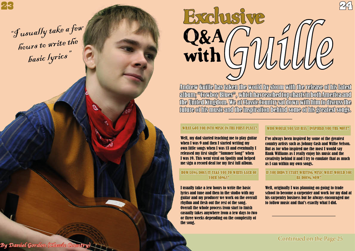
Double-Page Spread Draft Two
This is draft two of my double page spread, here is what is new and what has changed:
- Changed the colours of the questions and the answers
- Shrunk the text and added another question to the page
- Changed the colour of the page numbers
- Changed the font and colour of the byline
- Changed the background to go with the rest of the magazine
To improve in the future I will:
- Add a quote in the top left corner
- Maybe fit another two questions on it
- Make the byline more readable
- Make the standfirst larger
- Maybe move the page numbers to the bottom.
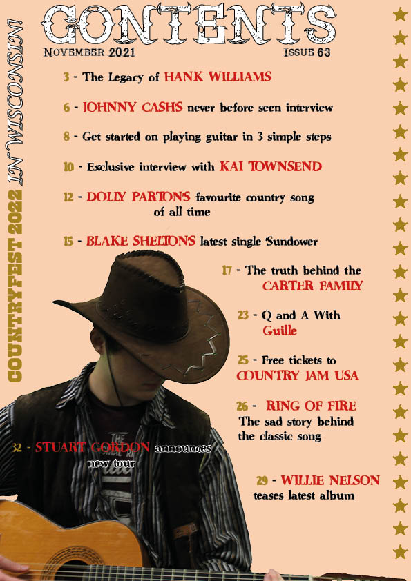
Contents Page Draft Two
Click on the image to see PDF
This is draft two of my contents page. Here is what is new and what the main changes are:
- I have replaced the image of Kai with Stuart as it seemed too similar to the front cover
- I put a border of gold stars on one side to fill the empty spaces
- I added the double-page spread to the contents
- I added an ad for CountryFest on the side
- I made the names bigger and red to stand out more
In order to improve in the future I will change:
- I will make some of the text easier to read
- I will fix some of the spacing in between the text
- Maybe change the colour of either the title or the date so it isn’t all white
- Add another item to the contents at the bottom to fill the gap
- Maybe move the “Stuart Gordon announces new tour” so it’s more visible
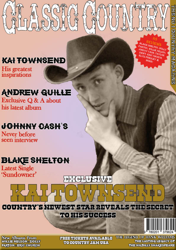
Front Cover Draft Two
This is draft two of my front cover here is what is new and what the main changes are:
- The classic country logo has stretched and gotten larger
- The name Kai Townsend has gotten larger and more noticeable
- The bottom area has become gold, gotten bigger, and changed font
- The barcode has gotten smaller
- The words “The number one country magazine in the Uk” have been shortened and moved to the side
- The “85 reviews” has gotten bigger and the “and” has changed to a “&”
In order to improve in the future I will change:
- I will make some of the text easier to read
- Fix some of the spacing of the headline
- Add a reference to the interview for the double page spread
- Maybe make the “The number 1 country magazine” a different colour to stand out from the gold
- Moe the text in the bottom right away from the edge
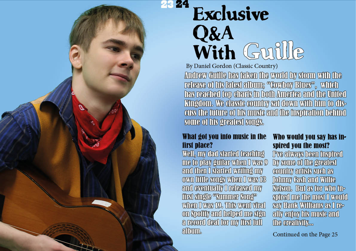
Draft of Double Page Spread
This is my double-page spread. I have made using photos from my second shoot and combined the pictures I took with the draft article I wrote to create a realistic-looking double-page spread. In order to improve it for the next draft I have made a reflection of what went well, what went wrong, and what I like about it;
5 Targets:
- Improve the background as the background is very simple and the white gradient makes the text hard to see
- Maybe choose a different font for the article
- Add a quote from later in the article somewhere to help attract readers attention
- Move the “Exclusive with Andrew Guille” as it is very close to the page numbers
- Add a byline that includes the photographer.
3 things I like:
- The image looks very well-suited for the genre
- The opening paragraphs of the article fit well on the page
- The title font looks very good.
5 What I need to do:
- I need to improve the background
- I need to have a look at different fonts for the article
- I need to try moving either the page numbers or the title
- I need to add a byline that includes the photographer
- I need to find a suitable quote to put on the double-page spread.


