November
26


November
23
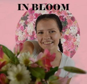
Digipak Draft 3
Digipak Draft 003
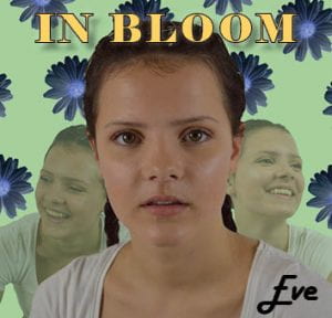
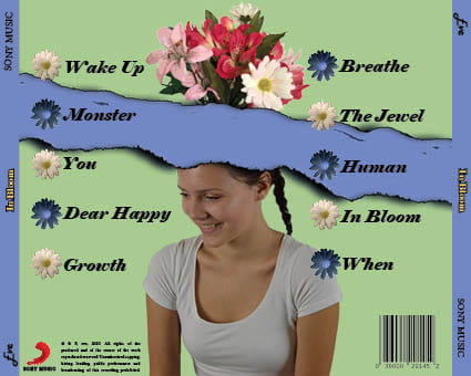
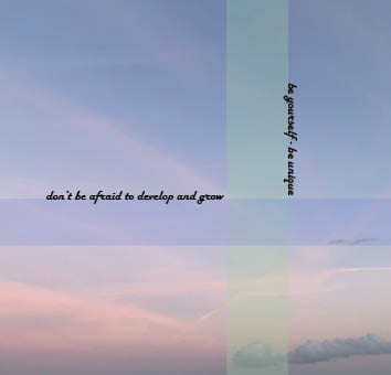
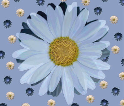
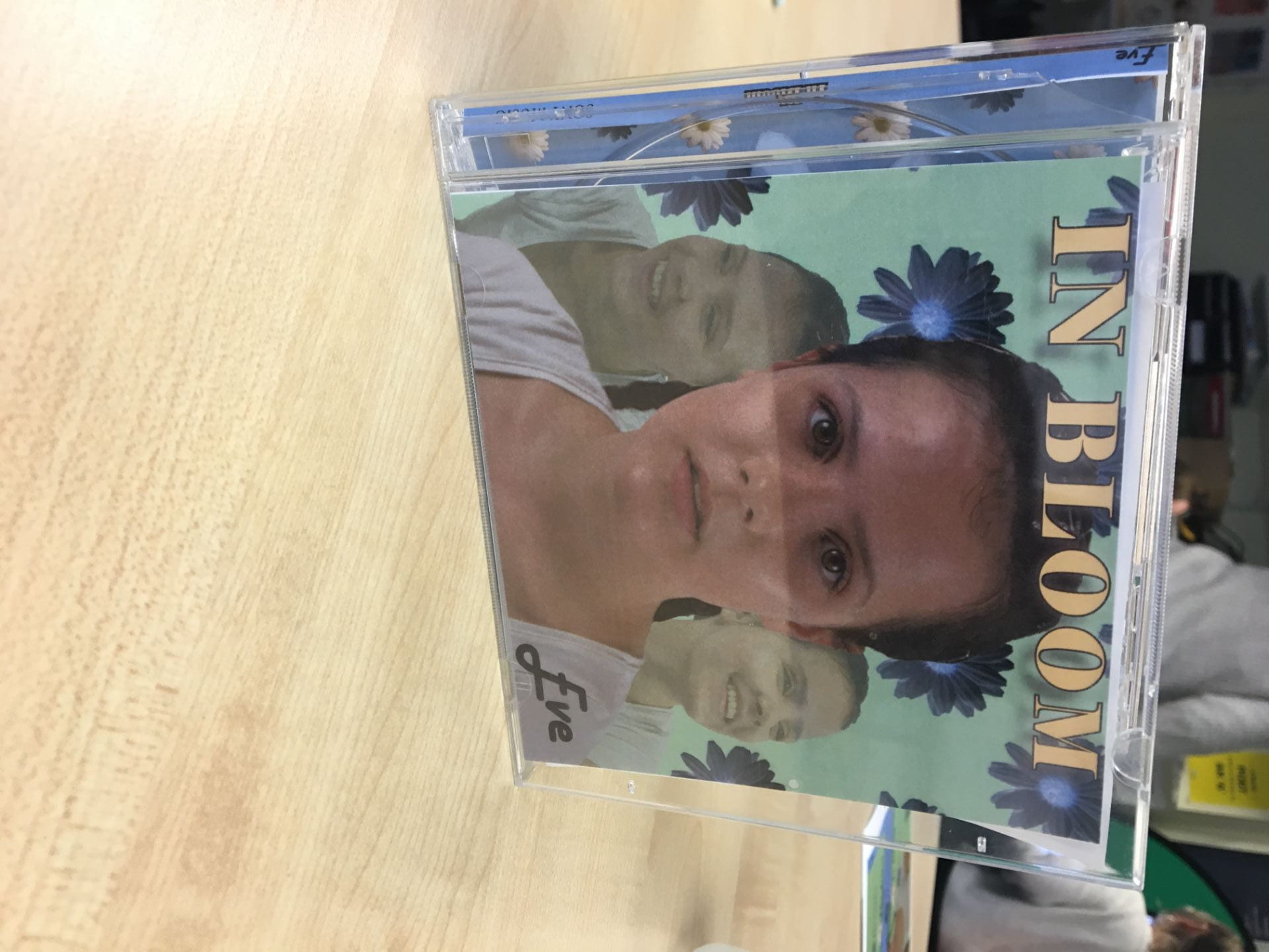
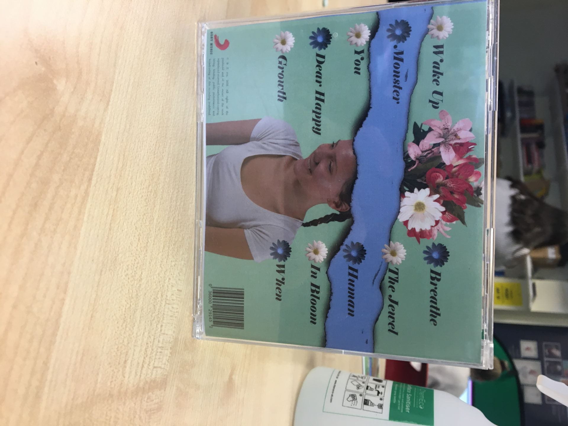
Our digipak in a CD case:

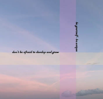
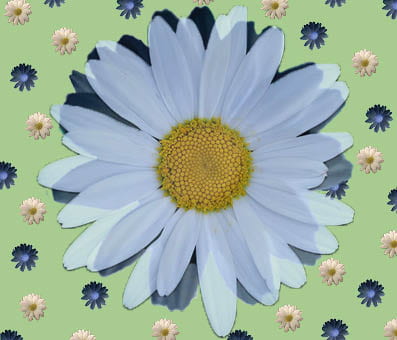
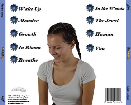
Front & Back Panes:
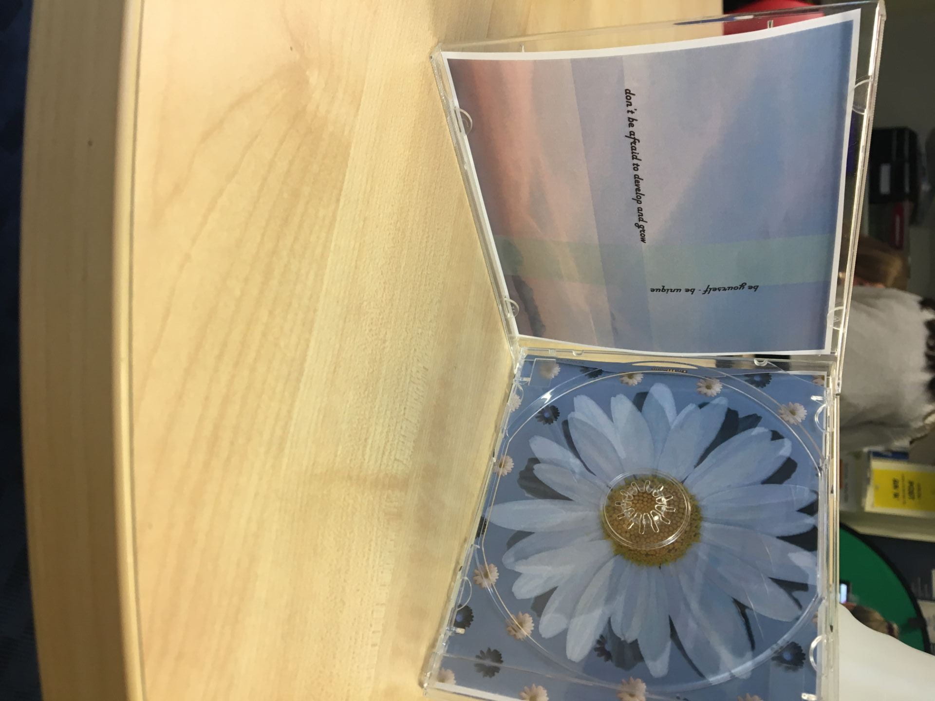
Inside Panes:
Spine:

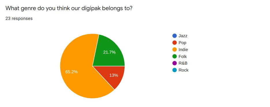
Audience Tally:
We sent around a form asking people what genre they thought our digipak belonged to. It is extremely important that we got the responses we needed in order to show that we had portrayed our genre successfully. Thankfully, the responses we got were: Indie, Folk and Pop, so, from this we knew that our genre was obvious to our audience.
What to add before final draft:
- change Eve’s lip colour
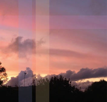
- change the colour of the rectangles on the sunset to match the daisy’s and the green background
- cut out the daisy on right pane properly – still has black edges
- change the font for ‘In Bloom’ and track names
- make daisy’s on right pane more cartoon-like (like flowers on back pane)
November
5
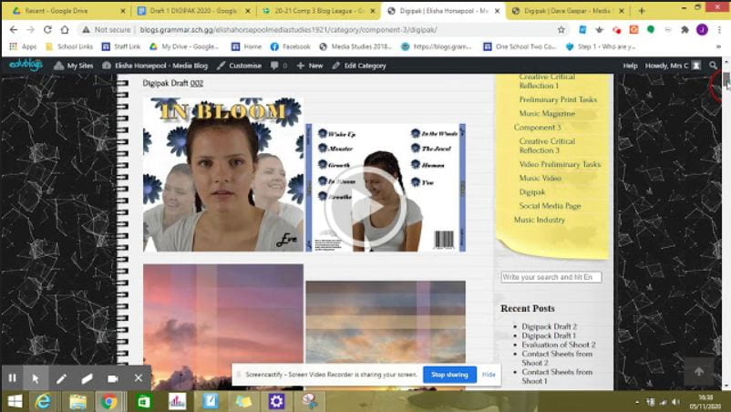
Digipack Draft 2
Digipak Draft 002


Teacher’s feedback:
Click on image to watch feedback video
Targets for improvement:
- take away the 2 transparent images behind the main one on the front cover
- change her t-shirt colour
- change the background colour – one of the colours from the sunset rectangles
- change the more yellow sunset to one with trees or a sea sunset
- add the flowers coming out of her head on back cover
- make tracks even on both sides
- alternate colours of daisy bullet points
- make ‘Eve’ bigger
- make back cover image bigger
- play with the ‘In Bloom’ font and the track list font
- give her some colour on her lips
October
23
Digipack Draft 1
Digipak Draft 001

Feedback from our teacher:
- make her bigger on the back
- maybe have 3 images on back not two? This could link in with an album name?
- change the inside panes
- the artist name on the front needs to be bigger and brighter
Overall we are really happy with what we have produced so far, and we think that our photo shoot was successful as we got images that matched our vision for our digipak. We also think that our editing and photoshop skills have worked well and we are happy with the direction that it is going in, and we know the changes we want to make.
October
18
Evaluation of Shoot 2
Overall, I think that our shoot went really well and we got some good and effective results. We managed to get some shots to use for theleft inside pane for our digipak, which we will invert and use on the right inside pane. We managed to get a variety of shots from different angles as well as covering all bases and getting high angles and lower angles. I like that we kept it simple and focused on nature as it is very conventional of our genre and is often seen in indie/folk album covers.

October
18
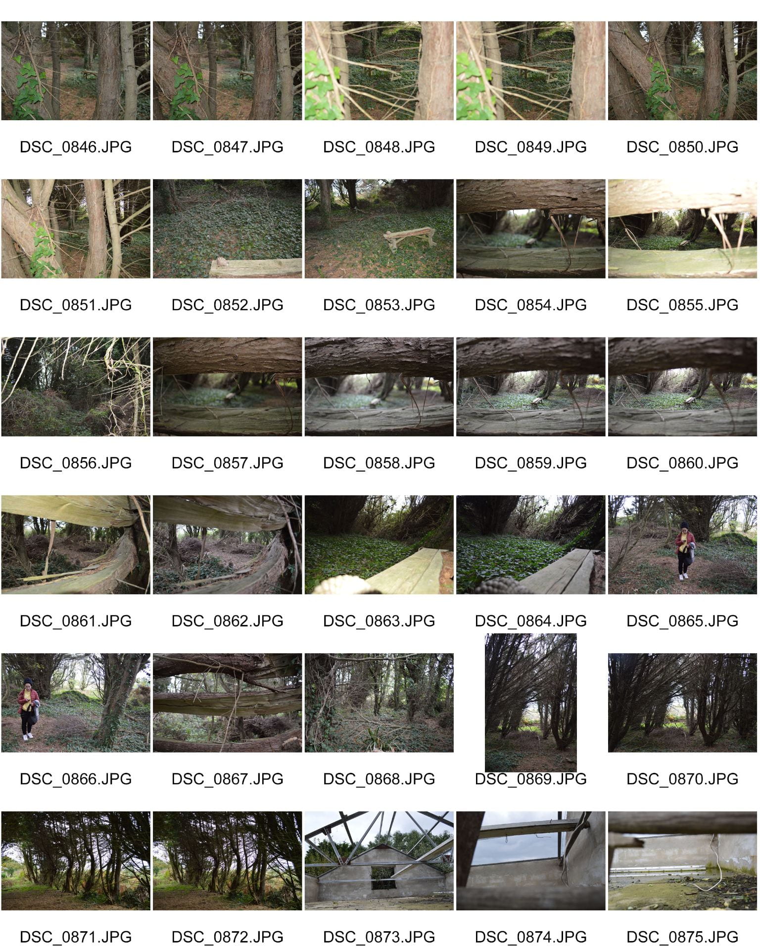
Contact Sheets from Shoot 2
Here are our contact sheets from our second shoot. Our main focus to have in the shots was the bench which was symbolic of childhood and innocence which we felt fitted well with our star image. We tried to compose and fram the bench inbetween trees and in the centre of the frame as well as off centre. We got various angles and shots around the bench and behind trees to add interest in the shots. There were some shots that we really liked which may be used for our inside panes.
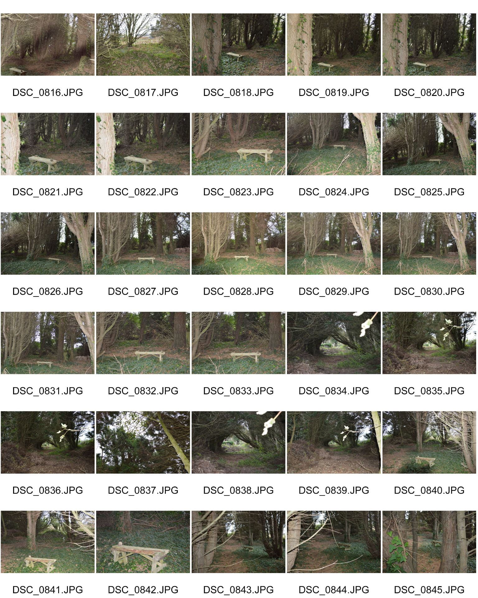

Here are some of my favourites and possible shots for our inside panes:
October
16
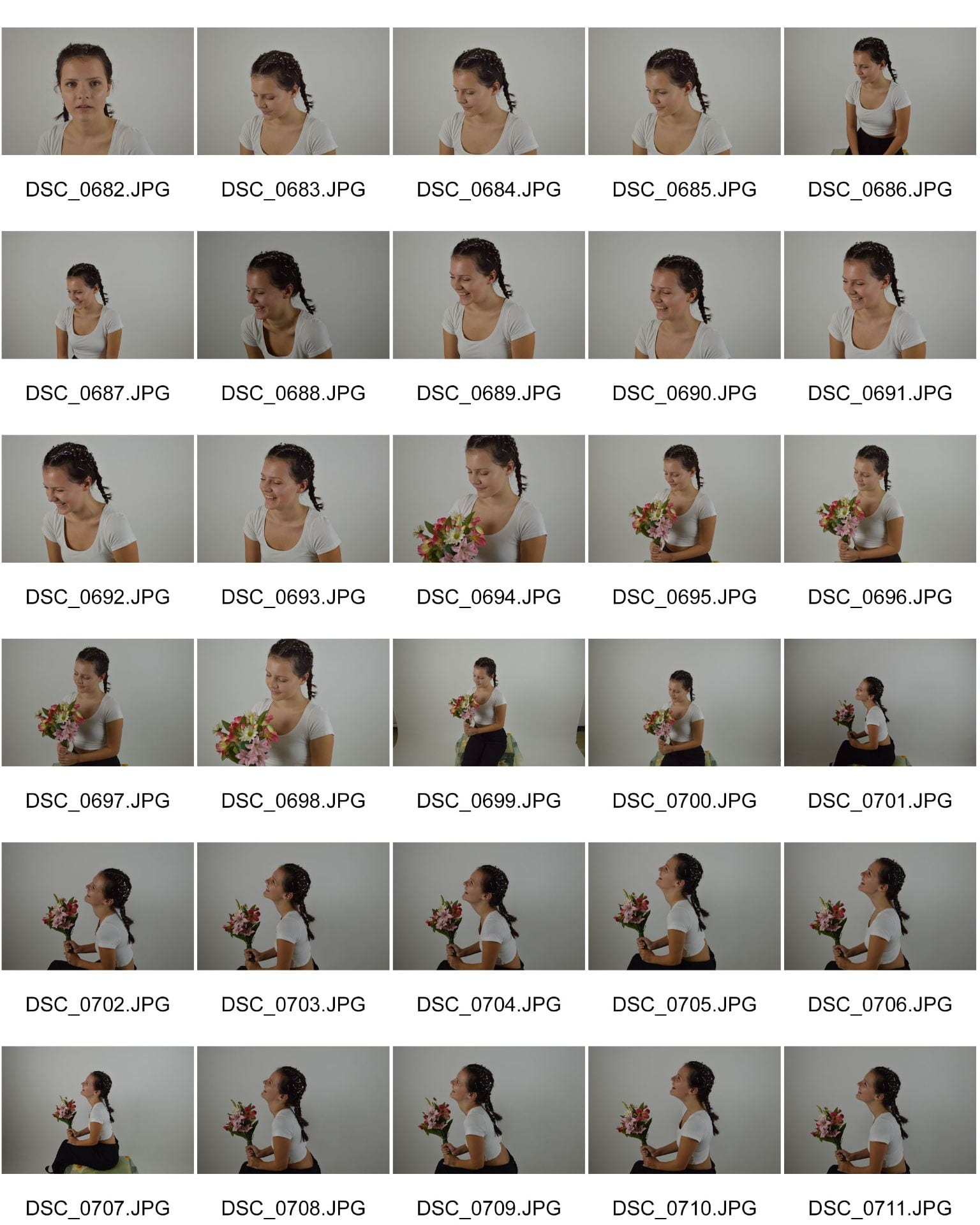
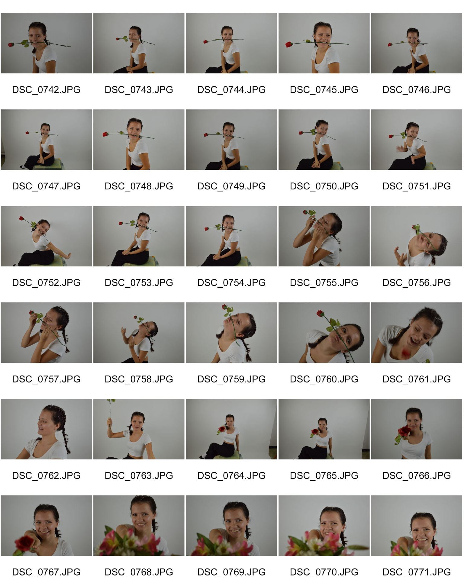
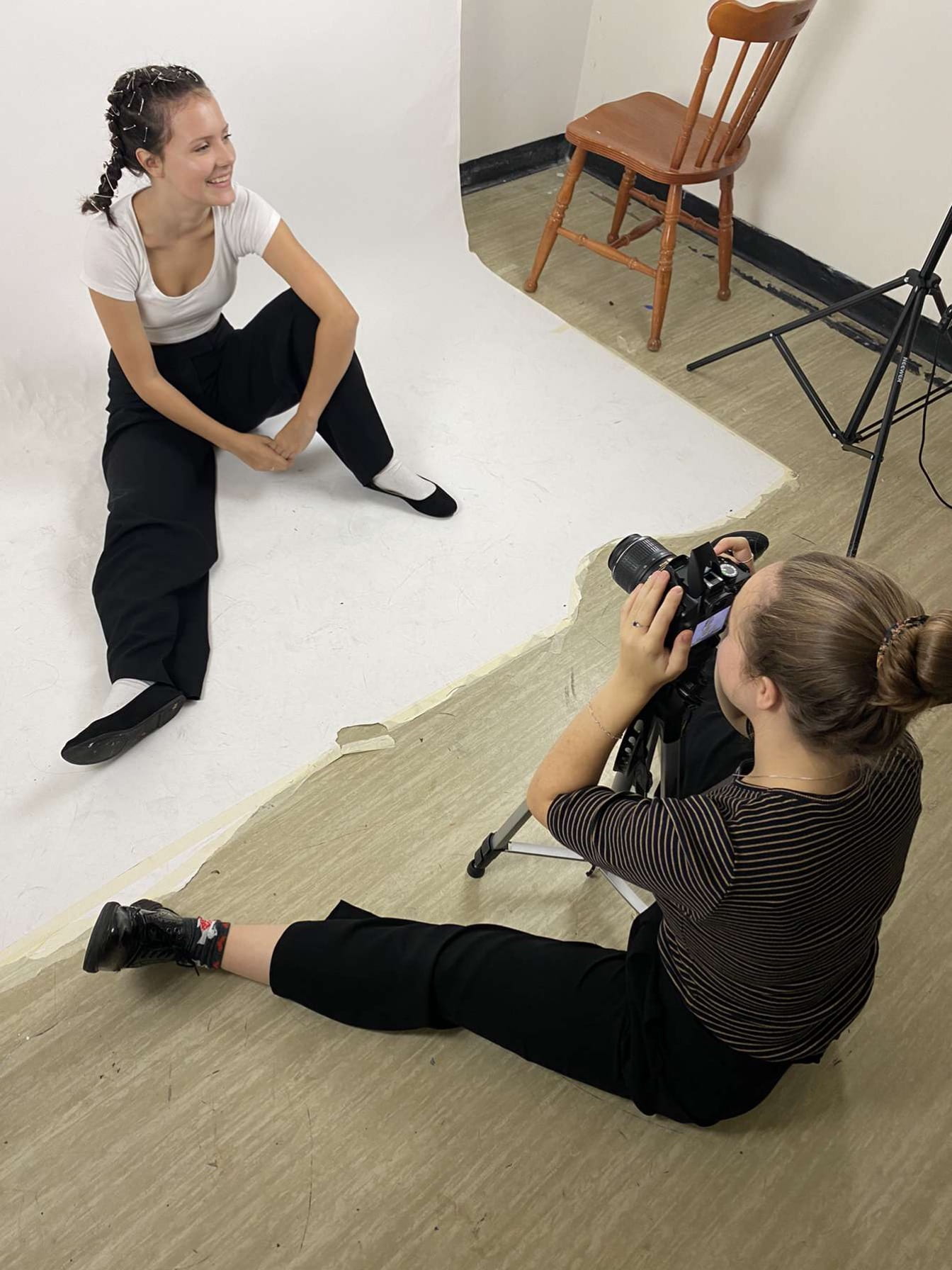
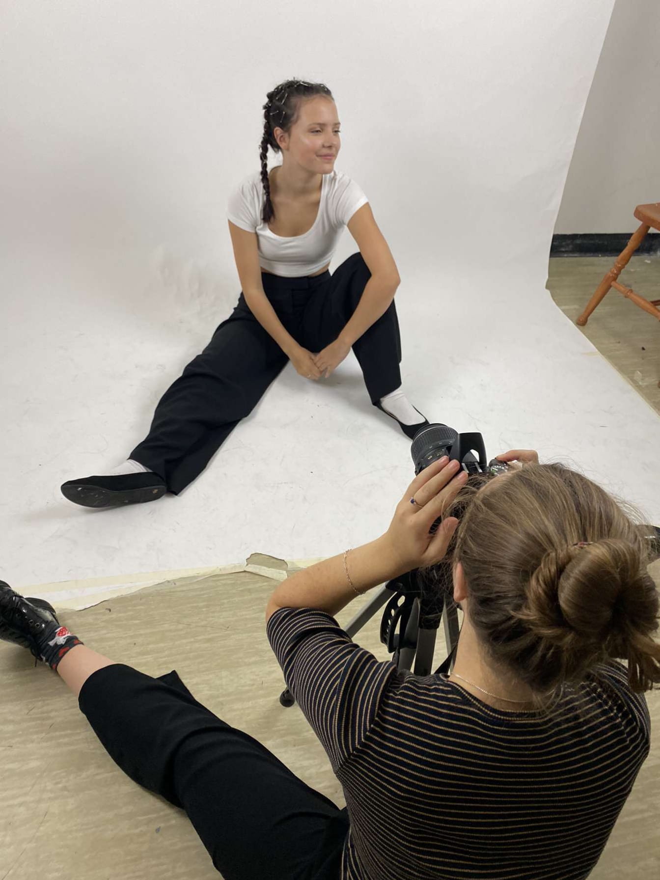
Contact Sheets from Shoot 1


October
16
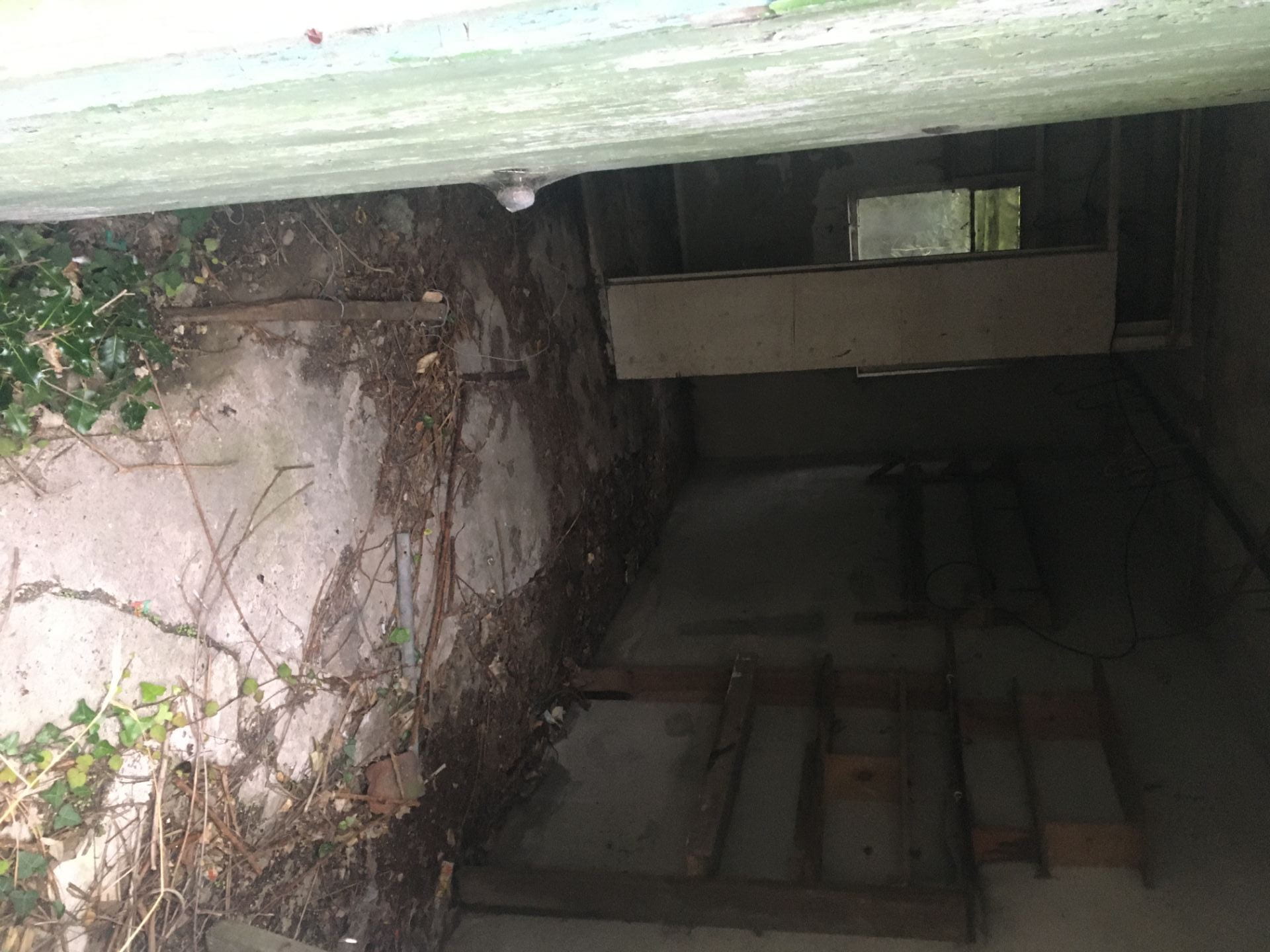
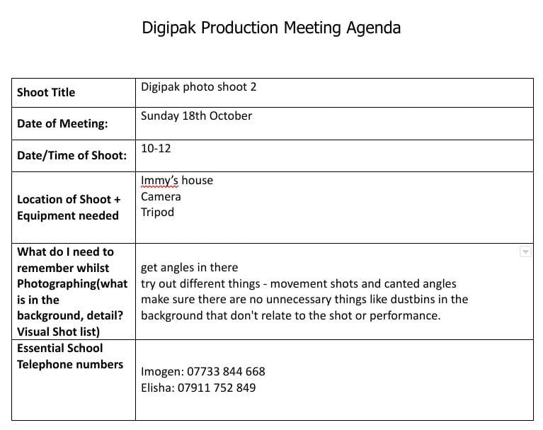
Production Meeting Agenda & Risk Assessment for 2nd digipak shoot
We needed to go on a second shoot in order to get the inside images for our digipak. We decided that in order to fulfil the conventions of our genre, we needed to include nature in our digipak. We decided to go for a woodland look and we took inspiration from one of dodie’s albums and have the original image on the left hand side and and invert the image on the right hand side. Here is our production meeting agenda and our risk assessment for the 18th October.
Production Meeting Agenda:
Risk Assessment:

October
16
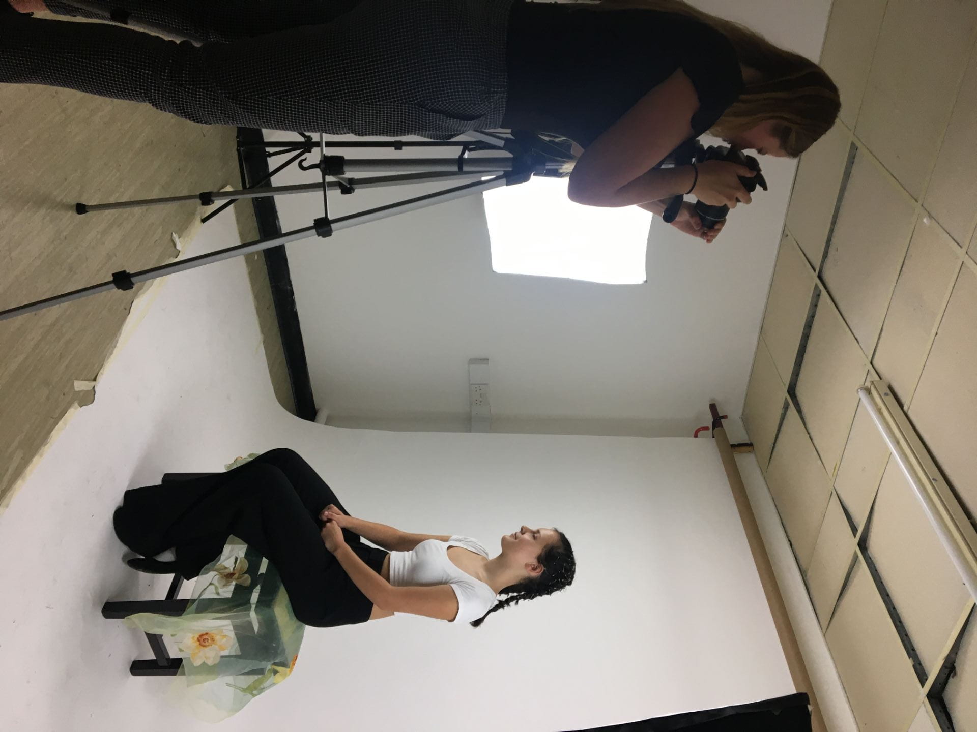
Evaluation of Shoot 1
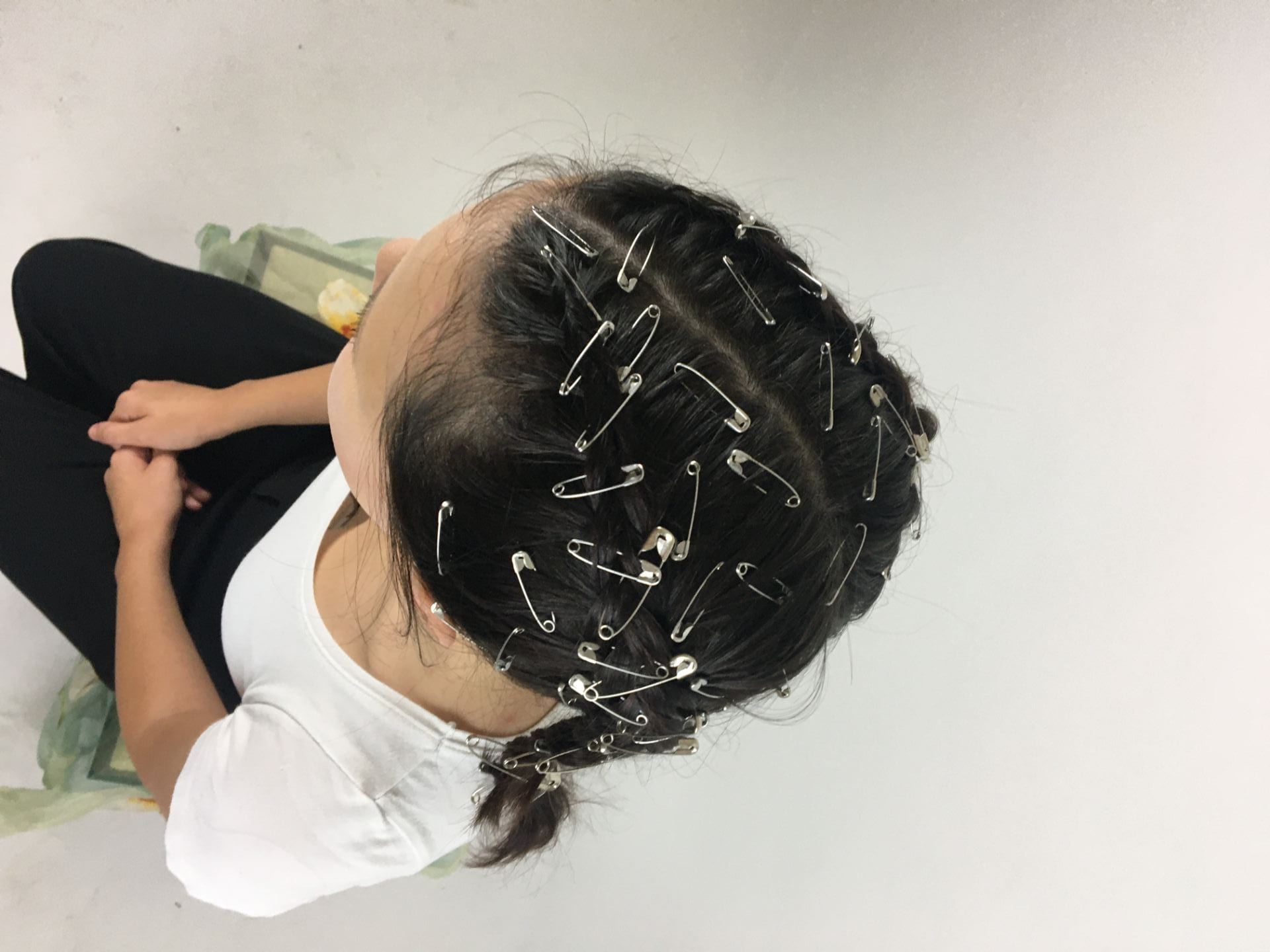
Overall, I think that our shoot went really well and Immy and I were really happy with the results. We managed to achieve the effect that we wanted in Eve’s hair and it looked even better than we imagined. We think we managed to get some shots to use for the front cover and back cover for our digipak. We managed to get lots of mid shots which are the shots conventionally used for our genre as well as covering all bases and getting high angles and lower angles and side profile shots. Our star was smiling the whole time in order to portray the happy nature of our star image and to reflect the music on the digipak. Our shoot could have been better however because we couldn’t really see the safety pins in Eve’s hair very well which was one of the main aspects of our outfit however the shots we got make up for it. I really liked the natural look that she had as it made her more ordinary and relatable for our audience, closing the distance between her and her fans.
October
14
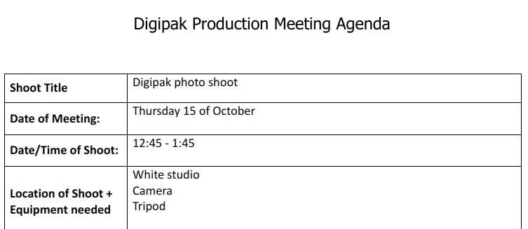
Photoshoot Production Meeting & Risk Assessment for Shoot 1
Below is our production meeting agenda and risk assessment for our digipak photoshoot. It is important to have a PMA when doing a shoot so that everything is organized – you know exactly what you need and who is responsible for bringing it. It is also important to have a risk assessment to prevent or be aware of any risks at the location you are shooting at in case anything happens.
For this shoot, we aim to have successful shots that we are able to use in our digipak that convey our star as friendly, calm and relaxed whilst also reducing the distance between the star and her fans, making her more ‘ordinary’.
Production Meeting Agenda:
Click on image to view full document
Risk Assessment:

Click on image to view document