Category Archives: Component 1

A Front Cover Analysed

In this post, I will be analyzing a front cover of a professional magazine. This magazine is with my chosen genre Rap.

In August 1997, Harris Publications released the first issue of XXL. It featured rappers Jay-Z and Master P on a double cover. In December 2006, XXL took over the struggling hip-hop producer and DJ magazine Scratch (another publication owned by Harris Publications), re-branding it as XXL Presents Scratch Magazine.

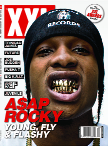
What we see first on the front page is the big bold red ‘A$AP ROCKY’ text which stands out very nicely while using a sans serif font. This helps us to identify who is the cover start almost instantly.

Next, we see the logo in the top left-hand corner, again this is nice and bold with a box around the outside. The producer has used again a sans serif font as this fits more with the rap genre.

The use of boxes outlining the text really catches the eye and makes us want to read more as it sets a nice modern feel to the rap magazine which is following the rap culture.

The target audience is people aged from 16-32, as this is an age group with the majority listening to rap or hip-hop. This age group has proven with the amount of social media posts.

Some message that is given from this genre of music is not very good for some of the younger views with a lot of smoking, drinking and drug use which is also referenced in most of the songs. Some messages are good, showing good signs of a good role model. Things like the support at Glastonbury for banning plastic bottles from the festival encouraging the use of cans that could be recycled which all the artists and groups at the festival supported to help climate change.

A New Improved DPS

This is my new and improved front page

I have improved my front page a lot. The color scheme has changed completely from the blue to the orange to represent the bright color from the jumpsuit. The font are all of those to represent the hip hop rap magazine.  I have added a logo in the corner and added exclusives banners.

What is new?

  • Colour scheme
  • Logo
  • Exclusive banner
  • The colour on the photo

What is next?

  • Start to work on a contents page to put at the back of my music magazine
  • Perfect the contents page, so i can reflect on it
  • Start to create an advert to place into my music magazine

11th draft


Design skills 1

This term I have been learning the ways of media.

I started by catching up on the work I missed at the start of the term. This included all the work with the camera and mise en sene. This has allowed me to then take photos that I have then gone on to use in programs such as InDesign and photoshop.  I did have some previous knowledge on photoshop but I have also learnt some ways to change contrast and colours in the photo as well as learning how to whiten teeth.

I have learnt some ways to play around with text on InDesign using stroke to have the effect of a shadow or to incorporate a new colour into the design.

My magazine front cover first draft was not very good, I used the basic skills I had already learnt to try and finish the first draft. I then took it upon myself to ask and research new ways and techniques to use to make my final copy of my front cover how it is now.

I learnt how to use the burn tool to darken skin colour and add a sort of tan to my models

I learnt how to use the stroke took in InDesign for mt text to make my cover and 2PS.

I have tried to make my writing enable to read as I really want to intrigue people and interest them in the rap culture and industry. This, in theory, could be a very good business idea if anyone would have wanted to publish a rap magazine as there are not many rap magazine.

My model was dressed to my stander and was fit for the shoot. He knew exactly how to model too allowing us to get the best photos for the magazine. We want to make Dave look like a guy you wouldn’t want to mess with.

As a Rap fan, I’ve tried to make a magazine I would have enjoyed reading as if I enjoy it hopefully others with similar interests would have picked it up for a read.

Feedback & Reflection on Draft DPS

Targets for development? What’s new and what’s next?

My targets set by my peers are;

Will said,

  • He wanted some patterns on the background at the top on the left page.
  • He would like the paragraphs to be the same length.

Mrs Cobb’s targets,

  • Get rid of hyphens
  • Choose a sons serif font
  •  Paragraph the article
  • Break it up with quotes or photos
  • Drop capital – needs changing.
  • No page number
  • No date.

My targets

  • Complete listed above
  • Pick final story and photo
  • Adjust story
  • Cut photo
  • Fix paragraphs
  • Fix paragraph length

How will i do this?


I will look through some internet story’s and adapt the story around a photo i took of harry on my location tour. Then i will complete the rest of my targets.

Draft of The Double Page Spread

CLICK FOR PDF

This is my first draft of my 2-page spread!

I need to think of a title and I also need to cut out my photo of Dave and place it on a nice background, or I will change the photo completely and adapt my story around it.

These are my targets set my, my teacher;

  • Get rid of hyphens
  • Choose a sans serif font
  •  Paragraph the article
  • Break it up with quotes or photos
  • Drop capital – needs changing.
  • No page number
  • No date.

Third Shoot Contact Sheet(s)

Today I and my fellow classmates took a day out to go and visit Castle Cornet, a loverly Castle located on the castle and placement in St Peter Port. These are the photos I took while out, some were hard to take as the weather was against us.

I like this photo as it gives a real sense of drama.

Harry has a lot of fear on his face and his body image portrays it too


Harry in this looks really almost week as he is low and looking very sad so this could be a reason for the story behind the picture