

Category Archives: component 1
second shoot contact sheet


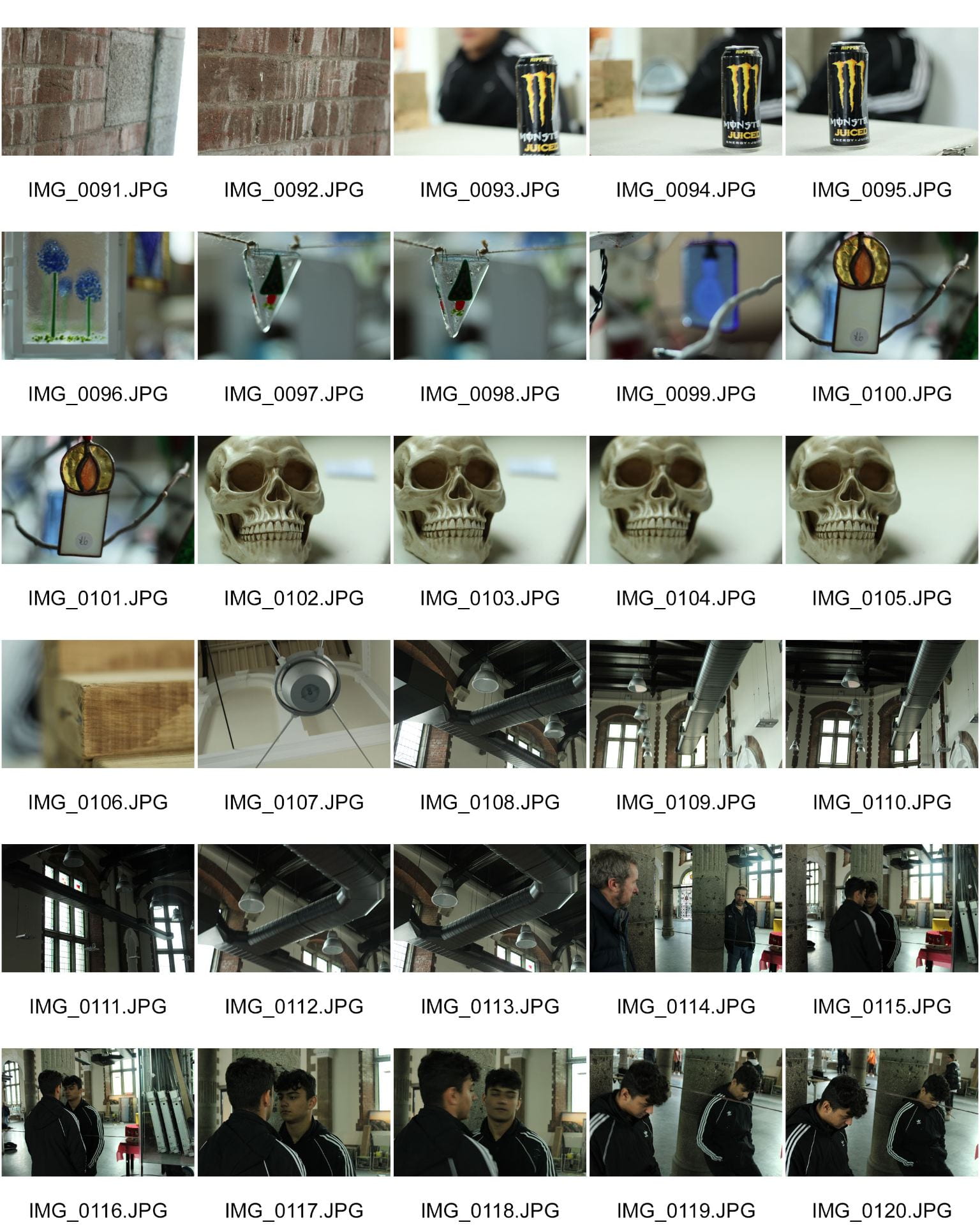
This a collection of contact sheets from the second shoot we did that took place in town, i feel i have gathered a good amount of picture including different places and angles. I particularly like the ones of my model by the steps i feel the setting fits the theme really well with the endearingly grime like background, the pictures in the building i also feel worked particularly well and are quite good background images. I also played with a macro lense witch yielded some nice images such as the Christmas decorations and skulls.
A New And Improved Feature Article

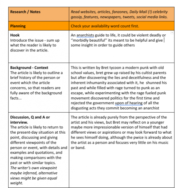
This is the redraft of my article in the second draft i made sure to make it obvious what anarchism is and hoe its fits in politically as this what if someone isn’t quite sure what anarchism is or how it works my article wont alianatee them while still not sounding to redundant to any season punk or anarchist.
I decided to also lay off the government and focus more on society as i feel contextually that makes more sense and the topics mentioned feel more as a result of society than a tyrannical government.
I also added some statistics to give the article a bit more structure and substance to my article, its allot easier to take away something from an article if instead of opinions its hard facts and statistics.
So… I am ready to photograph my star
My mission statement for my magazine is ”we make music for people who listen” this could be communicated as its a music enthusiasts magazine for music enthusiasts, compared to pop witch is usually listens too quite passively, my ”brand” would communicate authenticity and a comparable understanding of the genre as if i lived through the punk movement in the 70s. As a result feel my shoot needs to incorporate allot of classic punk elements for instance battle jackets, braces and boots. The setting should also communicate this being grime or dirty like a back ally for instance. I may photograph my start from a lower angle than usual so to make him appear more powerful or with a higher status, i could also incorperate a canted angle to communicate his chaotic vision witch the canted angle has connotations of.
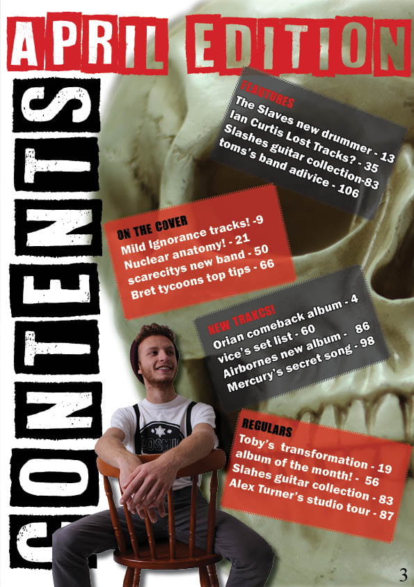
What is a contents page
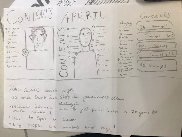
These are the drafts of what i think my contents page should look like, on the left there a more traditional looking contents page. I like the look of it as its simple and readers know exactly how it look it makes scene and is quite familiar. The flip of that is the far right that is slightly more modern, it showers a contents on the side of simple headlines but then a second column containing images (these could be articles from the cover or features or a couple other options).
Complete magazine draft
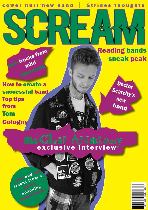
.The Green on purple needs to be changed(issues for colour blind people)
.Mast head needs to be broken up
. capitalisation
.Separate headlines
.Price, date
.Work on grammar on the double page
.Change colour scheme in contents
.Change mast head type face
.Seems child like
.Change the image of my star with a businessman
.Grammar
Draft of the Double Page Spread
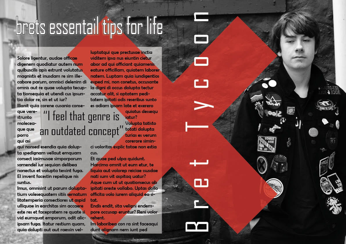
This is the first draft of my double page spread and i feel it turned out well, although i feel that the main typeface is a tad to big and could do with being a serif font as it would be easier to read, I also neglected to include page numbers witch would have to be remedied. Although i do like my mast head, i feel the font fits with the theme and the white nicely contrasts with the dark background. I also feel the big red x is a nice addition witch breaks up the image a bit more and makes it allot more visually interesting. The type face could do with a change maybe more bold but also needs proof reading with the obvious addition of the article.
Draft Feature Article

My article is the top tips for life from the perspective of a punk, it follows my star (Bret Tycoon) as his explains his perspective on day to day and his advice on life from someone maybe in a similar position to him.
article idea development
My article will be a list of top tips for life from the perspective of an anarchistic punk, the target audience for witch will be someone aged between ages 0f teenager to mid twenties and middle class, witch would be the average person who avidly listens to and consumes punk culture and media. These people crave direction in life usually with not many prospects and having something like punk fueled of low income and rage appealed to them and the magazine needs to reflect that.
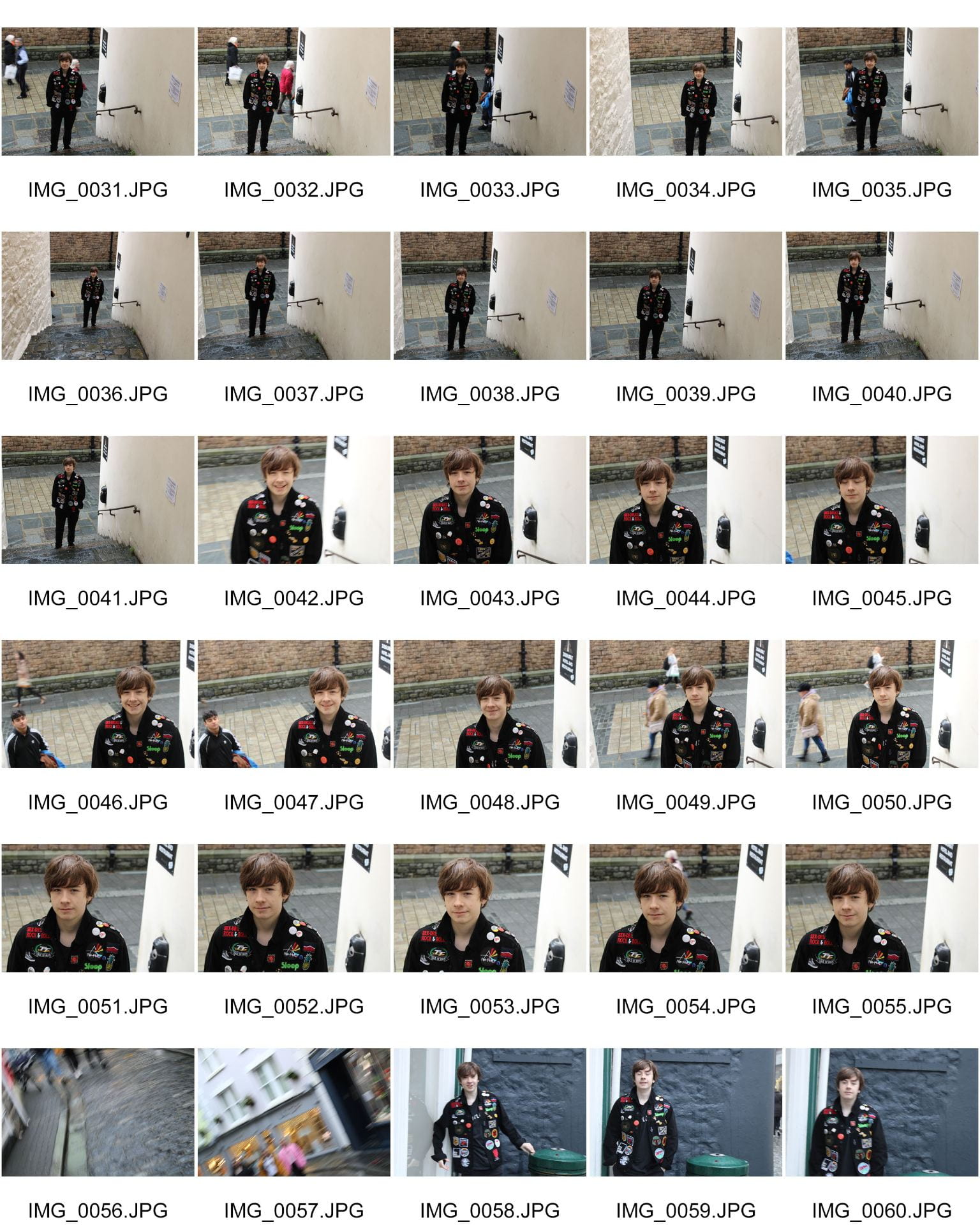
First shoot contact sheet
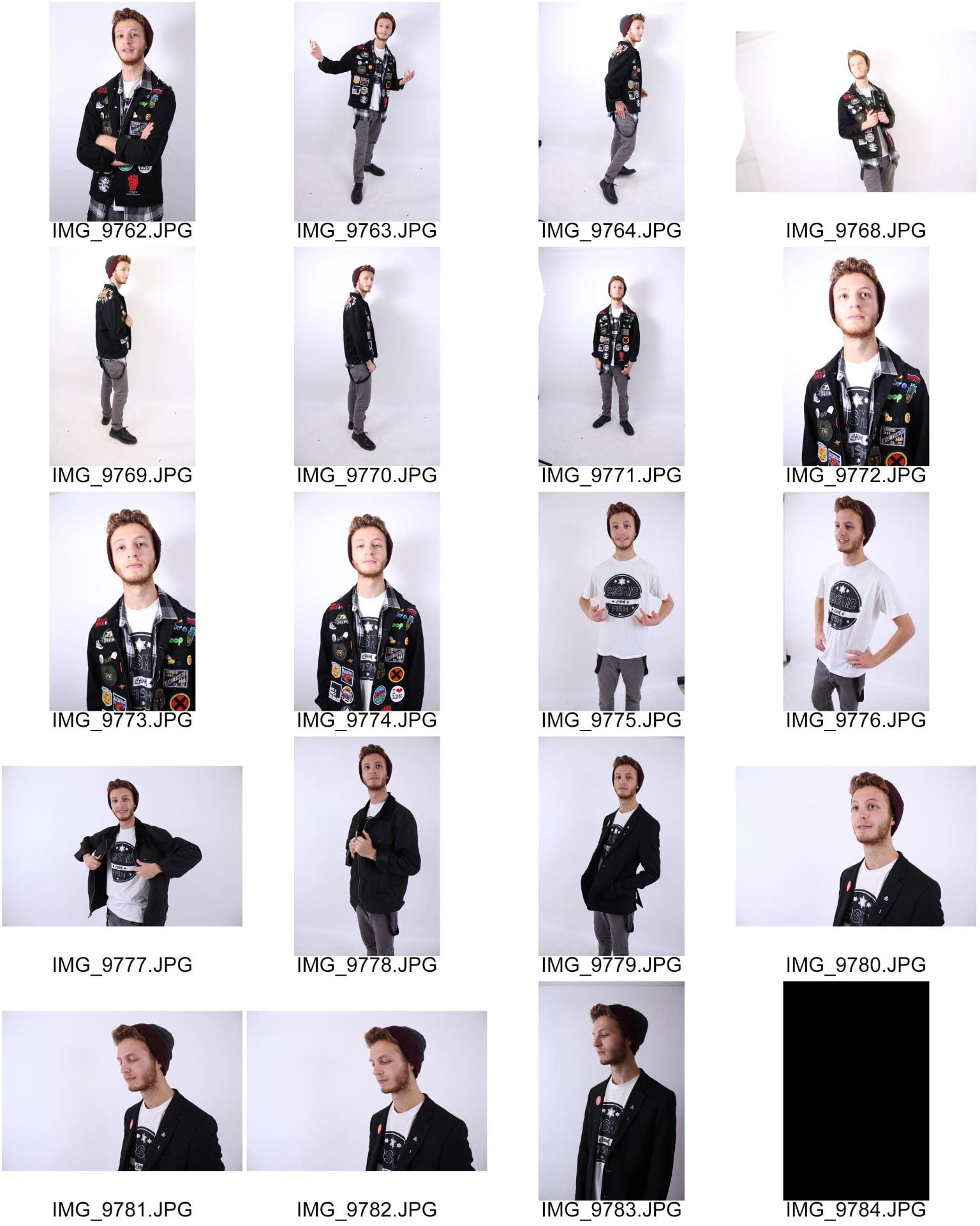
I feel that i may have met the standard for my shoot, the images appear to be in focus and not over or under exposed and i feel they meet the theme and have the relevant imagery associated with a punk. Especially in regrades to the battle jacket witch makes it very clear what genera is being emulated. The next time i do it i will make sure to have a clear plan of how to light the studio in regrades because if we had a better plan it might have been a smoother quicker process.