Digipak – Final Draft

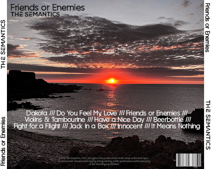
For the final draft of out Digipak, we ended up changing the size of the horns and halo to ensure they stand out from the background. This makes the overall idea behind the ‘friends or enemies’ title stand out in the representation of the images. We also added the pink and grey bars at the bottom of the opposite colours, this again makes the different sides stand out and oppose each other. We also increased the size of the fonts for the titles to make sure they are easy to read from a distance, for example on a store shelf.

Digipack Mock Up

This is a mock-up of roughly how our Digipack looks. We did this by analysing other artists Digipacks from our genre and appropriating some of the typical technical conventions of the genre and making it into our own idea. This way our star image stays appropriate for Indie Rock and our target audience. The front cover will be two men staring each other down, representing the ‘friends’ and ‘enemies’. The back will be a picture of a sunset, edited to the sun is the main pop of colour on a mostly saturated background.

Digipack Photoshoot Contact Sheet and Evaluation

We had a photoshoot for our digipack. We planned out most of the photos to ensure the shoot would go smooth and we would get all the shots we needed for out covers. We also made sure we got plenty of different angles and distances to keep the shots interesting. our shoots will continue to be planned this way for the future, as this way we got best results.

DigiPack – Draft 1

Please click on the image to see the PDF…

Upon reflection there is a fair amount to change. We need to…

  • Changing the front page to maybe have one of the two in black and white or even flipping the image.
  • change the size of the titles and song names on the back
  • Add more to the front cover, maybe some graphics and more colour to make it pop

The LookBook – DigiPak

Made with Padlet

To get a better idea of what makes our genre’s conventional image, we made a look book. This is a collection of annotated images that generally define our genre. We also added in posts and pictures from other indie rock artists. This gave us a good idea about what sort of thing to plan for our digipak and social media page. Our group decided that our 5 main descriptors for this genre are…

  • Indie
  • Relatable
  • Colourful
  • Dark
  • Casual Style

This has created a “Blueprint” for our band’s style and will help with the social media page’s progression.

Our Mission Statement – The Package Brand

When it comes to creating the Digipak, there is many things that need to come together to produce a good package and brand. The USP is the main thing that will draw your audience in, often it will be centred around the star image and band/characters in the video. The mission statement is made to help people understand the message behind the brand.o

In this presentation we show all of our research into our target audience and our main ideas about the mission statement and USP. We uncovered a lot of information such as our target audience’s age, psychographic and gender.