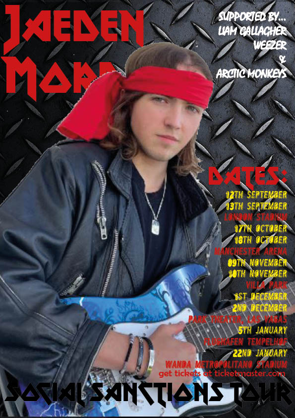
Firstly I did some research into what makes up a heavy metal poster. Looking into it I found that many of them are gritty and metallic, many of them are dark using dark colours with pops of bright colours all over. For example in the “Metal For Life” poster it is completely grey but there is pops of yellow for some of the important information, drawing your eyes to certain bits. I then took all this information and created a poster of my own trying to represent the heavy metal genre. I designed the poster around the idea that the background will be metal to show simply that it is a heavy metal poster, then adding the model on top with dark, conventionally cool outfit. Knowing all this will increase my repertoire of elements of media and give me a deeper understanding of the key ingredients used to make a stylistic media text.
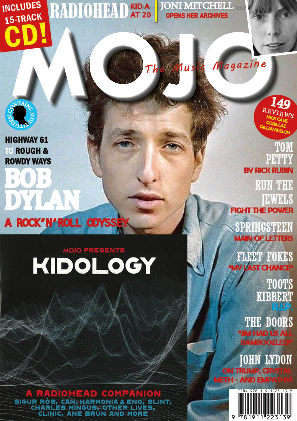
This is my swede of the MOJO music magazine, I re-created this on Adobe InDesign. Mine is at the top and the original is at the bottom. I have learnt through doing this how to use InDesign and how to apply my media detective skills in searching for the more intricate parts of the magazine. I found that magazines have universal similarities like the masthead, cover lines, cover star, tag lines and more which all come together to make the main template for magazines in all styles and genres.
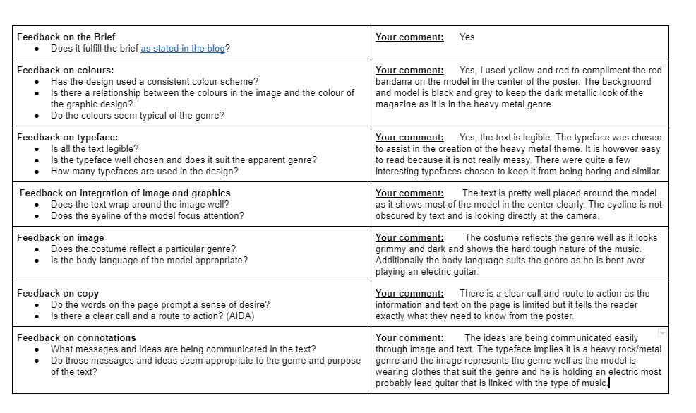
Whilst I was doing this I noticed some strengths and weaknesses in my use of Adobe InDesign, I have made a list of three main points for each…
Strengths…
Using the various tools to create/re-create the differing fonts in this magazine cover. I was able to use tools like font style and size, bevel and emboss, drop shadow, step and repeat and more to create the best styles of text as I could.
I was able to use other types of software like Adobe Photoshop and 1001 fonts to add more to my magazine than I otherwise could. for example I could not get a black silhouette with a transparent background to go into the blue pug on the left so I made a black silhouette on photoshop and used the “magic eraser” tool to cut out the background making it transparent.
I was also best at placement on the page and layering. I was able to layer the page well so the right things were in front and in the background for example the masthead was in the background behind the photo and pug in top right and left.
Weaknesses…
I could have been better at creating the pugs in the right size and shape. the blue and red pugs half way down the page were circular but they also had jagged edges almost like a star.
Using the right photograph. The background to the photo in the original magazine is darker and the cover star is a bit bigger so I could have used photoshop to make that more suitable to the original in my own.
I could not find the exact barcode or picture. I could have also found the right picture for the background but I used a slightly different one to compromise.
I have found some useful videos on how to make and design my own magazines better in the future, One is a more basic over all tutorial video to remind me when needed and the other is a more targeted video that helps me create better shapes used for pugs/puffs.
Basic Over All Tutorial Video…
Create Better Soon…
I have now had the practice of making a magazine on my own, I now feel more confident in my abilities to craft my own media and therefore more confident that I will be able to make a well thought out music magazine.
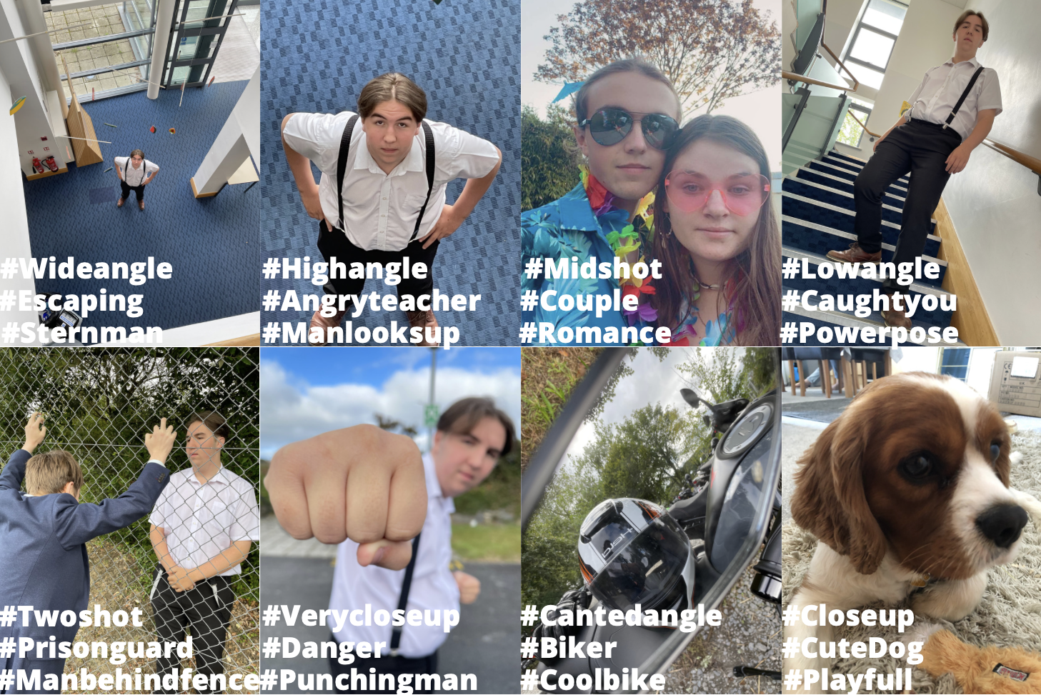
All images convey or represent something wether its a style of music or feeling or something else. This padlet of my favourite images from our main photo shoot shows how we created different meanings in all our images. Below each image I wrote what their connotations, denotations, and what type of shot they are. One of the best is the second one along from the bottom left, the very close up shot type gives the photo a sense of foreboding and danger. We learnt about canted angle photos and how to produce them. Our group took a few canted photos but the bike mirror was the best one, it also shows framing and close and wide angle as it is close to the mirror but inside the frame it is quite wide. The image has the narrative of a biker lifestyle represented through denotations of a bike helmet and a motorbike, the connotations of this is are a tough and cool biker. It also could convey a outlaw life style. Using camera and Mise-en-scene to create a powerful story is key to a good photo, it shapes the photo a gives it a good narrative.
Looking on to making my magazine cover the practice of talking photos like this will help me to produce a well thought out image to capture the audience’s attention and needs.
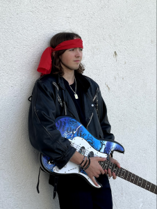
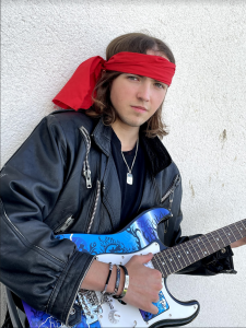
Mise-en-scene is used in most if not all media to convey meanings through images and media languages. Literally translated it means what’s on scene, this is an easy way to remember what it means and how to use it because of how its worded. We used multiple different of media texts and images to display the genre of music we were trying to convey such as locations, outfits, poses, hair and more. Heavy Metal is a very Anarchic and rough style of music which I feel we re created well. After a short research period we managed to create our images and accurately depict our style of music.
From this exercise I have learnt how to use MES, props, lighting, outfit, make-up, background and location, to create a scene and theme to a picture without telling the audience through words. The composition of the image is equally important to represent ideas, having the model look a certain way or having the camera take a wide angle shot rather than low close up completely changes the narrative of the image. The photo on the left shows some of the ideas the class had about what the image we created through costume and props conveys. The audience thought that I looked mean, Anarchic, tough, and stereotypically cool. Knowing how to do this before I come to make my images for my music magazine fit the part for the genre. The composition of the image is
All media creates meaning through images, text, layout, and design. This could be in typeface, colours of text, backgrounds and photos, or it could be how the model is standing or what his facial expressions are. I have decoded the denotations and connotations of this poster and how all four things above change how we view the poster of Drake’s “Summer Sixteen” tour. The poster has many different meanings implied within connotations and denotations that are quite different from each other. These all represent the feelings and values that Drake wants you to know, they are meant to draw you in. Further deconstructing this poster the plain colours and modern fonts show different meanings directed towards the younger population.
Seeing how all the different features of media texts create meanings and ideas in a well known musicians tour poster has helped me to understand how to use them in my own. Using images, text, layout, and design features I will now be able to more effectively produce a music poster to fit to a certain target audience and make an interesting set of feelings, values and ideas for my own music poster.