Creative Critical Reflection Q2 – How does your product engage with audiences and how would it be distributed as a real media text?

Here is my screen chastity showing how my magazine engages with my target audience and how it will survive in a digital media world.

Blues Bank is a music magazine based around Blues music, culture, history and news. 

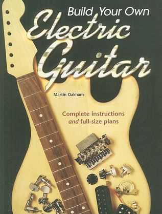
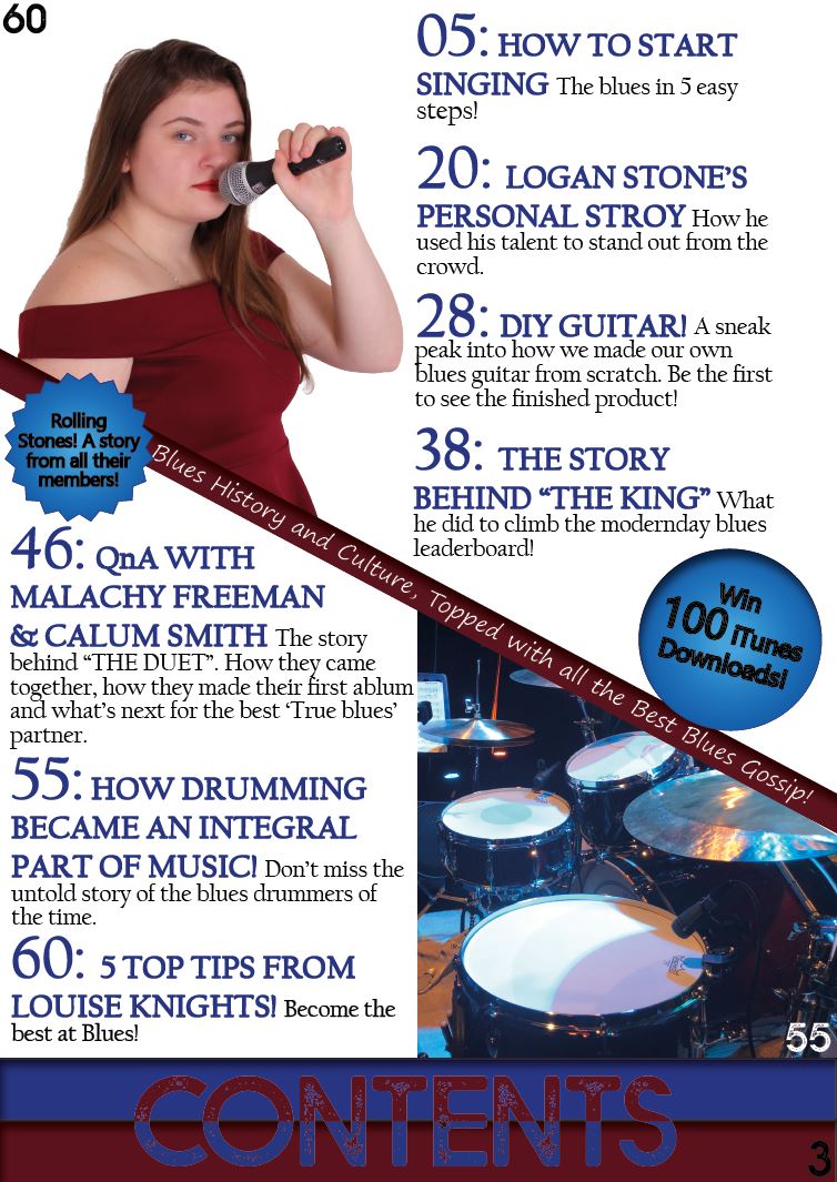
Blues Bank aims to give the reader factual information and exciting news about all things Blues. ‘We are delighted to say that our magazine does this in the most enjoyable, extensive and diligent way possible. The magazine stands out from the rest straight away as it covers multiple grounds. Within ‘Blues Bank’ you will find history, gossip, entertainment, and extra experiences like a step by step guide on how to build your own guitar or how to start singing the blues in 5 easy steps. We try to make learning about Blues music as fun as possible as this is one of our main brand values and usp’s.

I have done quite a bit of research into my target audience during the making of this magazine, the majority of which has been on YouGov. On YouGov I started doing some research into different psychographics and demographics. I found that the main demographic that would buy and enjoy my magazine was mostly people aged 40-60 (42% of people) however there is still a slightly smaller audience as well being aged between 20-40 (21% of people). Another part of my research into this area showed that it was more likely for musicians of any kind to read my magazine.

I feel that my target audience would buy the magazine because it adds a modern twist to older music. I used Blumler and Katz’ uses and gratifications and AIDA (Attention, Interest, Desire, Action) to assist with the making of my magazine.  

My Masthead, Blues Bank, is important to my magazine because it shows the informative but fun nature of the magazine and portrays the bluesy theme very well.

Another major part of the magazine is the main cover stars. I used my knowledge of the genre to make up the right costumes and props for the models to craft a strong Blues feel, and make them seem like genuine musicians. This creates a good star image and really targets the audience I aimed to. The names for my stars have been made to feel fanciful so they seem like real stars. Malachy Freeman and Calum Smith are simple but imaginative enough to draw the reader in, this is another way my magazine appeals to the uses and gratification theory as it uses information and education, and Entertainment. 

During the planning phase I looked at quite a few different magazines to see what kind of shot and body language they were using. I ended up taking a mid shot of my model on the front page from a slightly low angle so you could see her face and most of the dress she was wearing, this way her identity was not hidden at all as many blues artists are quite upfront. The model also posed with a microphone up to her face so it looked like she was singing so people who did not already know who she was could easily see that she was primarily a singer.

For my magazine I have chosen BAUER publishing. I chose Bauer because I feel my magazine will fill the gap in their range of current publications. They do have some music magazines but they are more generalised like MOJO. Looking at what radio stations they have under their belt I found that they have 60’s through to current times and many rock and jazz radio stations but no Blues central stations. I thought that Blues Bank would fit in nicely and fill in the gap in their range; it could also pair with Bauer to create a Blues station.

The kind of advertisers I would hope to attract to Blues Bank are primarily music based. Something like a Drums, Guitar or Bass themed advert would be perfect. Due to the fact that most of my target audience is musicians I want to target that demographic in the advertising more than any other. Another advertiser we would like to attract is something like headphones as this targets Blues Bank’s more general audience without having to be specific as well as being useful and interesting to the musician side of the audience.

The way I plan on linking the digital and print versions together is I will provide a code on the front of the magazine that the consumer will be able to redeem online. This way people who buy the print version will still have access to the online version if they wish. We also have an Instagram Page where we keep everyone up to date on all things Blues. In the final stages of producing this magazine I will add the code and the Instagram Page name to the front of the magazine.

https://drive.google.com/file/d/1-Dgjz_aFGj9s-FXlZMJm7b-E9i7_sT7z/view?usp=sharing

My Chosen Adverts

These are the adverts I have chosen for my Blues magazine. My main target audience is musicians, aged 30 and above however any age group could wish to view this magazine as it is mainly a blues magazine, if they like Blues they can read it. The main reasons that I chose the ‘Build your own guitar’ Advert is…

  • Many people in my target demographic would like building, creating and music. This gives them the perfect opportunity to do both.  They also be interested in how guitars are made so following the ‘BLUES BANK’ guide on how to build your own guitar is a great match.
  • The colours are not too modern that they would put off older people but they also stand out enough that slightly younger people would be interested.

The main reasons for choosing the ‘Baton Bridge Blues Festival’ are…

  • Having a Blues concert in a Blues magazine is good for publicity and sales of tickets as it is the same if not very similar target audience for both the magazine and the festival.
  • The colours again stand out but not to much to change the feel of the magazine.
  • The festival would also get known to a more international group of people so again sales would most likely go up.

Complete Magazine Draft 3

These are my third drafts of my front cover, contents page and double page spread.  For These the main things I changed are…

My Front Cover Draft 3…

  • Added more cover lines and spaced them out as they were too close and hard to read.
  • Added the grey burst behind the headline to give it contrast to the white background.
  • Changed the colour, stroke and font of the main cover line “Louise Knights” to stand out from the rest of the text.
  • Added a puff too the middle right of the page making it more busy and interesting to read/look at.
  • Changed the blue background at the bottom of the page to suit the colour scheme and theme more.

My Contents Page Draft 3…

  • Changed the title to be at the bottom of the page and made it two tone to fit the colour scheme, also adding more interest to the page.
  • Moved the placement of the pug on the left from bottom to middle.
  • Added page numbers to the photos to give clarity and changed the size of the page number at the bottom.
  • Put stroke on the titles to make them stand out.
  • Brought the cover lines closer together and justified them to the left to make it easier to read.

My Double Page Spread Draft 3…

  • Added Page numbers.
  • Changed the size, shape and angle of the ‘DYNAMIC DUO’ title.
  • Made the Main cover lines and names of the stars to a different colour to stand out.
  • Made the main cover lines capitals.
  • Justifies the stand first to the middle to align with the cover lines.

Please click on image to see PDF…

Font Page…

  • Increase the line spacing between the cover lines as they are fighting for space a little bit.
  • Move ‘The King’ text down to the next line and change colour to stand out.
  • Make the ‘Lou Knights’ text bigger.

Contents Page…

  • Play with the colours a bit more to add flare.
  • Change the Line spacing a bit of the main cover lines

Double Page Spread…

  • Justify the Stand first to the right and left
  • Make the column for the writing line up so the text is all in lined up together throughput the page
  • Add some drop shadow, inner glow, bevel and emboss or satin effect to the picture in the bubbles to make them distinctive.

Draft 2 of my Contents Page

This is my second draft on my contents page. For this I looked at my peer assessment and 5 main points and corrected them. They were…

  • The main writing for what’s on each page needs to be in a different colour as it is too similar to the other. 
  • There is too much of the word contents. 
  • Needs to get rid of one of the contents titles. 
  • Needs to add in more pugs and plugs to show the audience different and exciting things happening in the magazine. 
  • Need more images of models.

For future drafts I want to…

  • Possibly change the background so it isn’t so bland to look at.
  • Add something to the bottom of the page to make it more interesting than just two lines.
  • I may add a background to the image of the model on the top and left.
  • I also might change the image on the bottom left.
Please click on the image to see PDF

Double Page Spread Draft 2

In my second draft I amended the main points I wrote on the DPS Draft 1 post.

Things I changed…

  • I changed the place holder text to the biographies of the artists.
  • I added a byline and drop capital for the standfirst.
  • I also changed the questions and first line of standfirst to a different font (the same as the title) and made them bigger so they popped.
  • Lastly I added ‘The Duet’ on the second page to fill in the space.

To Change…

  • Although ‘THE DUET’ fills the space I feel it might not work as I also introduce them on the bottom of the page on the piano keys.
Please click on the image to see the PDF

Front Cover Draft 2

This is the second draft of my front cover.

  • I did not like how the front cover was all blue from side to side in a gradient so I made a box for the star and main cover lines to go in.
  • I also changed the font and size of the cover lines to stand out more from the Main cover line and name of the star.
  • I made a feathered colour box to go at the bottom behind the price “100th Issue” and barcode to stop the page looking too blocky.
  • Finally I made the main cover star a bit bigger to go over the lighter blue box of at the top also to fill the space between the light blue divider and the dark red puff at the very top.

Things to change…

  • I want to fill the space around the middle box with cover lines so it does not look so bland and so it gives the reader a little more information about the magazine.
  • I would also possibly change the size of the cover star to not take up so much space on the left side.
  • Change the size of the main cover line and star image name.
  • I will look into changing the background behind the masthead so it doesn’t look so bland as well.
Please click on image to see PDF