Critical Reflection Essay

Critical Reflection Essay:

How did your research inform your products and the way they use or challenge conventions? 

How do your products represent social groups or issues? 

How do your products engage with the audience?

How do the elements of your production work together to create a sense of ‘branding’?

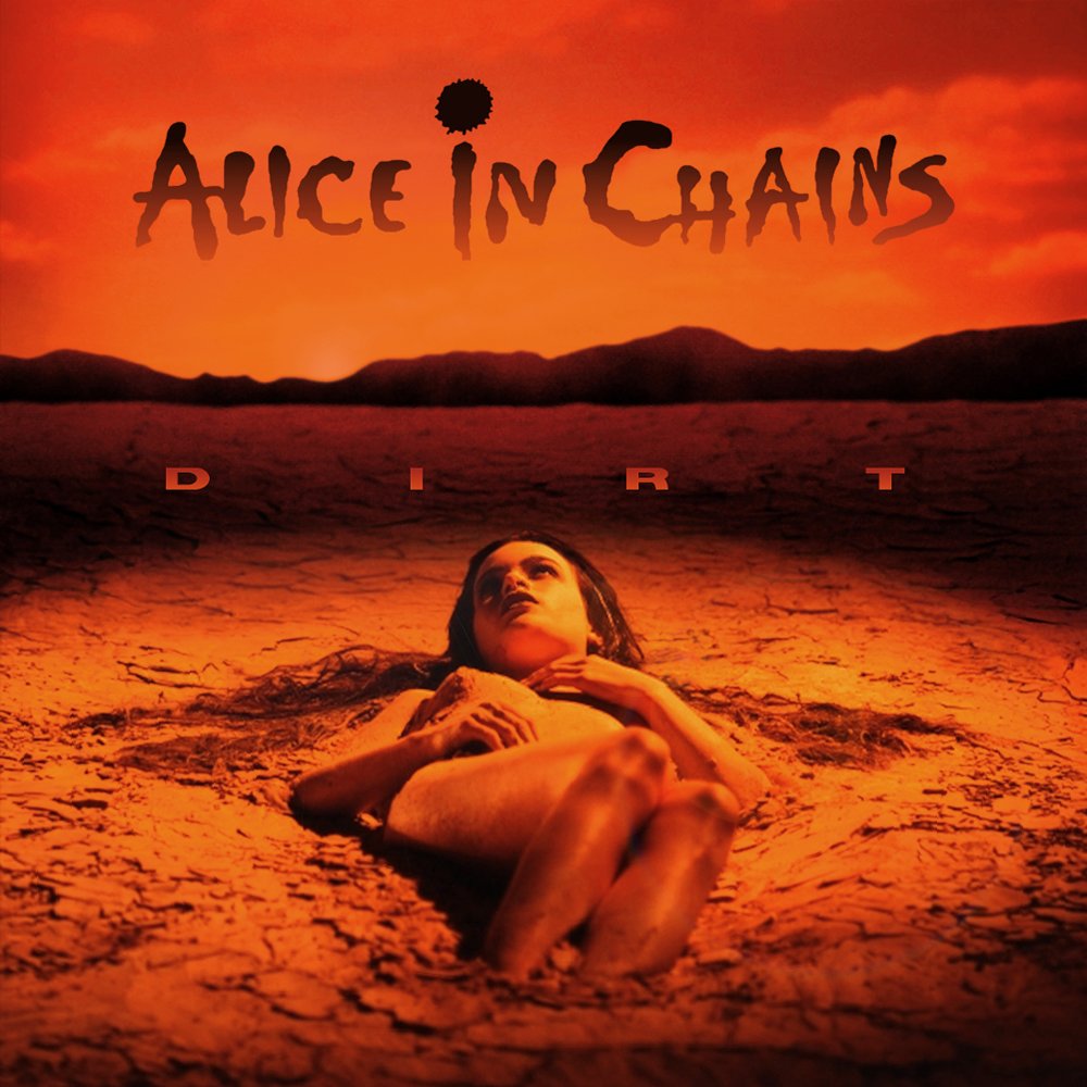
The Digipack which I created represents the grunge genre via the use of dark and desaturated colours seen in albums such as Dirt, Bleach and Full Circle, the abstract image reflects not only the theme of the album (a school theme) but also that the school is controlled by some overseer and the dark colours and clothing that can be seen reflect that this figure may be an antagonistic force. In this way, the album cover illustrates the lack of freedom of those caught in the school system as they are figuratively (and literally) in the palm of someone’s hands. The inner panels also further illustrate the grunge energy that I am trying to emulate. The left inside panel features scattered polaroid images (signifier) that reflect carelessness, recklessness and a chaotic atmosphere (signified) (De Saussure). These sensibilities are what Barthes would describe as mythic representation of grunge artists, since these ideas of them are so ingrained in society that it has become a globally accepted view of grunge artists and bands. The right inner panel features the two characters in my music video, the student and the teacher. I positioned them in this way so as to create a visual sense of conflict between them that is reinforced by their opposing philosophical approaches evidenced in the music video. Finally, the back panel features a report card with subpar grades awarded as well as the tracklist incorporated into it. This use of merging the image and tracklist together is something that many grunge bands have done before such as in Dirt (Alice in Chains) where the writing is specifically made to look messy and rough so that it resembles something drawn in the dirt, cleverly tying together the theme and informational aspects of the album.


During the preparation and planning for creating my music video, I decided to research various grunge rock artists such as Alice in Chains, Nirvana and more contemporary bands such as Foo Fighters and Fontaines D.C. The research involved gathering ideas for the basic mise-en-scene (costume, lighting, actions, hair/makeup, props and setting) and following the repertoire of elements (Lacey) to reinforce the grunge aesthetic and feel . For costumes, I specifically took influence from how Kurt Cobain of Nirvana dressed. (A plain t-shirt with an unbuttoned chequered shirt over it and slightly worn jeans), my research also showed that the majority of grunge bands utilise low key lighting and chiaroscuro to reinforce the dark and edgy tone. The props we used were reinforced greatly by Nirvana, we used electric guitars, bass guitars, a drum kit and strewn cables and amps to further reinforce the feeling of an anarchic, careless and modern band that is breaking tradition and moving away from more popular forms of music, such as Pop, Hip Hop and EDM (Electronic Dance Music). Our setting was informed by the name of the original song “School” by Nirvana, as such we decided to base our entire video around the idea of being trapped in school by an oppressive and authoritarian teacher. I used these genre conventions as a basic blueprint (Altman) with which to create a faithful and accurate video that embodies the typical conventions of the grunge genre.


Branding is a specific story that the audience believe and buy into. Something that resonates in the hearts of those who interact with it. In this way, my products create a sense of branding through:

The protagonists ideology on display in my music video, that of wanting to break the shackles of conformity that bind him, would resonate with the values, attitudes and beliefs found in my main audience and as such this would affirm their personal identities, while this strong ideal they hold would make them inclined to interact with others who hold the same beliefs (Social Interaction) (Blumler and Katz).

The social media page reflects the idea of branding through the way in which our stars are presented as brash, unapologetic and anarchic. The social media page makes use of cross media convergence seen in one of our songs being featured in a film and also through the use of collaboration with other artists. 

Finally, the digipak conveys the rebellious and abstract spirit of the band through the abstract image on the front pane that introduces the theme and ideals of the album and the band, as well as the two inside panes that reflect their divergent attitude towards objects and ideologies that society holds in high regard, with the photos of fun times for the band being left scattered and strewn implying an abstract narrative as to what happened later on to the person revisiting these photos and the stare down between the authoritarian, oppressive teacher and the rebellious, non-conforming student.


The products I have created engage with the audience through the affirmation of their personal identities within the music video, their desire for entertainment and information seen through the social media page as well as the social interaction with other like minded individuals who follow similar bands, like similar music and have similar values attitudes and beliefs that our digipak enables. (Blumler and Katz). Through all the products we have made we encode our message and themes of social uprising and non-conformity that our audiences decode in their own ways and that allows us to strengthen the parasocial relationship we have with our audience as they adopt our own personal beliefs (Hall). Furthermore, the advantage of our online presence through the social media page makes it far more likely that people of similar tastes and ideologies will meet up and form groups or fandoms, taking back the media from large corporations and pushing our message of standing up against the established traditions of society (Jenkins). The many ways in which our audience can interact and engage with our products also pushes them to make content since in modern times media is becoming much more than a one way broadcast, now our audiences can broadcast back to us, and become prosumers, democratising the media landscape and making it far more participatory. (Shirky). 

Social Media Page – Draft 1

Social Media Page – Draft 1

This is the first draft of our social media page, featuring information about up and coming album releases, who the band are and where they are based as well as the charity that they are partnered with. Furthermore, we have a few posts relating to teases for an album drop and the theme, as well as showing the bands recent activity, playing at pubs and such.

Digipak – Final

Digipak Final Draft

This is the final draft of our digipak.

Reflection

What we changed:

On the front pannel we have slightly changed the band name to mirror something more akin to the design of Metallica with the larger leading and ending letters.  On the inside panes we changed the images to be more scattered and strewn to create a sense of carelessness and create a chaotic atmosphere on the left. On the opposite pane we have only made the addition of a border between the teacher and student to show a bold divide between the ideologies of the two. On the final pane we have just added spines that feature the band name and album name.

Self Assessment:

Front Panel:

I believe that the front panel works well as a way to communicate the theme of the album (school). The schoolbus in hand works as a good abstract metaphor, which other albums such as ‘dirt’ and ‘nevermind’ are known for, that represents an unseen, omniscient and omnipotent force that controls the school system. The band name is an element that immediately draws attention due to its central placement, contrasting colour and inventive design that evokes the feeling of bands like Metallica, Pantera and Megadeth.

Ride The Lightning | Metallica CD | EMPThe Great Southern Outtakes by Pantera (Album; Rhino; R1 554578): Reviews, Ratings, Credits, Song list - Rate Your MusicCountdown To Extinction': Megadeth's Explosive Political Assault

Inside Left Panel:

The inside left panel features a set of scattered polaroid images impyling an abstract narrative about the ‘good old days’ of the band. The scattered placement of the images connotes a carefree and reckless attitude towards objects of such importance, breaking the traditional idea of finding something nostalgic precious and worth protecting. Furthermore, the use of monochrome colours within the digipak also connotes a harshness and edginess that is found within many other piece, such as Dirt by Alice in Chains.

Dirt images and artwork | Last.fm

Inside Right Panel:

The inside right panel features a stare down between two different characters that are featured within our music video, one being an authoritarian, oppresive teacher that believes his word is law and the other, a rebellious, anarchic teenager who resists against that kind of rule and believes in anyones right to do anything. While in reality, both of these world views are too extreme on either end of the spectrum, in our chosen genre however, the anarchic rebel is glorified as a freedom fighter, as seen in our music video.

Back Panel:

The back panel features a report card that integrates the tracklist with moments of abstract narrative, seen with the grades that the student has recieved, feeding more into the idea that they are a menace within school and, at a larger scale, society. The canted angle used for the image reflects not only the sentiment to disregard the traditional norms of society that would be seen in the ubiquity of standard, central angled shots.

How well we represented the genre:

Through this digipak, we represented the genre using common elements of grunge such as dark, monochrome colours, an abstract image/idea and the glorification of rebellion against an established system. Other ways in which we represented the genre came through the idea of including abstract narrative within the digipak, specifically on the back and inside panels. Furthermore, the idea to show a idealogical battle between protagonist and antagonist was a unique idea that we found perfectly encapsulated the themes that we wanted to convey.

Digipak Draft 3

Digipak Draft 3

This is the third draft of our digipak

What we have added:

In this draft we have added a spine that can be visible when placed into the cd case, so that when viewed on a shelf, stack against other cases, it is obvious to potential buyers what this album is and who it is by. We have also slightly changed the band logo with a bigger F and Y at the start and end of the band name to evoke the idea of something similar to that of Metallica and songs similar to what they make. Finally, we also changed the polaroid photos to be more askew, as if they were scattered and strewn connoting an air of carelessness.

This is our third draft in a CD case

We also did a peer review and this is the feedback that we got:

In future, we will act upon this feedback and use it to create a digipak that resonates more with our target audiences values, attitudes and beliefs through the visual design.

Timeline and Marketing Ideas

Timeline and Marketing Ideas

This is our plan of our social media page. It forms an accurate basis and timeline of how we are going to order and write our posts out. The use of the plan as a timeline also allowed us to acertain a rough idea of how well we will ultimately build up to the release of the album and the hype and mystery created around the build up. The main idea for the social media page is to sell things to the audience, in this way, we are hoping to use AIDA (attention, interest, desire, action) to achieve this goal. The first step in achieving AIDA (attention) is to share information about new projects, releases and stories on social media. We will form interest by giving updates to established ideas, done through the use of status updates, videos showing progress and synergy shown through working with other renowned artists. In terms of forming desire in our audience, we will employ an exclusivity philosophy and put a limit on being able to recieve a product, done through the use of a ‘first-come, first-served’ approach and giveaway to make people really want the product. Finally, we will achieve action through ‘a call to action’ evidenced through the use of links to shops and merch stores and giving the audience everything they need to be able to go straight to the product and buy it.

These three examples will be what we reference and take inspiration from:

This marketing campaign demonstrates how we can use a powerful motif, such as a continuous use of colour or style to our advantage and make our brand synonymous with those elements.

This campaign reveals how the use of regular livestreams or updates can be used to build hype around a product through the active participation with fans and how re-releases of well known established songs with a new spin can help to bring back older audiences after a long period of time as well as attract new audiences.

This campaign illustrates how we can build up a significant amount of hype in our audience by teasing the upcoming release of a product through cryptic messages and clues over the course of a long period of time.

Reflection

This task has helped show us how we can use social media in inventive and unique ways to build hype, appeal to older fans and attract new audiences. This research has been invaluable in helping us gain inspiration and an understanding of how brands interact with their audiences that will assist us in the planning of posts on our social media page.

Digipak Draft 2

Digipak Draft 2

This is the Second Draft of our Digipak:

Reflection

What we’ve done:

In this draft we have enlarged the band name at the top of the cover as well as rearranging the background to be properly centered. Furthermore, we have changed the name of the album along with the font, size, colour and adding a box around it to make it stand out. Also within this draft, we have added the two inside panes featuring the protagonist and antagonistic force staring each other down on one side and a collection of images from our music video made to look similar to polaroids. Finally, we have also added the copyright info, warnings and barcode.

What we will do:

For draft 3 we plan on changing the layout of the inside panes slightly, on the left we want to angle the images slightly askew and overlay them to give an impression of having been carelessly scattered on a surface with added a subtle drop shadow to make the images seem like distinct objects that have a 3d presence and not just flat 2d objects. On the right we want to add some sort of visual to represent the split between the teacher and student, currently we have considered some sort of visual in the shape of lightning to give the impression of a clash/feud between the two.

Rough sketch ideas of border split:

Digipack Draft 1

Digipack Draft 1

This is Draft 1 of our Digipack:

Reflection

In this first draft we have implemented a rough idea for our front and back panes on the case. We used a serif font for the band name to separate ourselves from the majority of artists within our chosen genre, such as Alice in Chains, Pearl Jam and Soundgarden who all use sans serif fonts and aline ourselves, stylisticly, with a band like Nirvana. The abstract image of the schoolbus within the hand connotes a control of the education system by some omniscient overseer who, represented through the dark clothing and background, is implied to be some sort of antagonistic force to the philosophy found within grunge music. Furthermore, the back pane of the report card provides not only a way of keeping the tracklist within the theme of the album (school) but also provides some additional narrative to our music video by reinforcing the bad track-record of the student in his school life.

What we will change:

In future drafts we plan on rearranging the background for the front pane as it is not aligned properly and is off centre, throwing off the focus of the viewer. We will also add the proper copyright info, barcode and advisory warnings to create some verisimilitude. Furthermore, we will implement designs for our inside panes in draft 2. We also plan on changing not only the name of the album but also the font, colour and giving it a box to make it stand out. Our current ideas for this change consist of changing the font to something more akin to a hand written font, as such it will be sans serif which perfectly reflects and encapsulstes the genre as a whole, seen in albums such as ‘Facelift’, ‘In Utero’ and ‘Core’.

Audience Interaction with a Social Media Page – An Analysis

Audience Interaction with a Social Media Page

This is our screencastify for our analysis of how an audience interacts with a social media page:

Reflection

This task allowed us to analyse a similar artists SMP and take inspiration from the way in which they utilize AIDA and Blumler and Katz’ uses and gratifications theory to use in our own SMP. Furthermore, we look at how they form a parasocial relationship with their audience and as such are both present and absent in our lives. We also analysed how they present an ordinary and extraordinary side through the use of the metanarrative.

Social Media Page – Key Terminology

Social Media Page – Key Terminology

Reflection

This task, has helped me understand and consolidated the terms and conventions in reference to a Social Media Page, going forward, when designing our bands Social Media Page we will use what we have learned here in terms of how to best display relevant and important information and access to products in reference to AIDA.