Digipak Final Draft
This is the final draft of our digipak.

Reflection
What we changed:
On the front pannel we have slightly changed the band name to mirror something more akin to the design of Metallica with the larger leading and ending letters. On the inside panes we changed the images to be more scattered and strewn to create a sense of carelessness and create a chaotic atmosphere on the left. On the opposite pane we have only made the addition of a border between the teacher and student to show a bold divide between the ideologies of the two. On the final pane we have just added spines that feature the band name and album name.
Self Assessment:
Front Panel:
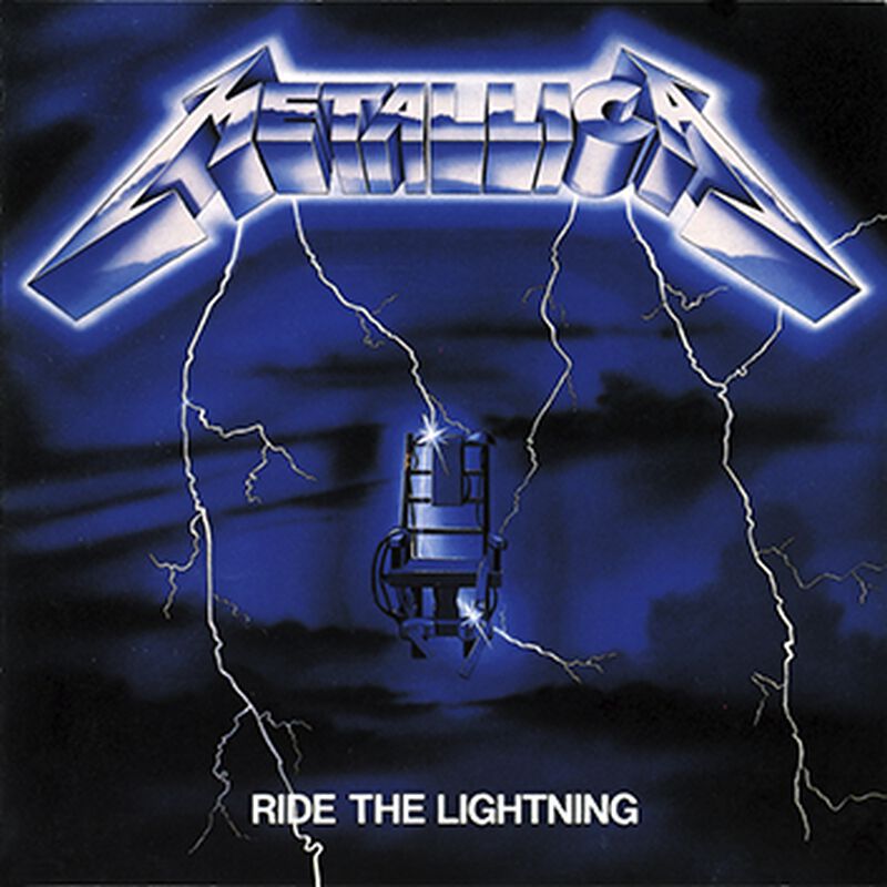
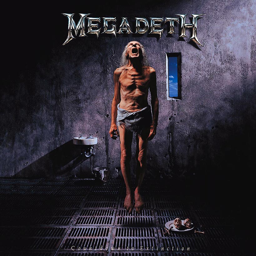
I believe that the front panel works well as a way to communicate the theme of the album (school). The schoolbus in hand works as a good abstract metaphor, which other albums such as ‘dirt’ and ‘nevermind’ are known for, that represents an unseen, omniscient and omnipotent force that controls the school system. The band name is an element that immediately draws attention due to its central placement, contrasting colour and inventive design that evokes the feeling of bands like Metallica, Pantera and Megadeth.

Inside Left Panel:
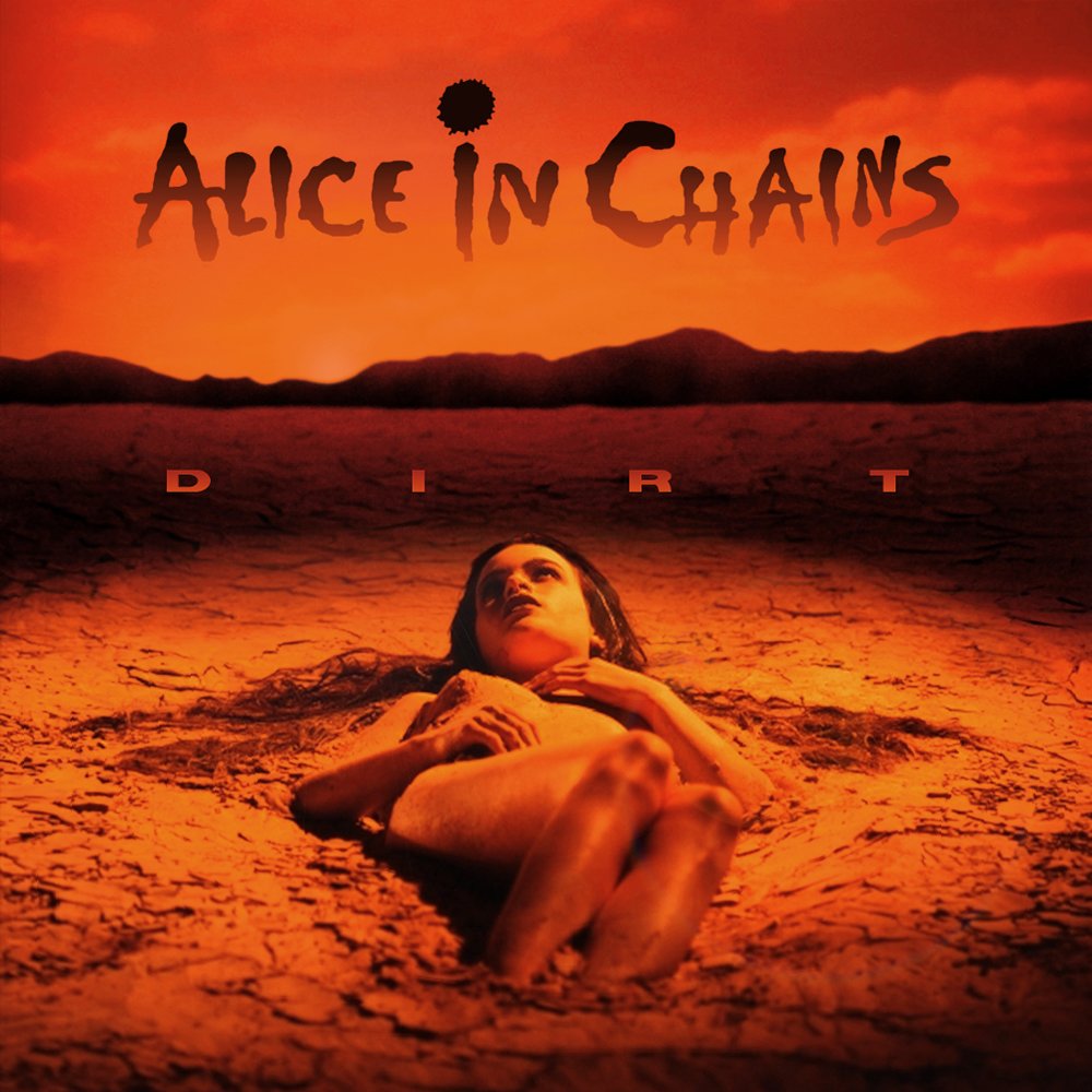
The inside left panel features a set of scattered polaroid images impyling an abstract narrative about the ‘good old days’ of the band. The scattered placement of the images connotes a carefree and reckless attitude towards objects of such importance, breaking the traditional idea of finding something nostalgic precious and worth protecting. Furthermore, the use of monochrome colours within the digipak also connotes a harshness and edginess that is found within many other piece, such as Dirt by Alice in Chains.
Inside Right Panel:
The inside right panel features a stare down between two different characters that are featured within our music video, one being an authoritarian, oppresive teacher that believes his word is law and the other, a rebellious, anarchic teenager who resists against that kind of rule and believes in anyones right to do anything. While in reality, both of these world views are too extreme on either end of the spectrum, in our chosen genre however, the anarchic rebel is glorified as a freedom fighter, as seen in our music video.
Back Panel:
The back panel features a report card that integrates the tracklist with moments of abstract narrative, seen with the grades that the student has recieved, feeding more into the idea that they are a menace within school and, at a larger scale, society. The canted angle used for the image reflects not only the sentiment to disregard the traditional norms of society that would be seen in the ubiquity of standard, central angled shots.
How well we represented the genre:
Through this digipak, we represented the genre using common elements of grunge such as dark, monochrome colours, an abstract image/idea and the glorification of rebellion against an established system. Other ways in which we represented the genre came through the idea of including abstract narrative within the digipak, specifically on the back and inside panels. Furthermore, the idea to show a idealogical battle between protagonist and antagonist was a unique idea that we found perfectly encapsulated the themes that we wanted to convey.


