Final Draft of Digipak
Reflecting on previous feedback and targets for improvement, we made certain to change the essential inaccuracies of our digipak before the final submission.
Here is our final draft of the digipak:


As a group, the main priority was to adjust the colour correction of the digipak so that pink/purple colour was fluent throughout. As, in draft 3, the pink/purple colour was irregular and unalike; however, this was easily solved with the use of photoshop. Using the same part of the song, we altered the lyrics, on the inside panel, so that they didn’t appear repetitive and unvaried.
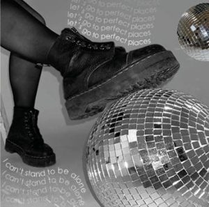
In the end, the ‘rip’ effect was executed excellently; the monotone image clearly represents the feelings of vulnerability, trapped, and isolated in contrast to the elegance and peace reflected in the monochrome image. There is a perfect balance of quirkiness, from the disco balls, and grunge, from the Doc Marten boots, that emphasizes the Indie Pop genre. Although, we realize there is evidently a mix of other genres, including disco and pop. We used a sans serif font throughout as it added a chic, stylized and informal element to the design of the digipak.
Reflection
Overall I am happy with the completion of our digipak. I feel the final product is a strong piece of work that perfectly reflects our hard work and determination, as well as, successfully representing our star image in relation to the chosen genre.