Music Video Draft 4

Music Video Draft 4

Below is draft 4 of our music video:

What’s new?
  • We have added extra transitions, on Premiere Pro, that we thought were fitting to the various bits within the music video.

For example, to closely echo the lyric ‘fading’, a dip-to-white was used. We also tried to incorporate a whip transition, however, we took it out as it was unpredictable. At the end of the video, we used a push transition to add a sense of idiosyncrasy, this works well with the clips and turned out to be effective.

  • We experimented with being creative and made shots of the pink performer overlay the silver performer to add an element of quirkiness.
  • The narrative montage was changed to be made more upbeat.
  • As a target stated by our teacher, we removed some of the repetitive clips of the actor walking along the path and instead included various shots of the actor dancing which were taken using different framing, angles, and distances.
  • An important shot of the ‘How To Fit In’ book originally had a zoom but we erased it as the quality dropped, alternatively we used a static shot.
  • We adjusted the colour correction throughout the clips so that they appeared brighter and more vibrant, expressing a fun lively atmosphere.

Focus Forward

Nearing the competition of our video, as a group, we are very proud of our work and feel we have made a successful music video to the best of our abilities. We are hoping to make some final minor changes in response to some peer feedback.

Chosen Adverts

Chosen Adverts

These are the adverts that I’ll choose from:

Reflection

Doc Martens Advert

I have chosen this Doc Martens advert as I feel the overall attraction of the advert would be of interest to my desired target audience. It also fits in very well with the vibrant colour scheme throughout my magazine. Referring back to my background information that I did in preparation for my indie pop magazine, I identified my target audience’s interest in style and fashion trends. Having indie being associated with hippies, makes the genre of indie pop very quirky and but grungy. So, I feel as though Doc Martens are a great reflection of the genre due to their rebellious style and trendiness across various social media platforms, especially amongst the female audience.

Doritos Advert

I have chosen this Doritos advert as I feel the simplicity and creativity of it will allure my ideal target audience. The simplicity won’t overwhelm my magazine and its readers. The way the product is incorporated into the design of the Mexican sombrero gives a sense of quirkiness and fun with the advertisement which would reflect the genre of indie brilliantly. Plus, Doritos are a popular worldwide food to snack on, tasty and very craveable. Ideal for any gender of any certain audience.

Even though I will not be marked on these adverts, this task has been very helpful to create a magazine that includes all necessary features and technical conventions of a magazine. It has also allowed me to remind myself of my target audience’s demographics and psychographics, as well as their uses and gratifications.

Complete Magazine Draft 3

Complete Magazine Draft 3

Here is my complete draft 3 of my magazine:

Teacher’s Feedback

So What Improvements Need To Be Made?

Front Cover

  • Work on my Masthead – add words/design feature in the corners to further bring you in to the magazine. A branding or logo, ie. ‘Just Be It’ or ‘Belong’.
  • Looks clunky around the models hair – try add a drop shadow or a glow to lift the image off the page.

Contents Page

  • Images need something else – add rotation to the images (put them off the 90 degree).
  • Don’t use the same background colour of the images (soft beige) – change it to something different like white or a gradient.
  • Boxes can be a bit more zainy/wacky.
  • Make title of ‘Contents’ straight and bigger – possibly repeat a smaller version of ‘Aspire’ along the top.
  • Use guidelines to line up the numbers and coverlines.
  • Add more stories.
  • Pull out colour from the sycadellic design and drag it across the page.

Double Page Spread

  • Fill green box.
  • Make elaboration stronger.
  • Rather than ittalice the questions, make them pop –  add a drop cap, change the colour, put an outline around them.

Second Draft of Double-Page Spread

Second Draft Of Double-Page Spread

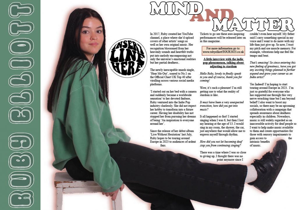
Here is the second draft of my magazine’s double-page spread:

What’s New?
  • I tweaked the headline to ‘MIND AND MATTER’, and changed the colour of the ‘AND’ to a complimentary colour of green.
  • My article is added and laid out in columns, a complimentary coloured box is positioned behind the website so that it stands out to the readers.
  • I took the pull quote out of the article as I felt the article didn’t need breaking up, so I’ve placed it by the model instead.
  • I’ve added a light complimentary coloured outer glow to my model to give her more definition.
What’s Next?
  • I feel like I need to change the title to something relating to the article like ‘Feeling The Beat / Music / Vibrations’ as at the moment it doesn’t quite fit so changing it will be better for the target audience.
  • I might make my pull quote bigger and position it further down on my model, then add a box above it either talking about the outfit or linking social media’s so that I fill the empty space.
  • I’m going to see whether a background colour is needed as white is a bit plain.
  • Finally, I need to add a standfirst and a by line.

Second Draft of Contents Page

Second Draft of Contents Page

Here is the second draft of my magazine’s contents page:

What’s New?
  • Even though the window design (in my first draft) was a creative idea, something didn’t feel right so I decided to scrap it and start over. I explored my skills further by using Adobe Illustrator to create a funky, old-school inspired doodle design which I placed down the side of the page. I also made sure to use bold colours as my magazine was very muted.
  • Within the new design, I want to place images so I’ve put white placeholder boxes to give me a rough idea of spacing and size.
  • I’ve written coverlines for my magazine which I think would appeal to my target audience.
What’s Next?
  • I need to pick out the images which I’d like to be placed on the design feature and get them cut out in photoshop.
  • I feel as though I may need to add a background colour or spice up the presentation of the coverlines.
  • Also, I need to address the page numbers.

Draft Feature Article

Draft Feature Article

MIND OVER MATTER

In 2017, Ruby created her youtube channel, a place where she’d upload covers of other artists’ songs as well as her own original music. Her recognition blossomed from her heavenly sounds and heartfelt truths put into melody encompassing not only the universe’s emotional realities but her disability of being partially deaf. 

The inescapable single, ‘Hear Me Out’, soared to No.1 on the Official Chart UK Top 40 after viralling across various social media platforms. 

From being sat on her bed with a camera to being a worldwide sensation to her devoted fanbase, Ruby ventured into the Indie Pop industry cluelessly. She did not expect her hobby to transform into a future career. Having her disability has not stopped her from pursuing her dreams of being ‘an inspiration to everyone around her’. 

“I want to do more with my life, than just give up”

Since the release of her debut album ‘Made In Heaven’ last July, Ruby hopes to be touring around Europe in 2023 to audiences of ardent fans. Tickets to go see these awe-inspiring performances will be released later on in this magazine, for more information go to: www.rubyelliottTOUR2023.co.uk 

A little interview with the indie-pop phenomenon, talking about adjusting to stardom

Hello Ruby, lovely to finally speak to you, and of course, thank you for coming!

Wow, it’s such a pleasure! I’m still getting use to what the reality of stardom is like.

It must have been a very unexpected transition, how did you get into music?

It all happened so fast! I started singing when I was 6, but then I lost my hearing at the age of 13. I would sing in my room, the shower, the car, just anywhere that would allow me to express myself through rhythm.

How did you not let becoming deaf stop you from continuing singing?

There was a time where I was so close to giving up, I thought there was no point anymore since I couldn’t even hear myself. My father said I carry something special in my voice and I want to do more with my life than just give up. So now, I trust my pitch and use muscle memory. For example, vibrations help me feel the tempo and beat.

That’s amazing! So since entering this new feeling of greatness, have you got any exciting things planned to further expand and grow your career as an Indie artist?

Yes Indeed! I’m hoping to start touring around Europe in 2023 which will be a new experience for me. I’m just so grateful for everyone who has supported me through this very nerve-wracking time but I am beyond belief! I am also wanting to boost my socials, so there may be an upcoming collaboration with a campaign that spreads awareness about deafness especially in children. Nowadays, music is still widely regarded as an inaccessible activity for deaf people so I want to help and support those who desire a career involving music because I can relate as I was one of them a couple months ago.

Second Draft of Front Page

Second Draft of Front Page

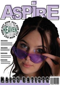
Here is the second draft of my magazine front cover:

What’s New?

  • I completely changed the name of the magazine to ‘ASPIRE’ as I feel a one-word name would be more effective and it reflects the aim of the magazine perfectly.
  • As well as changing the name, I also swapped font types which then led to modifying the design layout to make it more quirky and fit the genre better.
  • I made my Main Cover Star Image overlap my Masthead.
  • Since I wasn’t happy with my first draft, I decided to spend time at home playing around on Adobe Illustrator, identifying unique designs that could make my magazine visually appealing to the target audience. I was able to spice up my original plain pug by cleverly using my Adobe software skills to incorporate the album name into the circular shape and have the words ‘OUT NOW’ spiral around the outside.
  • I also changed the colour of the word ‘HEAVEN’ from yellow to green so that it fits better with the colour scheme I have throughout my magazine.

What’s Next?

  • I’m still not happy with the placing of the Main Cover Star’s name. I might try it going down the side of her instead of at the bottom, this could then potentially leave room to mention other star’s within the Indie Pop genre.
  • Make the colours a lot bolder.
  • I’m thinking of moving my model to the right a bit, to leave more room for the coverlines.
  • Finally, I need to come up with coverlines as that is what my front cover is lacking.

Draft of the Double Page Spread

Draft of the Double Page Spread

Here is the first draft of my magazine double-page spread:

Reflection

What I Like:
  • I like the colour scheme as it is simple and uncomplicated. I took the green from my model’s jumper and used it as an accent colour for the page. The green also works well as a transition colour from my contents to the double-page as there is a hint of green on the wheels of the pennyboard featured in the contents image.
  • I like the positioning of my model, I enlargened the image so that your eyes are immediately drawn to her. She also overlaps onto the next page which I think is very effective as it allows the article to be wrapped around the image, making the text flow and outline her leg.
  • The layout is very basic, with the name of the star written down the side of the image and a bold title for the article. It isn’t overwhelming for the readers.
What I need to do:
  • I think I need to fill the space next to my model whether that be a quote pulled from the article, stating where the outfit is from as my target audience is into fashion or simply moving my model more to the right.
  • I need to make my headline a tad bigger as I feel the placeholder text is overpowering it. The placeholder text also gives me a rough idea of how much I need to write as at the moment I feel like it’s too much.
  • As the text looks a bit chunky, I’m thinking of adding a pull quote into the middle of my article just to break it up.
  • I need to add in a standfirst to expand on the headline and further tempt the reader to read on, this may result in re-arranging the layout.
  • I may change the colour of my star’s name as I feel the shades of the green clash, making it difficult to read. A complementary colour may be good to use.
  • I might change the headline to ‘MIND AND MATTER’ as the article should be about what really matters to the star.

Second Shoot Contact Sheet(s)

Second Shoot Contact Sheet(s)

Here are my contact sheets for my second photo shoot with my model:

CLICK HERE for the full contact sheets

Short List of Images

These are the photos I have chosen to be on my shortlist of images:

I chose these images to be shortlisted because they are my favorite and had good lighting as well as being in focus. My Mise-En-Scene captured my genre perfectly. I went for a more casual costume with my Indie Pop model, a very vintage but grungey look. The poses I directed my model to do would be well suited for a double-page spread as they can be manipulated to cross over onto the other page and the lighting complements my model flawlessly.

As it was meant to be a location shoot I attempted to take photos in and around the school however, the lighting became very dark making it difficult for the camera to focus on my model. In the end, I made good use of my limited time slot in the white studio and thankfully had the images I envisioned for my double-page spread.

When choosing a final image for my double-page spread, I decided to use image 1 as I feel it encapsulates the mood I wanted to express throughout the page. I’m really happy that I incorporated the stool as it gives off the chill vibe and the way my model is positioned on it has a sense of playfulness. With her leg stretched out aswell, it provides me with the opportunity to wrap my text around the image so the article can outline her leg. This would work exceptionally well for my double-page spread.

Shoot Evaluation

Overall, I believe this photo shoot was successful. Having everything planned and organised thoroughly, with the use of my Production Meeting Agenda, help massively as it meant we could get straight into the production without rushing. My model came fully prepared with the costume on and hair/makeup done, this was handy as we didn’t waste any time in the white studio due to the location shoot not going to plan for us. Unlike my first shoot, I was finally able to sync the camera and flash together and as a result of that, the photos came out admirably.

Production Meeting Agenda for Second Photo Shoot

Production Meeting Agenda for Second Photo Shoot

In order for me to be completely organized and feel prepared for my second photo shoot, I made a Production Meeting Agenda so that my shoot would be successful.

Reflection

This helped me to visualize my model and create a suitable costume that would fit my chosen genre, Indie Pop, perfectly. It allowed me to plan a really productive shoot, providing me with clear ideas of what I would like to happen, the different poses on the stool that I’d like my model to potentially replicate, and hopefully, it’ll have a promising outcome.