Social Media Page – Draft 2

Social Media Page – Draft 2

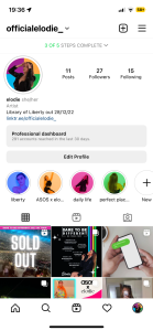
Following on from our draft 1 of the social media page, we have been on top of our marketing timeline and further improved our posts; including more variety of gifs and reels. We posted gifs as reels to promote and advertise our brand and star image, whilst still considering AIDA.

https://www.instagram.com/officialelodie_/

Both of the examples above were designed using a website called Canva. We decided to post a ‘50% off’ reel to advertise a huge sale for Black Friday; this would have helped boost the star’s collaboration with ASOS. As well, we thought it would be a creative and strategic move to reveal a limited number of new singles by creating gifs that shared a similar design element with the album cover.

Teachers Feedback – Screencastify

What works well?
  • Drip-fed content well and created encouragement to interact.
  • We have developed and created a huge amount of content across posts, reels, and story highlights.
  • The way we embraced pride and LGBTQ+ issues by acting as an ambassador for the Stonewall Charity.
  • We created an array of teaser content using gifs conventional to our theme.
  • Glad we had a vinyl release of the album, it acts as a collector’s item and would appeal to our target audience.
  • The creation of a Q&A on the story allowed for interaction with the star on a more personal level.
  • Lovely tone of voice throughout the social media page which included language such as ‘literally’ and ‘goddess’, gives. a good sense of ordinary/personal life.
  • We have promoted elements of the music video through other aspects of the social media page, such as through the ASOS x Elodie campaign which works well.
  • We have chosen the perfect synergistic relationship with ASOS.
targets for improvement
  • Include a link in the bio to our music video that is direct, so you don’t need to go through the linktree.

Focus Forward

Our social media and marketing campaign is near completion, with a couple more planned posts left to upload. I feel we have successfully represented our star as a proactive female who is being their honest, most authentic self whilst actively seeking change and becoming a style icon. We have made sure to keep the theme conventional to our chosen genre and interest our target audience with certain aspects that would appeal to them. We have kept a similar branding design throughout our posts and advertisements to make our brand cohesive. After making the final improvements, suggested by our teacher, the social media page will be completed.

Social Media Page – Draft 1

Social Media Page – Draft 1

To promote our star image and advertise the product, we created a social media page that will successfully sell our marketing campaign. So far we’ve used a variety of media texts like videos, photos, and gifs to highlight the work-life balance and represent our artist as ordinary and extraordinary.

Here is a link to our Instagram page:

http://instagram.com/officialelodie_

and some images from the profile:


Focus Forward

I feel our social media page effectively creates awareness and buzz around our star image and product. From reflecting on the current Instagram page, as a group, we can identify the key aspects that need improving. An example would be to begin acting on the audiences’ uses and gratifications; we should plan a Q&A to upload to the story for the fans to have that opportunity to socially interact with the star on a more personal level. As well, we should start thinking of a synergistic relationship with a well-known brand as both parties can gain benefits from the collaboration by sharing audiences and expanding the star image.  I am really happy with how the social media page has developed and began building our marketing campaign.

Final Draft of Digipak

Final Draft of Digipak

Reflecting on previous feedback and targets for improvement, we made certain to change the essential inaccuracies of our digipak before the final submission.

Here is our final draft of the digipak:

Click here for full image

As a group, the main priority was to adjust the colour correction of the digipak so that pink/purple colour was fluent throughout. As, in draft 3, the pink/purple colour was irregular and unalike; however, this was easily solved with the use of photoshop. Using the same part of the song, we altered the lyrics, on the inside panel, so that they didn’t appear repetitive and unvaried.

In the end, the ‘rip’ effect was executed excellently; the monotone image clearly represents the feelings of vulnerability, trapped, and isolated in contrast to the elegance and peace reflected in the monochrome image. There is a perfect balance of quirkiness, from the disco balls, and grunge, from the Doc Marten boots, that emphasizes the Indie Pop genre. Although, we realize there is evidently a mix of other genres, including disco and pop. We used a sans serif font throughout as it added a chic, stylized and informal element to the design of the digipak.

Reflection

Overall I am happy with the completion of our digipak. I feel the final product is a strong piece of work that perfectly reflects our hard work and determination, as well as, successfully representing our star image in relation to the chosen genre.

Digipak Draft 3

Digipak Draft 3

Click here for full image

We have decided to re-design and follow a new approach for the two inside panels. The disco balls were a perfect addition to the digipak, linking in with the music video and brand, reflecting utopia and a self-fashioned identity. The Doc Marten boots emphasize the grunge and rebellious style of indie pop. The third pane represents the star’s vulnerability, elegance, and grace.

To further develop our digipak for the final draft, we carried out research to identify which genre the digipak reflects best in hope that it’d result in successfully representing our chosen genre.

Originally, we wanted our digipak to encode the indie pop genre. However, we have an understanding that there is a radical mix of generic elements on our digipak. The appearance of the digipak has a clear blend of genres, including pop and disco.

Focus Forward

Overall, we have represented our star and genre adequately and so shall reflect on the improved formatted design positively. Inserting our digipak design into a CD case appeared super helpful as it allowed us to physically see our ideas for the digipak visualized in its product and to identify if images didn’t align properly. As a group, we have established some minor adjustments that need improving, for example; there is a slight difference in the colour correction of the pink/purple images so we will use photoshop to change this and the lyrics on the inside panel are repetitive so we will vary the lyrics using the song.

Timeline and Marketing Ideas

Timeline and Marketing Ideas

Timing is an essential skill in building a marketing campaign. By creating a chronological timeline, including a series of posts, stories, and events regarding our star; you are simply able to plan and plot several easter eggs of spoilers, teasers, and interactive opportunities that build excitement for an unknown product, like an album launch.

Before building our social media platform, we constructed this timeline which follows our ideas for a successful marketing campaign. When organizing this chronology, we made to sure think about AIDA (Attention, Interest, Desire, Action) and our audiences’ uses and gratifications. Attention will be acquired by the use of stories and highlights; Q&A’s will feature on the stories which will give the fans a chance to socially interact with the star, also having a linktree in the bio will guarantee attention as fans will click on it to receive additional information surrounding the star. Creating interest will include posting reels of behind-the-scene footage from various important shoots that will entice the audience to the product. Desire will be created by revealing various unreleased track names from the album along with a short snippet of the song, this makes the audience want to purchase and stream the album when launched. A call to action will be created by selling tour tickets through the linktree, announcing collaborations, and posting photos for fans to like, comment and share.

This collaboration with ASOS is a synergized relationship that will benefit both parties by selling the star image to reach wider audiences. The collection will be called Elodie X ASOS, and it’ll allow fans to personally identify with the star by purchasing the clothing and sharing the style. We also plan to use another online software, called Canva, to create and design posts to promote and boost the upcoming star and brand. Having an equilibrium of work and personal posts will allow for our star image to be seen as ordinary and extraordinary (Dyer’s paradox of the star).

Focus Forward

By creating and organizing this timeline, we have a clear understanding of how to achieve AIDA successfully throughout our social media page. Additionally, a strict plan gives us something to follow and stick to, and if we fail to keep up, we will fall behind in the marketing campaign; so to prevent this we will ensure posts are made prior to the release date stated on the timeline.

Digipak Draft 2

Digipak Draft 2

Taking into consideration the improvements made upon reflection on draft 1, we continued the process of editing and created draft 2 of our digipak. Below is draft 2:

Click here for full image

Teachers Feedback – Screencastify

WHAT WORKs WEll
  • The graphics are impressive.
  • Love the tonal feel of the digipak.
  • The choice of typeface is absolutely perfect on the tracklist and the artist’s name.
  • The 2 contrasting images on the front cover work well together – the black and white image is very powerful and striking.
  • We’ve used colour correction really nicely throughout – gives an electronic feel which works really well for the genre.
  • The back cover is perfectly laid out and excellent.
TARGETS FOR IMPROVEMENT
  • Try to make the artist’s name, ‘Elodie’, bigger on the front cover.
  • Not convinced about the ‘Library of Liberty’ following the path of the artist’s forehead – try testing other possible appearances of the album title.
  • Re-think the inside panels; maybe integrate the motif of the torn effect – too many images are present, seems odd to place a CD on the artist’s face.
  • Replace some images with a graphic – think of the iconography that surrounds our star or what appeals to their audience.

Reflection

The completed draft 2 front and back covers synthesize really well with one another; I think this is because the thematic relations of the ‘rip’ effect are present in both designs. As a group, we agree that the inside panels are the weaker developed and require major adjustments. The overall feel of the inside is flat, there’s no element of dimension in comparison to the depth of the tear. We’ve booked a second studio shoot to get some fancy shots of a disco ball in the hope we can manipulate the images to a liking that would fit a design suitable for the inside. This’ll add an element of quirkiness and playfulness, which was lacking in the previous draft. It also reflects the alternative/indie pop genre perfectly. As well, there is a slight difference in colour correction throughout the digipak, however, this should be easily adjusted within the software available to us. This reflection will allow us to work efficiently and effectively, as we now have a clear understanding of what needs more focus. On the whole, our project is a reflection of our hard work and determination of creating a successful digipak for our brand.

Digipak Draft 1

Digipak Draft 1

After the completion of our shoot, we took to the Adobe Creative Cloud to begin designing the first draft of our digipak. We specifically used Adobe Photoshop and Indesign to edit and manipulate the images and colours.

Below are the first two panes of the digipak (front and back cover):

Click here for full image

From successfully producing a competent first draft of our digipak, we individually self-assessed the product in regard to the marking criteria. This allowed us to identify ways in which it can be improved.

TARGETS FOR IMPROVEMENT
  • The original design for the back pane looks good, however, upon reflection on the first draft, I feel it is too different from the front cover. Maybe, an option would be to incorporate the torn effect into the design of the back so that the theme is carried throughout and the link is more explicit.
  • We should use our creative skills to experiment with different layouts of the tracklist as currently, the format is very basic.
  • We need to add record label logos to keep with the formal conventions

Reflection

Overall, I am very happy with the outcome of our digipak’s first draft. It has expanded our skills and knowledge in relation to Adobe Software and provided us with a great understanding of improvements that’ll make it of high quality. I feel we have given ourselves a strong starting point in the production of our brand and can further excellent it with the targets we have stated. Firstly, we shall begin to configure a new layout for the back in order to make it cohesive with the rest of the digipak. When rearranging, we will make sure to avoid overcomplicating the design and keep it simple by carrying through the ‘rip’ effect, this will also allow us to keep with the brands’ style. Our idea for the inside panels was to use a monotone colour scheme to accentuate the meaning of exposure and vulnerability within the industry; which is reflected through our marketing strategy and mission statement of the brand.


Conventional Analysis of a Professional Social Media Page

Social Media Page – Conventions Analysis

As a group, we recorded a screencastify; analyzing a star similar to ours. This allowed us to realize the conventions of the page, and how it encouraged A.I.D.A – Attention, Interest, Desire, (call to) Action. We also identified how the page enabled the audience’s Uses and Gratifications (Blumler&Katz) and the available opportunities for Social Interaction, Personal Identity, Entertainment, and Information. As well, we established examples of integrated advertising that help promote the star image and brand and how it encourages going viral.

We utilized Dyer’s paradox of the star to explain how the style of the feed can represent the star image as ordinary and extraordinary. After analyzing, we found a majority of artists, within our chosen genre, have a good balance between work and fun everyday life posts.

Focus Forward

This task has allowed me to understand what formal and technical conventions of a social media page can make a star’s platform successful. It is very important to incorporate Blumler&Katz theory of Uses and Gratifications because there are many features that will allow for interaction and that will the boost star’s image and brand. As well, it will encourage A.I.D.A, as a conventional style of an artist’ page will attract the desired target audience. Discovering how to replicate and achieve these ideal effects from conventions, we are now prepared to create an account that will reflect and represent our star image and brand perfectly.

Social Media Page Terminology

Social Media Page Terminology

By analyzing an artist’s social media page, similar to our genre, I was able to identify the importance of technical conventions in relation to social media.

Focus Forward

Now, I can begin to apply my knowledge and understanding of the social media technical conventions to my own social media platform for my artist. A social media profile can act as a marketing tool for the star image and brand. By creating a successful social media page, it will lauch as a marketing campaign, raising awareness and promoting the brand to a wider target audience. This has made us realize what causes activity amongst the varying posts; by posting photos as well as videos, we will provide more variation to our page. Also, highlights are a great way to permanently advertise products, brands, and events. Creating a synergized relationship will expand the reach and be beneficial to both parties. After this task, I am able to begin planning and drafting posts for our social media page; knowing what will fit with our marketing strategy, be engaging and allowing an equilibrium of work and everyday life posts. Additionally, understanding what will provoke Blumler&Katz’ theory of social interaction, personal identity, entertainment, and information.