Second Draft of Front Page
Here is the second draft of my magazine front cover:
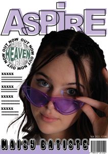
What’s New?
- I completely changed the name of the magazine to ‘ASPIRE’ as I feel a one-word name would be more effective and it reflects the aim of the magazine perfectly.
- As well as changing the name, I also swapped font types which then led to modifying the design layout to make it more quirky and fit the genre better.
- I made my Main Cover Star Image overlap my Masthead.
- Since I wasn’t happy with my first draft, I decided to spend time at home playing around on Adobe Illustrator, identifying unique designs that could make my magazine visually appealing to the target audience. I was able to spice up my original plain pug by cleverly using my Adobe software skills to incorporate the album name into the circular shape and have the words ‘OUT NOW’ spiral around the outside.
- I also changed the colour of the word ‘HEAVEN’ from yellow to green so that it fits better with the colour scheme I have throughout my magazine.
What’s Next?
- I’m still not happy with the placing of the Main Cover Star’s name. I might try it going down the side of her instead of at the bottom, this could then potentially leave room to mention other star’s within the Indie Pop genre.
- Make the colours a lot bolder.
- I’m thinking of moving my model to the right a bit, to leave more room for the coverlines.
- Finally, I need to come up with coverlines as that is what my front cover is lacking.