Reflecting on previous feedback and targets for improvement, we made certain to change the essential inaccuracies of our digipak before the final submission.
Here is our final draft of the digipak:
Click here for full image
As a group, the main priority was to adjust the colour correction of the digipak so that pink/purple colour was fluent throughout. As, in draft 3, the pink/purple colour was irregular and unalike; however, this was easily solved with the use of photoshop. Using the same part of the song, we altered the lyrics, on the inside panel, so that they didn’t appear repetitive and unvaried.
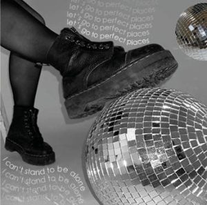
In the end, the ‘rip’ effect was executed excellently; the monotone image clearly represents the feelings of vulnerability, trapped, and isolated in contrast to the elegance and peace reflected in the monochrome image. There is a perfect balance of quirkiness, from the disco balls, and grunge, from the Doc Marten boots, that emphasizes the Indie Pop genre. Although, we realize there is evidently a mix of other genres, including disco and pop. We used a sans serif font throughout as it added a chic, stylized and informal element to the design of the digipak.
Reflection
Overall I am happy with the completion of our digipak. I feel the final product is a strong piece of work that perfectly reflects our hard work and determination, as well as, successfully representing our star image in relation to the chosen genre.
We have decided to re-design and follow a new approach for the two inside panels. The disco balls were a perfect addition to the digipak, linking in with the music video and brand, reflecting utopia and a self-fashioned identity. The Doc Marten boots emphasize the grunge and rebellious style of indie pop. The third pane represents the star’s vulnerability, elegance, and grace.
To further develop our digipak for the final draft, we carried out research to identify which genre the digipak reflects best in hope that it’d result in successfully representing our chosen genre.
Originally, we wanted our digipak to encode the indie pop genre. However, we have an understanding that there is a radical mix of generic elements on our digipak. The appearance of the digipak has a clear blend of genres, including pop and disco.
Focus Forward
Overall, we have represented our star and genre adequately and so shall reflect on the improved formatted design positively. Inserting our digipak design into a CD case appeared super helpful as it allowed us to physically see our ideas for the digipak visualized in its product and to identify if images didn’t align properly. As a group, we have established some minor adjustments that need improving, for example; there is a slight difference in the colour correction of the pink/purple images so we will use photoshop to change this and the lyrics on the inside panel are repetitive so we will vary the lyrics using the song.
Taking into consideration the improvements made upon reflection on draft 1, we continued the process of editing and created draft 2 of our digipak. Below is draft 2:
Click here for full image
Teachers Feedback – Screencastify
WHAT WORKs WEll
The graphics are impressive.
Love the tonal feel of the digipak.
The choice of typeface is absolutely perfect on the tracklist and the artist’s name.
The 2 contrasting images on the front cover work well together – the black and white image is very powerful and striking.
We’ve used colour correction really nicely throughout – gives an electronic feel which works really well for the genre.
The back cover is perfectly laid out and excellent.
TARGETS FOR IMPROVEMENT
Try to make the artist’s name, ‘Elodie’, bigger on the front cover.
Not convinced about the ‘Library of Liberty’ following the path of the artist’s forehead – try testing other possible appearances of the album title.
Re-think the inside panels; maybe integrate the motif of the torn effect – too many images are present, seems odd to place a CD on the artist’s face.
Replace some images with a graphic – think of the iconography that surrounds our star or what appeals to their audience.
Reflection
The completed draft 2 front and back covers synthesize really well with one another; I think this is because the thematic relations of the ‘rip’ effect are present in both designs. As a group, we agree that the inside panels are the weaker developed and require major adjustments. The overall feel of the inside is flat, there’s no element of dimension in comparison to the depth of the tear. We’ve booked a second studio shoot to get some fancy shots of a disco ball in the hope we can manipulate the images to a liking that would fit a design suitable for the inside. This’ll add an element of quirkiness and playfulness, which was lacking in the previous draft. It also reflects the alternative/indie pop genre perfectly. As well, there is a slight difference in colour correction throughout the digipak, however, this should be easily adjusted within the software available to us. This reflection will allow us to work efficiently and effectively, as we now have a clear understanding of what needs more focus. On the whole, our project is a reflection of our hard work and determination of creating a successful digipak for our brand.
After the completion of our shoot, we took to the Adobe Creative Cloud to begin designing the first draft of our digipak. We specifically used Adobe Photoshop and Indesign to edit and manipulate the images and colours.
Below are the first two panes of the digipak (front and back cover):
Click here for full imageClick here for full image
From successfully producing a competent first draft of our digipak, we individually self-assessed the product in regard to the marking criteria. This allowed us to identify ways in which it can be improved.
TARGETS FOR IMPROVEMENT
The original design for the back pane looks good, however, upon reflection on the first draft, I feel it is too different from the front cover. Maybe, an option would be to incorporate the torn effect into the design of the back so that the theme is carried throughout and the link is more explicit.
We should use our creative skills to experiment with different layouts of the tracklist as currently, the format is very basic.
We need to add record label logos to keep with the formal conventions
Reflection
Overall, I am very happy with the outcome of our digipak’s first draft. It has expanded our skills and knowledge in relation to Adobe Software and provided us with a great understanding of improvements that’ll make it of high quality. I feel we have given ourselves a strong starting point in the production of our brand and can further excellent it with the targets we have stated. Firstly, we shall begin to configure a new layout for the back in order to make it cohesive with the rest of the digipak. When rearranging, we will make sure to avoid overcomplicating the design and keep it simple by carrying through the ‘rip’ effect, this will also allow us to keep with the brands’ style. Our idea for the inside panels was to use a monotone colour scheme to accentuate the meaning of exposure and vulnerability within the industry; which is reflected through our marketing strategy and mission statement of the brand.
Here are some behind-the-scenes of our studio shoot for the digipak:
Here is a short list of our favourite photos from the shoot:
WHAT WENT WELL?
We captured a range of varying shots from extreme close-ups to long shots. This will allow us to show variation throughout the digipak and overall brand package.
All shots were focused and taken in good lighting. This gives high quality to the shots as well as the brand itself as these images will be used across both the digipak and social media pages.
The Mise-En-Scene was thoroughly planned out and executed to a high standard. Our idea of using a variation of black outfits (all within the same aesthetic) will enable us to colour correct with vibrant bold colours in post-production. The white flower earrings represented the genre of indie pop/alternative perfectly and overall made our star image look sophisticated and elegant.
As a group, we showed good communication and teamwork skills. Although we had a tight schedule, we were able to get everything completed within the time frame. We had plenty of time to ruin the makeup, and change hairstyles, and outfits.
To provide a comfortable environment for both the star and directors, we had music playing in the background throughout so it created an enjoyable atmosphere and no one felt awkward.
TARGETS FOR IMPROVEMENt
At first, we struggled with lighting and the flash but then we got help from a photography technician who switched us to an on-camera flash which was helpful as it gave us more flexibility with our shots, seeing as we didn’t have to worry about the cable being a trip hazard.
Focus Forward
Overall, we work superbly as a group and had a very successful studio shoot. Now that we have a variety of different shots, we can begin to edit and format images into a rough layout for the digipak. In addition, we can start drafting posts/stories for our social media page, and interact with our audience. All our media texts will favourably capture our brand’s package.
Following our previous studio shoot, we were able to compile a variety of shots ranging from extreme close-ups to long shots. These will be helpful in the production of the digipak and social media page.
Click here for the full contact sheet
Our star wore a variety of sleek, stylish black clothing which will work admirably will the colour correction later on. We managed to use our time effectively and gather the photos essential to the ‘rip’ effect. We have good contrasting photos of the elegant, peaceful star image to the more vulnerable, serious side of the star.
Focus Forward
After a very successful shoot, we have a series of high-quality, well-lit, and focused images that will come in use for the digipak and social media page. The simplicity of the costume will work cohesively with the plan to colour correct and make the photos bold with vibrant colours. Our social media page will have a variety of fun playful shots as well as stylized serious ones to represent the two contradictory sides of the star image. Additionally, we seek to have similarities throughout our brand and advertisement to the new album.
In order to be prepared prior to our studio shoot for the digipak, we created a PMA (Production Meeting Agenda) to organize the hair, makeup, costume, and props that would represent the star image of our star.
Click here for the full image
Reflection
This plan has allowed us to identify the order in which we shoot our star as our goal is to get various shots of different outfits and poses. Additionally, to successfully execute the ‘rip’ effect we need to ensure we gather pictures of the more vulnerable and conflicted side of the star image by ruining her makeup; however, this will need to be done at the end of the shoot. This shoot will improve our time management skills as we have a limited time slot and a lot to get done.
Before launching into the process of creating our digipak as a representative of our star’s new album, we roughly sketched out our design ideas for each panel so that we could visualize the intentions.
Click here for the full imageClick here for the full imageClick here for the full image
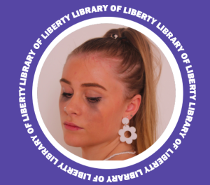
We utilized our previous padlet mood board to collate ideas for the design of our digipak. We decided to name the album, ‘Library of Liberty’ to reinforce the feeling of freedom and sense of change. As a group, we drafted 3 potential drawings that we thought would portray our artist and genre perfectly.
The front cover consists of incorporating a torn effect which reflects the internal feeling of being broken and trapped. The star will have a natural glow-inspired makeup look with simple black clothing that will make her look sleek and stylish, however, underneath the ‘rip’ effect the star will have ruined makeup with smudged mascara to make her look distressed and more serious. We envisioned the underneath image to be made monotone in contrast to a bluey-purple colour correction which will be applied to the image on top. This will perfectly highlight the struggles and suffocation of trying to fit in with societal expectations and reflect a breakthrough of change and freedom from being considered different.
As well, we are ensuring that we follow the formal and general conventions of digipaks within our genre; this is evident by clearly stating the name of the artist and album on the front cover. In the previous post, we collated together album covers similar to the genre of indie pop/alternative and found they usually incorporate illustrative elements and accentuate the star image by featuring the artist on the front.
The back cover, we were more conflicted about so came up with 2 ideas that could potentially work. The first one carries through the idea of using a torn ‘rip’ effect. The design is simplistic and is conventional. The track names are listed in down the centre and copyright details are visible. However, we thought the idea wasn’t strong enough and rather dull so decided to not pursue the design. Although, the second one is more stylized and striking with overlapping boxes of complimentary colours that would highlight colour corrected images of our star. This suits the genre of Indie pop/alternative with the bright colours and simplicity of design. As well, the formal and general conventions are included; there is a barcode, tracklist, copyright regulations and record labels.
Here is a list of the track names that will feature on our digipak:
Inferno
Kaleidoscope
Dismissal
Perfect Places
Karma
Dreamscape
Just Me and You
Tokyo
Today, Tomorrow, Forever
February
Bloom
The Shift
Focus Forward
Our understandings of the formal and general conventions of a digipak, specifically within our chosen genre, are evident throughout our mock up designs. With clear layouts, of both the front and back cover, we are now able to try replicate them onto Adobe Indesign and achieve the desired intentions of our digipak. We can further develop our knowledge and skills on editing softwares like photoshop to perfect the colour correcting and manipulation of images. This task has allowed us to plan the layouts that work conventionally, formatting, design elements, font styles, and colours; all of which will create a digipak that reflects our mission statement and star image. Our next step in production is booking the studio in order to shoot our star in ways that represent the desired star image of being ‘different’.
Commonly, Indie Pop album covers utilize abstract art and illustrative elements which create a sense of surrealism. As well, the artist tends to be featured on the covers of their own albums accentuating the star image. An array of colours are presented throughout the albums, especially shades of pink and blue which can convey their music targets both genders of an audience. The art of the albums is simple and effective but yet impactful with bold colours and minimalistic expressions.
In order to fully understand the formal/technical elements and generic conventions present on a digipak, I analyzed an album cover that is found within our genre of Indie Pop. The album I chose to annotate is ‘Be The Cowboy’ by Mitski who is an artist similar to ours.
Focus Forward
By analyzing, I was able to identify the conventional features of a digipak. These include; a colour scheme, an image, an album title, the artist’s name, a tracklist, logos of the record label, copyright information, and a barcode. It is important to understand the different ways a star can be portrayed, through illustrative elements and imagery of themselves, or something symbolic. We will ensure, as a group, that we follow the similarities of album covers in our genre so that our digipak will become successful in the competitive market.
In preparation for building our brand, we created a look book compiled with a series of different posters, album covers, colour schemes, and social media pages which brought inspiration to our group. This allowed us to identify certain illustrative elements and styles that are particular to our genre.
Focus Forward
This look book provides us with the inspiration that will influence various elements of design for our star image and brand. It serves as a stimulus for our digipak and social media page. It has also made us reflect on what is appropriate to our package and genre. However, it is important to understand that the digipak is not advertising our music video but instead an advert for the star image.