Final Digipak Draft

After further feedback we have completed the final draft of our digipak.

In this draft, we have altered the colour correction, making the digipak have a pink tone instead of purple. We chose to do this because the colours in the previous drafts were quite dull and didn’t entirely match.

Overall I think we have represented our star well and utilised elements from different genres to portray this. The design is well-developed and highlights the two sides of the artist, the rip works exceptionally well and has a direct impact on the audience. The juxtaposition between the elegant, graceful imagery compared to the uncomfortable, striking images create distress and alerts the audience to her life behind the scenes. This also makes her seem ordinary (Dyer) allowing the audience to relate to her and act as a role model for discussing these issues which are often seen as taboo or awkward.

We have used the majority of sans-serif fonts across the digipak, this is because they are bold and striking but also gel with the overall design well. We also chose a calligraphy-inspired font for our artists’ logo as this is conventional within our genre.

Social Media Page – Draft 2

Following feedback from draft 1 of our social media page, we have continued developing the Instagram page.

https://www.instagram.com/officialelodie_/

Since our first draft we have increased our use of GIFs and reels to create more interest and desire within our page. For example, after announcing Elodie’s upcoming tour we utilised a GIF to tell the audience it had sold out. Furthermore, we also utilised reels to release snippets of new songs featured on the upcoming albums, creating attention and desire.

Feedback from our teacher via screencastify

What works well…

  • We have drip-fed content well and have created anticipation for the launch of the album. 
  • We have developed and created a huge amount of content across posts, reels and stories. 
  • The way in which we embraced the Stonewall charity and acted as an ambassador to the LGBTQ+ community. 
  • We have created an array of teaser content utilising gifs on stories. 
  • We have added a nice touch by including vinyl within our album release, it acts as a collector’s item and would appeal to our target audience.
  • We have created interaction with the artist through a q&a segment, allowing the audience to interact with the star. 
  • We have used a tone of voice throughout the social media page which included language recognisable and normal to our target audience such as ‘literally’ and ‘goddess’. 
  • We have promoted our music video through other aspects of the social media page, such as through the ASOS x Elodie campaign which works well and adds a nice touch.
  • We have chosen the perfect synergistic relationship with ASOS, and have utilised this well throughout our page.

What we could improve…

  • Include a link to our music video in our bio so that it is direct and you don’t need to go through the linktree.

Focus Forward

Overall, our social media page is almost complete. We have represented our star impeccably and conventionally, keeping our target audience interested and allowing them to interact with our star. We have a cohesive brand image and have kept this consistent throughout our entire page and across our whole package. We need to add a link to our music video on our page so that is easier for our audience to reach key content. After this, our social media page will be complete.

Digipak Draft 3

Following feedback from our teacher we created draft 3 of our digipak.


We have completely reimagined the two inside panels, introducing some objects into the digipak – which separates the images well. The Dr Marten boot adds a slight punk/rock twist to the digipak and highlights the rebellious nature of our star metaphorically. The third pane is graceful and elegant, reflecting her intense emotions and vulnerability.

We carried out some research to determine if our digipak represented our chosen genre well.

We aimed to initially encode the indie pop genre, however, with the development of the digipak we understand we have combined a variety of different genres – in particular pop and disco.

Overall our digipak had a preferred reading (Hall) with the genres mentioned above holding a majority of the votes. However, there was a slightly negotiated reading with the EDM genre. However, this may have been because of the contrasting bold colours. The representation of our star was received well and the majority of our target audience understood the context of the star image and design. Furthermore, this also complied with our mission statement and the ideologies we wished to generate. Overall, we can reflect positively on the design and understand that with a few tweaks we have represented our star and genre appropriately.

Focus Forward

Altogether we should be pleased with the reconfiguration of our digipak and the messages it now encodes. It was extremely useful to physically see the digipak in a CD case to understand what works and doesn’t. However, there are some changes that need to be made to make it of the best quality. For example, the colour correction on the pink/purple images needs adjusting – they are slightly off, and to ensure that the digipak is cohesive we must rectify this in photoshop. Furthermore, the lyrics on the inside panel of the digipak will need changing, as they are from the same section of the song it could seem repetitive and boring.


Digipak Draft 2

After some reflection of our first draft, we continued production of our digipak and created a draft 2.

Screencastify of Feedback from Teacher

What works well?

  • Overall it is fantastic and works well, the graphics are well developed and technical.
  • The tonal differences between the images create depth and the black and white images are striking and powerful.
  • The composition of the image with looking directly into the camera is great and conveys meaning well.
  • The back of the digipak is perfect.
  • The choice of font is perfect and correct for the genre.

What can we improve?

  • We should make the ‘elodie’ bigger.
  • The album title following our model is somewhat confusing and we should consider trying alternative options.
  • Seems peculiar placing the CD on our models face.
  • Perhaps on the inside of the digipak repeat the motif of the tear.
  • Too many images on the inside, consider creating some graphics.

Focus Forward

Overall, I am pleased with the front and back of the digipak, there are some tweaks to make but overall they work together well. I am not happy with the inside of the digipak, I feel it is too flat and 2D compared to the front and back, lacking dimension and shape. It lacks quality and is not up to par with the rest of the design. We are going to do another shoot, using a disco ball, to create some new images which we can use and modify. This will help break up the images of our model and not be too overwhelming. There are also slight colour differences between the front and back which needs altering so they match and the overall effect is carried out effectively. We now have a plan of how to carry out our final draft and ensure that we work productively.

Social Media Page – Draft 1

To promote and announce our album, we created an Instagram page. So far we have created a social media page which is cohesive and aesthetically pleasing. We have used different media texts, such as video and GIFs to make our page more appealing to our audience.

Here is a link to our instagram page:

https://www.instagram.com/officialelodie_/

Some images from our instagram page…

Self Assessment

click to view PDF

Focus Forward

By understanding the different aspects we need to include in our social media page, we were able to identify key areas which we need to work on. For example, we need to focus on interacting with our audience. Currently, we have not done this. We should plan a Q&A on our stories to ensure we are incorporating our audience into our SMP. We also need to focus on utilizing cross-media convergence and selling physical copies of our album. Overall, I am pleased with how the page is developing, it appeals to our target audience and creates buzz around our brand and new album.

Marketing Timeline

Marketing strategies are crucial to a campaign, and require intricate planning and research to ensure you reach your target audience successfully.

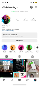
To begin creating our social media page (SMP), we had to make a plan to ensure we met the general and technical conventions of an SMP. We visualised on a timeline what posts we needed to create and when to post them, allowing us to have a successful campaign.

We want to ensure that we achieve AIDA within our social media page (Attention, Interest, Desire and Action. To create attention we plan to utilize stories and highlights to create snappy posts which grab the attention of our audience, making them click on links to our linktree and visit our Instagram page, where they would be able to find more information about the relevant post. We plan to create interest surrounding our page by releasing Instagram reels of behind the scene footage, giving the audience an unseen perspective of the life of our star. We plan to create desire by releasing short snippets of the unreleased songs from the album – making the audience want to purchase/stream the album when it releases. We plan to create action through selling tour tickets, and streaming/buying the album and merch – all of which will be easily accessible by a linktree in our bio.

We also plan to have a synergistic relationship with ASOS, releasing a collection called ASOS x Elodie. This is extremely important as it will allow us to reach different audiences that our brand and star would appeal to.

We also plan to use a variety of different media types including GIFs which we will created using an online software. They will be used to promote sneak peaks of new songs and potential promotions with the ASOS x Elodie campaign.

We also wanted to ensure that our star was perceived as ordinary and extraordinary using Dyer’s paradox of the star, making our star seem ordinary and extraordinary. We plan to do this through personal life, and casual posts which are relatable. Whilst also releasing brand deals and tour tickets.

Focus Forward

We have a clear plan and focus for our social media page. We have curated a brand which has a specific aesthetic and it is essential we stick to this to create a cohesive image for our stars and make them easily recognisable to the audience. We must stick to our plan and ensure that all of our content is pre-made ensuring we post on time. We must also interact with our audience and use things such as hashtags, to comply with formal and general conventions.

Digipak Draft 1

Using the Adobe creative cloud we have created our first draft of our digipak. We have so far created the front and back of the digipak.

click to see full screen

Overall, we are extremely pleased with the image manipulation on the front pane. It is executed brilliantly and conveys the underlying darker side to this album and genre in general. However, the back pane is lacking and is not cohesive with the front. We need to rectify this and come up with a new layout/idea to fix this issue.

Targets for improvement

  • We need to reorganise the back pane so that it is more visually appealing. We can do this by reordering the images and altering the colour correction. We should also look for a fun way to display the track list as it is currently quite boring.
  • We should ensure that we have the correct copyright text and include the ‘p’ symbol. We also need to add record label logos.
  • The black is quite harsh and we should look at using a softer colour to match our front pane.

Focus Forward

We have learnt new techniques and tricks in photoshop which will help us when creating the rest of our digipak. Currently, we need to reorganise our back pane and ensure it is of the best quality and utilises the great images we took in our previous shoot. Our aim on the inside of our digipak is to continue with the black and white theme that is present on the front cover. It depicts the darker side of the industry and is somewhat like ‘opening a book’ similar to opening a CD case. This will comply with our mission statement and overall brand image. We also need to ensure we have the correct formal and general conventions.

Evaluation of Digipak Shoot 1

To begin our design process, we had a photoshoot with our star.

Here are some behind the scenes images from the shoot.

This is a shortlist of some of our favourite images.

What went well?

  • Overall our mise-en-scene was portrayed well, and using all-black outfits will enable us to create the colourful design we are envisaging in post-production. We had several outfit changes which all followed the same aesthetic – we did this because we wanted variation amongst our digipak and social media pages as we want to emphasise the idea that there are different periods these images were taken.
  • We achieved a wide variety of shots, including close-ups and long shots. This was important so that we had variation amongst our digipak and social media pages. 
  • We also worked well as a team, ensuring that we stuck to our tight schedule and got all the correct shots. We also played music to make our model feel more comfortable in front of the camera – which worked well.

What could be improved? 

  • We did struggle with the flash system, to begin with, we then switched to an on-camera flash which worked a lot better. This allowed us to be more playful and flexible with the shots we were getting as we did not have to worry about the cable. This, however, did take some time to figure out so we did lose crucial time in the studio. 
  • We could have executed the ‘crying’ makeup look better, we could have used more mascara and dark-coloured eyeshadow to portray the context more successfully.

We should note that we made a conscious decision for our star not to be in our music video. As Elodie is already an established artist we felt that she could use her platform to showcase other peoples’ stories and act as an ambassador to them.

Focus Forward

Overall we had an extremely successful shoot. We can now plan and structure both our digipak and social media pages to ensure that they capture our mission statement and marketing strategy. These images will allow us to have variation across our media texts and encourage our audience to interact as they are visually appealing.

Contact Sheets – Digipak Shoot 1

After a successful shoot, we ended up with around 280 photos that we will use on our digipak and across our social media page.

click to see full sheet

We chose to use a variation of different outfits and hairstyles which all worked together cohesively. We also had a makeup look that used running mascara and ruined makeup to signify the daily struggles our star faced when expressing herself – similar to the target audience.

Focus Forward

Overall, we have curated high-quality images that will be perfect to use across our digipak and social media pages. We are looking to use more playful and fun images on our social media page and more serious ones on our digipak. We plan to colour-correct these images to make them pop and be more interesting. Our brand consists of four colours: magenta, orange, blue and green. This theme will be present throughout our whole project to make it more cohesive and make use of integrated advertising. It was key that our brand had a significant look and aesthetic to comply with the general conventions.