Print Production- Draft 2
Digi-Pak.
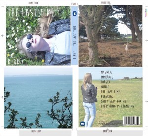
For our draft 2, we had edited the photos on the inside of the case so that they are more central, for example the wide angled shot of the sea was slightly uneven during draft 1 so we adjusted this and changed the positioning of the font. We also changed the font to a bold so that it was clear to the audience.
Here is our draft 2 of our digi-pak, click to view:
Advert.
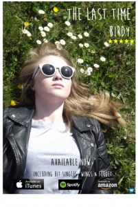
As for our advert, we applied the same font as the digi-pak and from the feedback from draft 1, I turned it portrait so that it was conventional and put in the release date and a star rating.
Here is our draft 2 advert, click to view:

