Chosen Adverts
Below will be my 1 of my 2 adverts. I have chosen this advert as I feel as if it link’s really well to my magazine with the genre and aesthetics.
This is a poster for Travis Scott’s ‘Astroworld Tour’. This is for the tour after his album Astroworld. I have chosen this advert as it links really well with my brand, the fonts used in the text link really well to my brand. Also with the colour being black, it fits really well with the contents page it’s alongside. The aesthetics of the poster suit my magazine.
Draft 3 for Teacher Feedback
The changes made to these drafts are –
Front Cover –
- Background from grey to black
- Image pushed more centrally
- Colour of coverline text
- Outline colour of main coverline
- Colour change of main coverline
- Barcode moved to the right side
- Price added
- Date of issue added
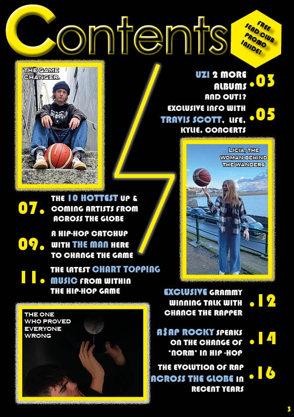
Contents Page –
- Font of heading/title
- Font in the pug
- Removed orange text
- Yellow borders applied on all photos
- Outer glow effect applied to all photo borders
- Page number added
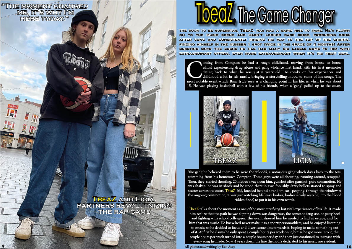
Double Page Spread –
- Background colour to blue
- Added orange effects to brighten up the page a bit, attract more attention
- Made the weight of text even on both smaller photo captions
- Added text to the main image
- Explained who the people in the photos are
- Shortened the intro
Below is a screen castify of my teachers review of my DPS, Front cover and Contents page –
To summarize the review, the changes and issues are –
Front Cover –
- sharpen image on photoshop
- make hat and glasses stand out
- en biggen image
- change pug
- revert to old font
- re-position barn
- get text off his face
- make a coverline yellow
- move main cover line to stand out
- get some continuity with fonts
Contents Page –
- add a pic of barn maybe
- get alignment back
- 3 pictures of the same people is weird
- add some blue, orange or grey
- sort the fonts
- make sure on the pug
- align text with photo border
- contents page = page 3
Double Page Spread –
- need a stand first
- unusual to read across
- different fonts?
Overall a bit all over the place, confusing, needs some consistencies and conventions.


