Critical Reflection Essay

How did your research inform your products and the way they use or challenge conventions?

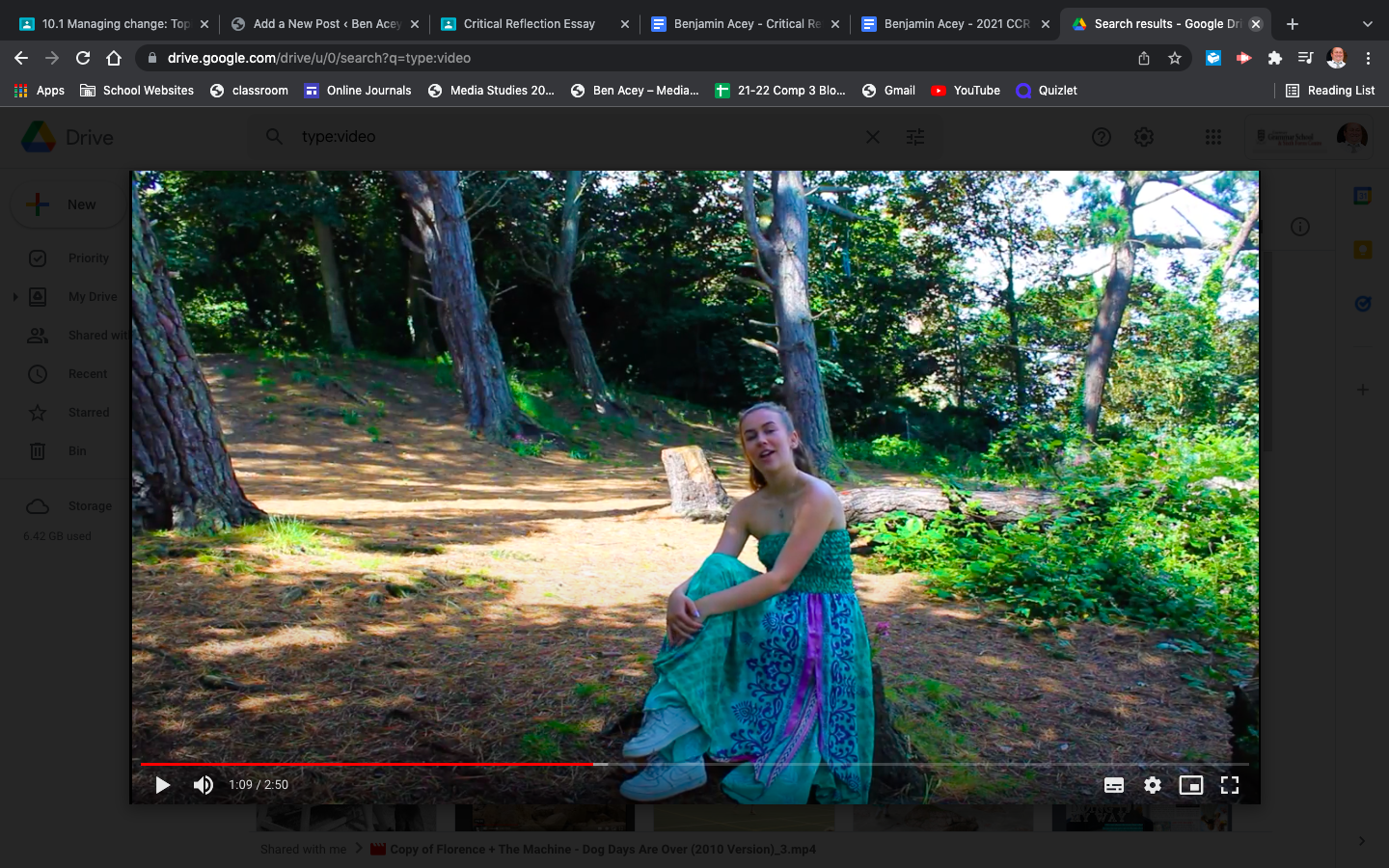
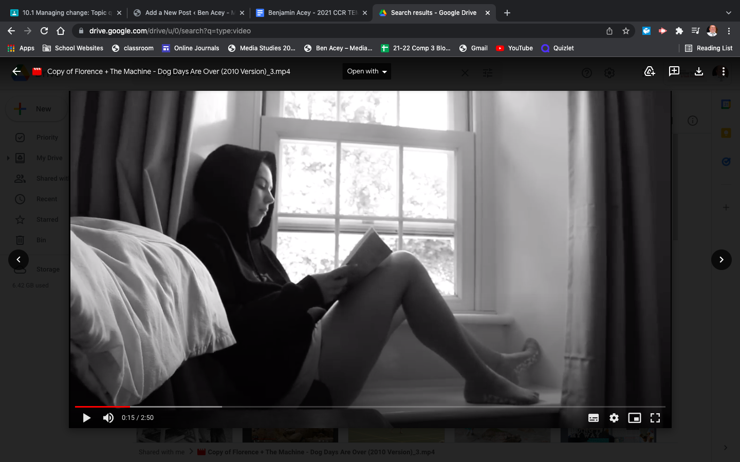
After doing some research into Indie Pop music videos we came to the conclusion they’re conventionally quite performance based, however if there is a narrative, it’s an amplified one. In terms of MES we knew that we would have to use quite an ordinary outfit for our narrative that you would see worn around your house. Not only to represent the sadness of being stuck at home but also because Indie Pop is generally very ordinary and subtle. For our performance element we used ‘snazzier’ MES. A flamboyant green dress with a cool fabric. We did this because Lacey states ‘genre is similarity and difference’, therefore we gave them what they wanted and in other parts we added our own unique element. 

Knowing what we know from our research. We decided to use the conventions and challenge them at the same time. We used the conventions to present our star as very ordinary, particularly in our narrative element. However we challenged them in the performance scenes to make our star look extraordinary, as in the paradox of the star presented by Dyer. In our performance scenes we dressed our star in a bright dress. We also used some colourful makeup to portray our star image in an extraordinary way. We knew how to connote this ‘extraordinariness’ by seeing what was conventional and typical for the star image of indie pop performers. As well as this, for our narrative we knew that some Indie Pop artists display quite depressing lyrics. Knowing this we used our amplified narrative to use a narrative which had a relation to this, as we thought this may be a preferred reading of the audience and they may connect with the performance and star image emotionally. We really used the generic conventions of Indie Pop in the mood and locations of our scenes. At home, she was trapped and depressed then when we move to the beaches and ‘forest’ she had freedom, happiness.


How do your products represent social groups or issues?

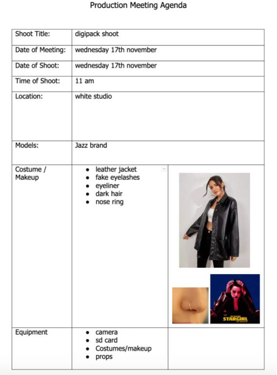
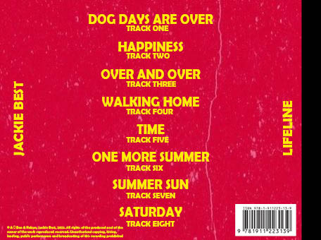
Part of our DigiPack production involved representing our star image in a unique way, to display the issues we want to represent. With our genre being Indie Pop, if we stayed conventional to the genre we would have what would be considered a very generic and simple cover. However whilst keeping conventions we have tried to jump out of the box a bit with our design, despite being a new artist. Obviously this is a risk as it may catch the attention of the wrong audience however it could work as a treat in portraying the paradox of the star.

Part of the message and issues we are trying to represent is that it is okay to be different, unconventional. In this modern world a lot of people are scared to be different, constantly trying to fit social media’s ‘preferred reading’ never expressing their true selves. With our digipak design we have tried to challenge this. We did this by making the front cover a lot darker, opposed to the typical light colours associated with Indie Pop. Instead we used a darker blue, red and a yellow to compliment these colours. We hope that despite this being a small gesture, it portrays an image suggesting it’s okay to be different and your true self, and it won’t matter nearly as much as you think.

How do your products engage with the audience?

To engage with our audience we created a social media page for our star. This allows us to engage with our audience on a variety of levels, fulfilling their uses and gratifications, a theory revised by Blumler and Katz. Whether we do this via the posts we make or the political stories or fan interaction opportunity.

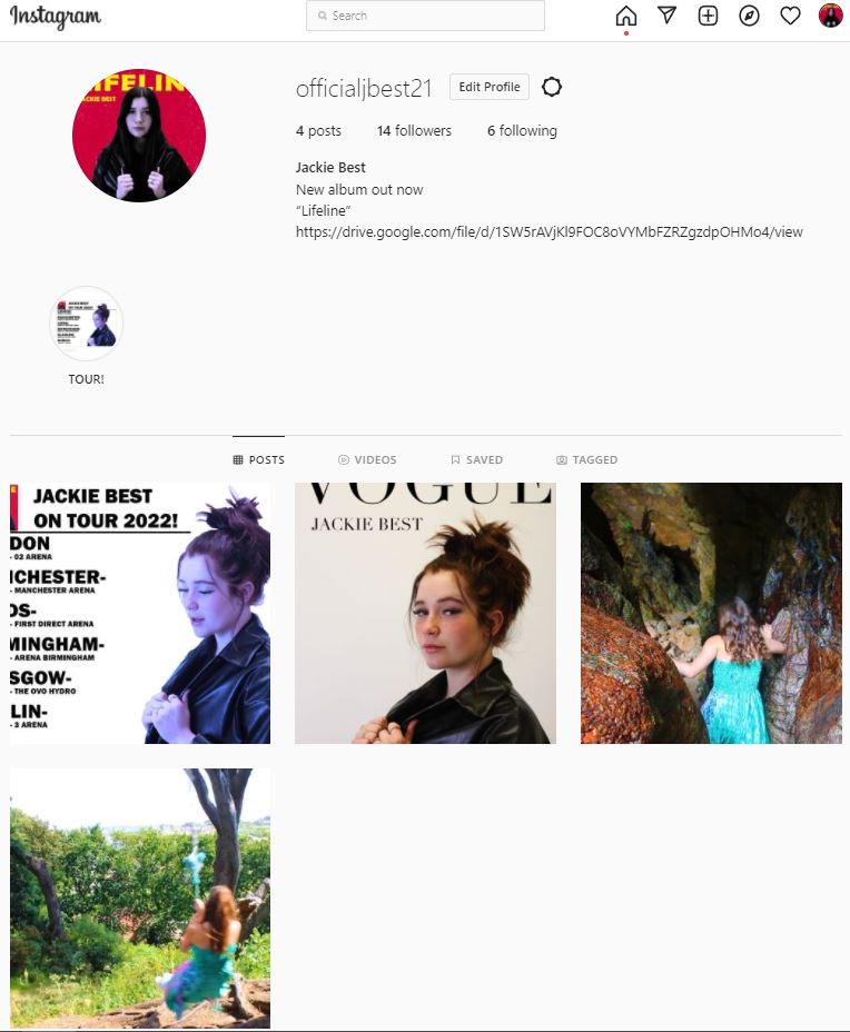
With the social media page we can style it and post whatever we want, manipulating the star image. If we post about political matters this may connect with the fans who have the same views, creating a deeper connection between audience and star, and potentially providing some personal identity. As well as this they can post information online about albums, tours, merch. This is information, another aspect to fulfill their audiences’ uses and gratifications which provides them entertainment at the same time. The best part about our star image having a social media page is the authenticity about it. The page is all about the star, designed by the star, and run by the star. This displays their true personality and allows the opportunity for social interaction, whether this is just liking the comments they leave under their posts or replying to their DM’s. Or, on Instagram you can do Q&A’s over your story, our star can do this and have their audience leave questions, then they choose a selection to answer. This is a very fun and accessible form of social interaction for all parties.

How do the elements of your production work together to create a sense of ‘branding’?

The branding of our star image within our music video, digipak and social media page was interesting, as we presented the star in very similar but potentially significantly different ways. Our music video presented our star image in a juxtaposition that linked a lot to Richard Dyer’s theory of ordinary and extraordinary aspects of a star. In our music video we presented the star as ordinary and extraordinary. We started our video with our star being ordinary, living a life like anyone else being depressed and lonely. However this soon changes to our star being extraordinary and presented in a free and flamboyant manner.

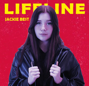
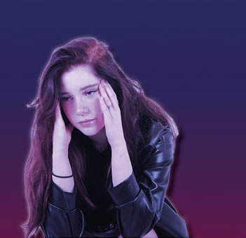
Despite this,  in the modern era a music video and digipak  a star would be presented as extraordinary with the more ordinary aspect of the star presented to their social media pages. So here we added our own unique twist to brand the star in our ideal manner. With our digipak we have presented our star in a different manner, yet still extraordinary manner. We present her in a leather jacket which isn’t conventionally an Indie Pop costume, and we use a darker colour palette. Combining these 2 things you would imagine our digipak falls more into the Rock genre however I would say it does just sneak into Indie Rock. As well as this on our social media page we present our star in a more ordinary manner. With the posts we’ve made showing her true personality more and giving her audience a better insight into her life. This links to Altman’s theory on ‘predictable pleasure’, she knows what her fans will want so she gives this to them so they feel closer to the star, which is important to build a loyal fanbase. WIth these 3 aspects we have branded our star to be strong minded and different, whilst hopefully still possessing the free and flamboyant feel.


Social Media Page Draft 2

Above is a screencastify of our first draft done by our teacher. He speaks about the positives and also the things we need to target and improve.

Our targets for improvement are –

  • Make a post about a charitable cause, preferably mental health as we can link to out song well
  • Needs more posts (at least 10)
  • Add links in the post so the audience knows where to purchase the tickets/merchandise from
  • Provide more information on our posts about what we’re posting
  • Look at real artists posts for some inspiration

Social Media Page Draft 1

Above is my social media page. This is my first draft and only the start.

I feel like this is a good start and is linked well to the criteria we need to meet for a successful page.

Design Coherence –

Similar generic conventions to our digipack and music video like the colour and fonts. Obviously the font on the Vogue cover is different but that is because it is their magazine and they always use that font.

Synergy –

We have intergrated synergy into our page with our collaboration with Vogue, however we are looking to make another post using some synergy.

Timeline –

There is a timeline so far I feel as their is first a teaser of the video, and then she we speak on a tour so I feel as if currently their is a rough timeline. However we may need to make this somewhat clearer.

Cross Media Convergence –

So far we have not done any cross media convergence so we will need to look into doing this.

Promotion of Live Events –

We have promoted our live tour which is a live event which is useful and information for our audiences uses and gratifications.

A Call to Action –

So far we haven’t done this however we will get this done when we release the album and music video.

Ordinary/Extraordinary –

So far we have mainly done marketing work however we will get a post in with some of the stars real personality.

Interaction/Engagement –

We haven’ touched on this as of yet however we plan to further down the line, most likely once we have announced the release of the album or music video.

Sell Physical Copies –

Haven’t as of yet touched on the selling of physical copies so we will have to do this down the line.

Issues & Charities –

we haven’t posted anything yet in regards to charities or issues however we are making a post to touch on the both of them in regards to mental health which will be posted soon.

Timeline & Marketing Ideas

Above is a timeline of how we intend for our social media page to be set up. As you can see we have 9 posts, which is 3 rows of posts. This covers a screen. Having this timeline set out gives us a rough plan which we can follow to ensure everyone in the group is on the same wavelength. As well as this it makes sure their is structure to the page and it’s no all just thrown together in a hurry.

In an attempt to combat the covid-19 pandemic Charli XCX announced on her Instagram that she was going to do a zoom call with 1,000 fans! This was in an attempt to promote and market her album. On the zoom she announced the dates, and title and the project entirely. She also brought in special guests to keep the calls exciting. As well as a very good marketing idea this also engages her audiences uses and gratifications for social interaction, which is another clever and effective element this provided.

A very intelligent and more modern way of marketing is seen in the way Trevor Daniel promoted his recent hit ‘Falling’.  What he did was create a trend on TikTok, a very popular app with around 1 billion users. Knowing this would catch on as many trends do on TikTok and that a lot of people would notice the song, taking an interest to it. Very clever and effective move in the modern world.

In this marketing idea, a popular and well known UK rap artist who goes by the name of M Huncho launched a campaign as if he was going for the London Mayor, as it was at the time of election. This publicity stunt which is seen as a guerilla style of marketing attracted a lot of attention from a variety of news outlets, gaining himself a lot of attention from a wider audience. As well as this what made the stunt even more confusing and baffling to fans was the fact that M Huncho never revealed his true identity, and has never revealed his face from behind the mask. This is partly due to the fact he wants his personal life to be private and free, but mainly because he has various charges awaiting him according to rumors and some of the stuff he talks about within his music about his days as a drug dealer could get him into a lot of trouble. As well as this, the icing on the cake was that he eventually released an album after all this commotion called ‘Huncho For Mayor’, so as you can guess his stunt gained this a lot of publicity and it gained a massive amount more in first week streams than  his previous album ‘Utopia’


Social Media Page Terminology

Above are a few slides I’ve put together where I have annotated of Billie Eilish’s instagram page. I have spoke about how she fulfil’s her audiences uses and gratifications and the different ways she does it, via information, entertainment or social interaction. Also whether she does this for marketing, branding or just for fun. I have also pointed out the formal and technical conventions of social media terminology she uses across her page, whether this is on her posts or just on her profile.

DP Mockup

Above is our very rough plan for what we wnat our digipack to look like. It has the front and back covers, and both inside covers all mapped out with a plan we can hopefully fulfil. Having this plan ensures we are all on the same wavelength and we do not drift away too much when we get stuck and always have a base plan to stick to and follow.

Reflection:

For our digipak we want to use bright and bold colors such as Yellow font with a red background and then tint our star image with a dark blue, we think these 3 colors will compliment each other really well. We are gonna have 2 different photos for our front cover and inside left page. Because we are only planning to use 2 images we want them to be big and keep the rest simple so the star images will take up most of the page. Our back page is sticking to the theme of bold font and yellow and red colors mixed together as we want to keep consistencies with our digipack. This is also quite a formal convention in all digipacks.

Photoshoot / Design Production Meeting & Risk Assessment

Production meeting agenda for our digipack photoshoot on Wednesday the 17th of November. Having this ensures that no one will forget what they need to bring and we are all well prepped with all of our planning in a space where everyone who needs to view it, can. It is well detailed too so that all props and costumes for MES won’t be forgotten and shows our clear plan for the day.

No risk assessment is necessary as we are only shooting in the white room at school with no danger.

Contact Sheet & Draft Ideas

Overall I feel as if the shoot was very successful. We got a large number of pictures, many of which high quality due to the camera focus, pose, mise-en-scene and the colouring of the photo. None of them are over saturated, none are too bright. They’re all of a high quality and each pose has a lot of photos of it to ensure we get the perfect one. As well as this everyone brought what they needed to, whether that be props or costumes. Also the technical conventions of our genre are displayed exactly how we wanted, which is good.

Below are our favourite images from the shoot that it is likely that we will use –

I like these photos as I feel they are very similar to many current photos of stars on their front covers, secondly I feel it represents my genre of indie pop in the way that we want, with our own little unique twists to support our idea and end goal. I also feel in these the mise-en-scene we intended to show is best on display here, with the leather jacket being very prominent and on display in the picture and the nose ring too which is what we wanted.

Digipack Draft 2

Above is our 2rd draft of our digipack. As you can see what have made a lot of changes from our previous drafts on all of the pages. On the front cover we have reshot the image, and changed the filter on the image. It is now not as blue and looks much better and natural. We have also changed the pose and make the image bigger, covering part of the title but not too much, however I feel as if this works very well. For our inside covers, we have added a photo to one of them instead of it just being a base colour as it once was. I feel as if this adds a bit of personality to the covers inside, as they were plain and bland beforehand. We also changed the background colour to a faded purple and blue look. I feel again this adds personality to the inside covers and makes it look much less ordinary. Finally on our back cover we have added our copyright information which is a formal convention to any digipack, as is the barcode which we have now added too.

Digipack Draft 1

Down Below is our teachers screen castify review of our second draft, underneath this I will summarize what he said and do a some targets for our third draft.

Targets –

  • Re-shoot with better MES to portray our genre
  • Ensure all writing is in line
  • Change the blue on the image to a filter – will look more natural like a blue light – do this on new image though not current one
  • Change colours on middle page as it’s too repetitive
  • Add copywrite information and barcode to back