DP Mockup

Above is our very rough plan for what we wnat our digipack to look like. It has the front and back covers, and both inside covers all mapped out with a plan we can hopefully fulfil. Having this plan ensures we are all on the same wavelength and we do not drift away too much when we get stuck and always have a base plan to stick to and follow.

Reflection:

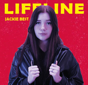
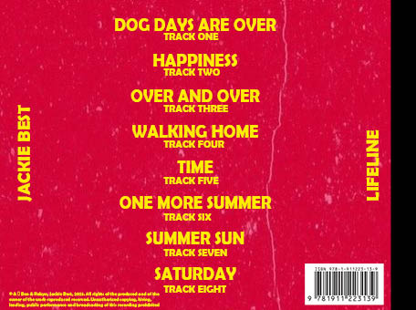
For our digipak we want to use bright and bold colors such as Yellow font with a red background and then tint our star image with a dark blue, we think these 3 colors will compliment each other really well. We are gonna have 2 different photos for our front cover and inside left page. Because we are only planning to use 2 images we want them to be big and keep the rest simple so the star images will take up most of the page. Our back page is sticking to the theme of bold font and yellow and red colors mixed together as we want to keep consistencies with our digipack. This is also quite a formal convention in all digipacks.

Photoshoot / Design Production Meeting & Risk Assessment

Production meeting agenda for our digipack photoshoot on Wednesday the 17th of November. Having this ensures that no one will forget what they need to bring and we are all well prepped with all of our planning in a space where everyone who needs to view it, can. It is well detailed too so that all props and costumes for MES won’t be forgotten and shows our clear plan for the day.

No risk assessment is necessary as we are only shooting in the white room at school with no danger.

Contact Sheet & Draft Ideas

Overall I feel as if the shoot was very successful. We got a large number of pictures, many of which high quality due to the camera focus, pose, mise-en-scene and the colouring of the photo. None of them are over saturated, none are too bright. They’re all of a high quality and each pose has a lot of photos of it to ensure we get the perfect one. As well as this everyone brought what they needed to, whether that be props or costumes. Also the technical conventions of our genre are displayed exactly how we wanted, which is good.

Below are our favourite images from the shoot that it is likely that we will use –

I like these photos as I feel they are very similar to many current photos of stars on their front covers, secondly I feel it represents my genre of indie pop in the way that we want, with our own little unique twists to support our idea and end goal. I also feel in these the mise-en-scene we intended to show is best on display here, with the leather jacket being very prominent and on display in the picture and the nose ring too which is what we wanted.

Digipack Draft 2

Above is our 2rd draft of our digipack. As you can see what have made a lot of changes from our previous drafts on all of the pages. On the front cover we have reshot the image, and changed the filter on the image. It is now not as blue and looks much better and natural. We have also changed the pose and make the image bigger, covering part of the title but not too much, however I feel as if this works very well. For our inside covers, we have added a photo to one of them instead of it just being a base colour as it once was. I feel as if this adds a bit of personality to the covers inside, as they were plain and bland beforehand. We also changed the background colour to a faded purple and blue look. I feel again this adds personality to the inside covers and makes it look much less ordinary. Finally on our back cover we have added our copyright information which is a formal convention to any digipack, as is the barcode which we have now added too.

Digipack Draft 1

Down Below is our teachers screen castify review of our second draft, underneath this I will summarize what he said and do a some targets for our third draft.

Targets –

  • Re-shoot with better MES to portray our genre
  • Ensure all writing is in line
  • Change the blue on the image to a filter – will look more natural like a blue light – do this on new image though not current one
  • Change colours on middle page as it’s too repetitive
  • Add copywrite information and barcode to back

The Look Book – The Package

Down below is a padlet that is our ‘look book’. Here we have analysed different front covers of digipacks from our genre, Indie Pop. Doing this has allowed us to identify the conventions of our genre and how e can use it for the branding of our digipack.

Made with Padlet

Doing this padlet ‘look book’ enables us to analyse different conventions and styles of digipack within the indie pop genre. With this look book it is clear to see specific consistencies and conventions whether this be font, colour palette, star image or the size of the letters. Having done this research and analysis allows us to understand what will catch the eye of our target audience and what we can do that fits the conventions but is a bit outside the box.

Our Mission Statement – The Package Brand

Down below is a slideshow we made as a group speaking about our branding. It holds our USP, Mission Statement, our competition and target audience. This will help us to design and create our digipack to catch the eye of this target audience and beat our competition with the way that we design and market our digipack. And obviously, knowing our target audience is important for this.

Digipack Convention Analysis

Below is my textual analysis of Billie Eilish’s upcoming album (‘Happier Than Ever’) digipack. I analyzed the conventions and how she challenged the conventions and the different ways she presented the vibe and feeling she intended. I did this by looking at the;

  • Album name & font used
  • Colour(s) used
  • Mise-en Scene – Costumes, Hair, Make Up, Facial Expressions, Body Language
  • Song names
  • Font & sizes used
  • Record label logo

As you can see I anaylzed the front and back separately. I went into a fair bit of detail on how she challenged the conventions, how she conveyed the mood of her album and the different ways she did this. The conventions and consistencies in what she did, even if these were typically unconventional. Obviously all the technical conventions were there, e.g the barcode, record label logo, album name, star image, however there were unconventional features within these. But that would be what she wanted, she is an artist who is forever changing the pop game and has the resources to take these risks.

Overall I’d say on the most part this is a very mellow and natural album cover. However if you look closely you can see the light surrounding the star image is brighter and it fades out, almost as if a spotlight is on her. This may suggest her ascending up towards heaven or something along those lines, as she is now ‘happier than ever’ as the album name states. However all of the MES and colours connote a very ordinary and natural feel to the digipack.