Draft 5 Work in Progress

These are my improved 3 pages of my magazine, they have been improved with the feedback I got given on my Screencastify.

Whats Changed?

Front Cover:

  • I have only one inset image on my front cover now with a border around it so it looks more professional.
  • I have gotten ridden of some of the text that was next to my models head and made my main cover star bigger.
  • At the bottom where it includes what artists will be in the magazine, I put a slash in between so it is easier to read.

Contents Page

  • I have changed the font of the title so it isn’t the same as the front cover and I have put the logo of the magazine beside it.
  • I got rid of some of the articles and made the boxes all the same size so it doesn’t look odd with different shaped boxes as that doesn’t look professional.
  • I have put page numbers on the inset images so the reader can easily find what page to go to find these images.
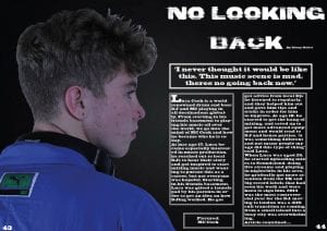
Double Page Spread

  • I have changed the background colour as usually a DPS wouldn’t be printed in black because of the cost.
  • I have made the text boxes the same size and only used one drop capital.
  • I changed minor things such as the page number being cut off at the bottom.


Feedback On Article

Below is my full first draft of my article written on a document and on my DPS so you can see how it will look.

Feedback  on article from Google Classroom:

  • Call the star by his last name instead of his first name
  • Have more advertisement about the artists new album
  • Have more quotes from the artist


Work In Progress

Whats new and whats changed?

Throughout my entire magazine I haven’t drastically changed anything. I’ve added in minor details such as borders around images and on the contents page to fill space. I made sure to keep the theme the same throughout otherwise it wouldn’t look as professional as it could. I also added in things I had previously forgotten to add such as page numbers and a byline. I just touched up most of it. For example, on my DPS, I just moved the text and image across so they wouldn’t be in the fold of the page. I didn’t feel like I needed to change much.

This is the Screencastify I have been given from my teacher on how I can improve my magazine even better.


What do I need to do now?

Front Cover:

  • Take away one inset image as there is too much going on.
  • Get rid of some text as there is too much

Contents Page:

  • Make the boxes with different article titles in them the same size
  • Change the font so it isn’t the same as the headline on the front cover

Double Page Spread:

  • Change the background colour as all 3 pages look very similar
  • Only use one drop capital, make sure my columns are the same size
  • Make sure the consumer can see everything on the page, nothing is cut off

So…How is it going?

When designing my magazine I had a rough idea of what I wanted it to look like, but I struggled a bit as there aren’t many drum and bass magazines around. So I mostly took my inspiration from colour schemes from album colours and photo shoots of drum and bass DJs so I could see what type of costumes they wear and how they are modeling for the photo. Once I had researched what I needed to, I had a much clearer idea of how I wanted my magazine to look.

I found that most font types for this genre were almost glitchy and seemed rebellious, so the font I chose off Dafont fit perfectly. I called my magazine RAVE as generally drum and bass parties are called raves. This is very to the point and I think by reading the title you will have some kind of idea of what genre the magazine is. For other titles and main text, I found a font on InDesign and changed the width, how close the letters were and the size of it to try and make it my own and look different from the original font.

I think the images I took for my magazine cover, contents page and DPS convey the genre clearly. The use of props on the front cover show that the main cover star is a DJ as the main cover line is also about the star. The contents page images I find show the rebellious side of the genre, with one of my stars stood in front of a police station. To conclude, I think the typeface and images clearly show what genre the magazine is and that the consumer would easily be able to differentiate this genre from other music magazines.

Design Skills 1

What new design skills have I learnt?

In Photo Shop, I used the magnet tool to help me cut around my models face and body. Using this tool is better than trying to use the eraser tool as its quicker to do and looks a lot cleaner than rather if i had to rub the background, whereas the magnet tool stays to the edges of what you want to cut out.

Because my model has curly hair, it was more difficult to cut out with the magnet tool, so I used the eraser tool to get close and in between the hairs.

In InDesign, for my front cover, I wanted my inset images in boxes or circles to make it look more realistic. So for that, I used the box tool to create a circle onto my front cover, I then selected the box and placed my image into it and adjusted the image so it fit properly. I think this looks more professional rather than having all of the images in rectangles/boxes and makes it look more interesting.


For my fonts, I wanted one that was a bit different and one that would stand out, so I looked at fonts on DaFont and found one called Bad Coma that I have used for all of my headlines and cover lines. Looking on DaFont gives more of a variety rather than editing fonts in Indesign or not finding one you like on Indesign or Photo Shop.

How will this help me in the future?

This will definitely help me in the future if my career is editing or something similar as I would’ve already had some of the skills needed for the job and I would be familiar with the software.


Risk Assessment

This is my risk assessment sheet for our photo shoot in town. Doing a risk assessment is important as if anything goes wrong the teachers or other people will know where you will be and who you will be with. You also think about the possible risks and the action required in order for that risk not to happen.

A New Improved Contents Page

Above is my improved contents page.

What did I need to improve on?

  • Fill the empty space
  • Insert page numbers to the different articles
  • Insert more text for the article titles

What did I do?

I put borders around the two inset images at the bottom, I think this makes it look more professional and makes them stand out a bit more. I added the page number at the bottom left of the page. I also added more articles which in a real magazine, would show it is packed with information the consumer would enjoy reading. Likewise I added page numbers so realistically it would be easier for the consumer to find the important pages. I also changed the font for the article titles as the one i use originally was difficult to read.

A New Improved DPS

Above is a new improved double page spread. Using the feedback I was given I was able to improve on my DPS and make it better.

What did I need to improve on?

  • Add page numbers and byline.
  • Move text and image across
  • Make headline smaller so it fits onto one side of the page

What did I do?

To improve, I added page numbers and a byline. I also moved my text, headline and image across so when the page is folded nothing is in the fold, I had to make my headline a smaller font so it would fit into one side of the page properly. I think this has made my DPS look more professional with everything I have added and improved on.

A New Improved Front Cover

Above is a new improved front cover of my magazine. I took on board all the feedback I was given and things I could improve on and made some changes to my front cover to make it look more professional.

What did I need to improve on?

  • Insert more pugs/plugs
  • Use a font that I haven’t already used for the headline and main cover line
  • Add more text/information to catch the consumers eye

What did I do?

I added two inset images and plugs, I also added a speech bubble that says the magazine includes a free poster to catch the consumers eye as generally music magazine front covers are packed with information. For my pugs/pugs, I decided to use a different font as the one I chose was difficult to read in a smaller typeface, it looks better just being used for the main cover line instead of the plugs/pugs as well.


Skip to toolbar